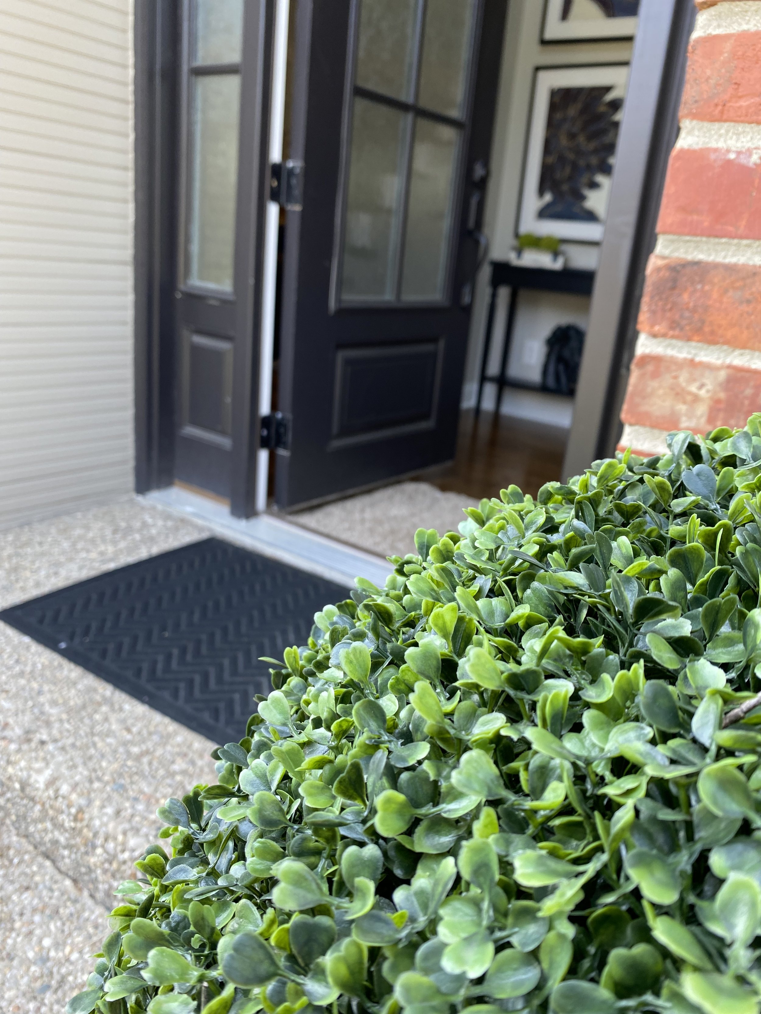
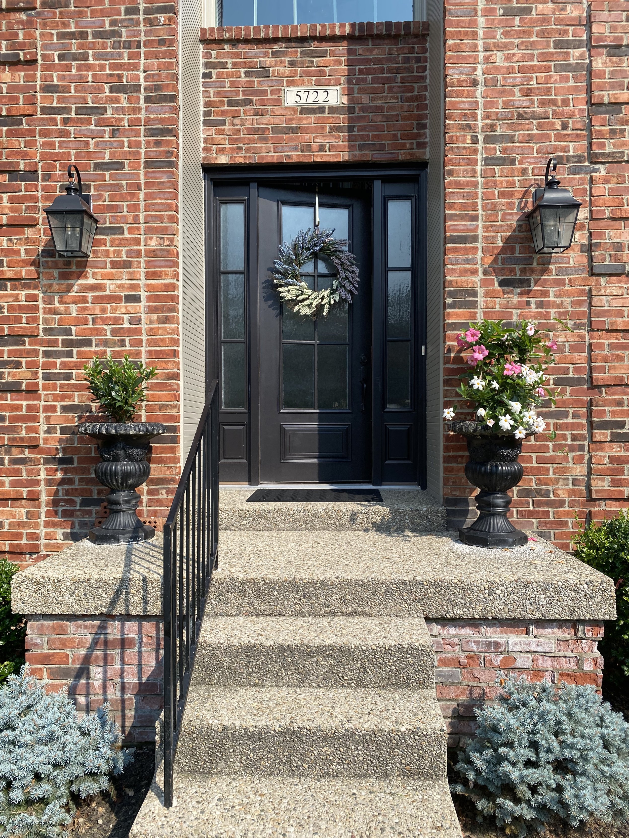
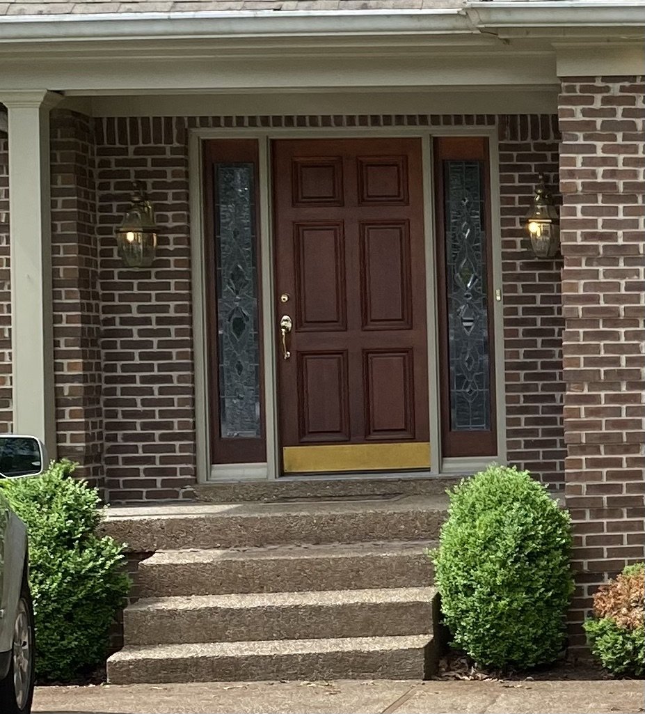
EXTERIOR REMODEL

Before: My 1940's home was well built and had LOTS of potential, but NO curb appeal!
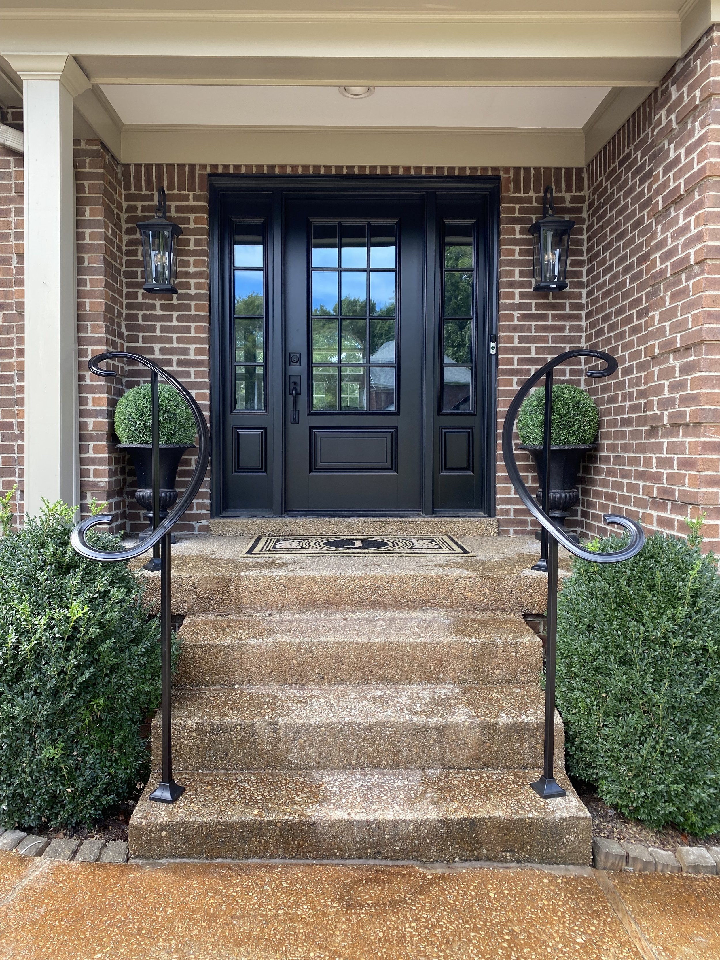
After: New dormers and gable add interest to the original "rectangle shape.".The stone around the porch, two types of siding (lap and shingle) and two different roofing materials (shingle and metal) offer a variety of textures. The dark gray hue of the newly painted brick allows the crisp white trim and bright turquoise door to "pop." The entire porch was raised to the same level as the door. This makes the space feel more like an additional room as well as provide space for a natural stone skirt around the porch.

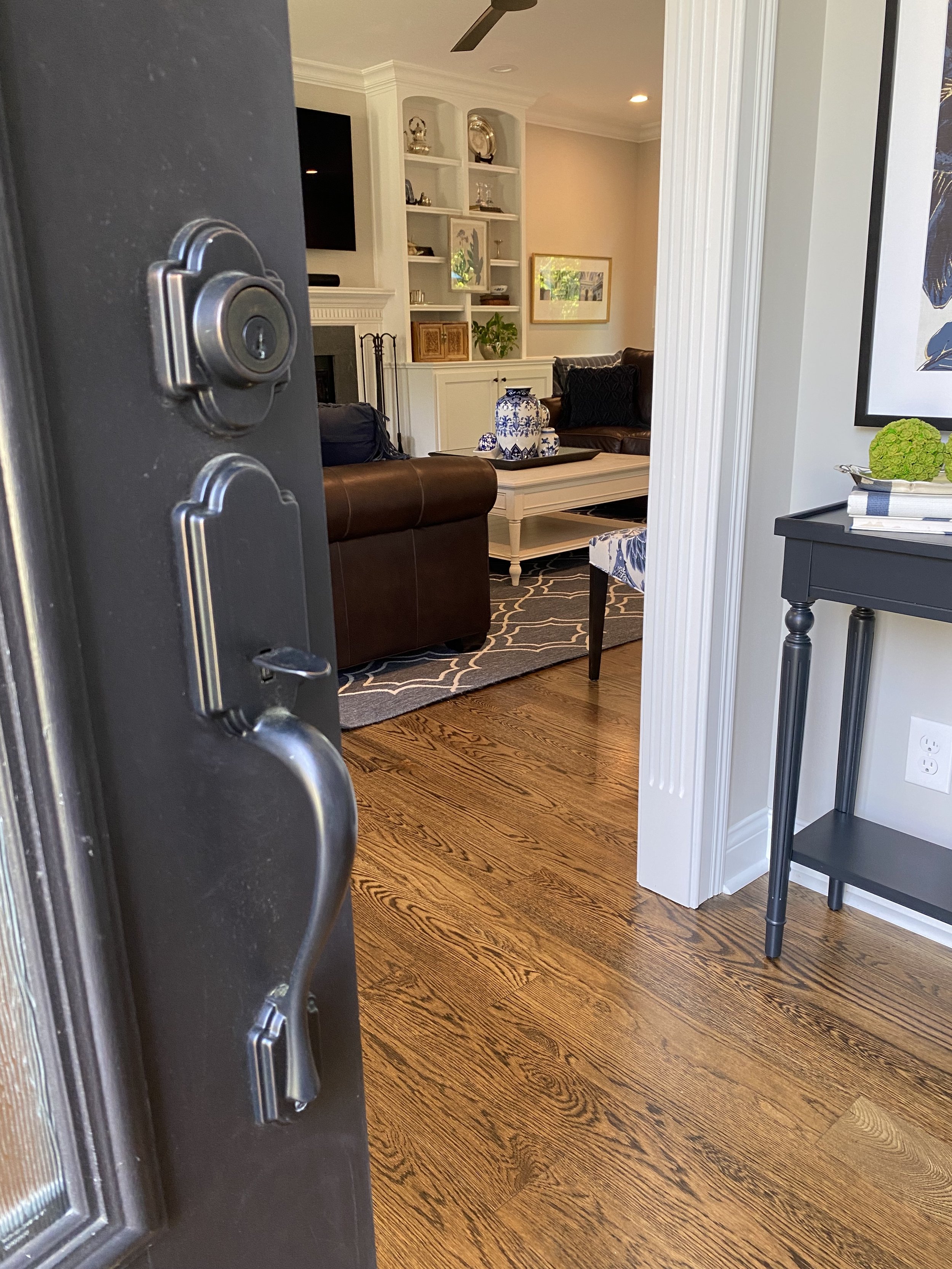
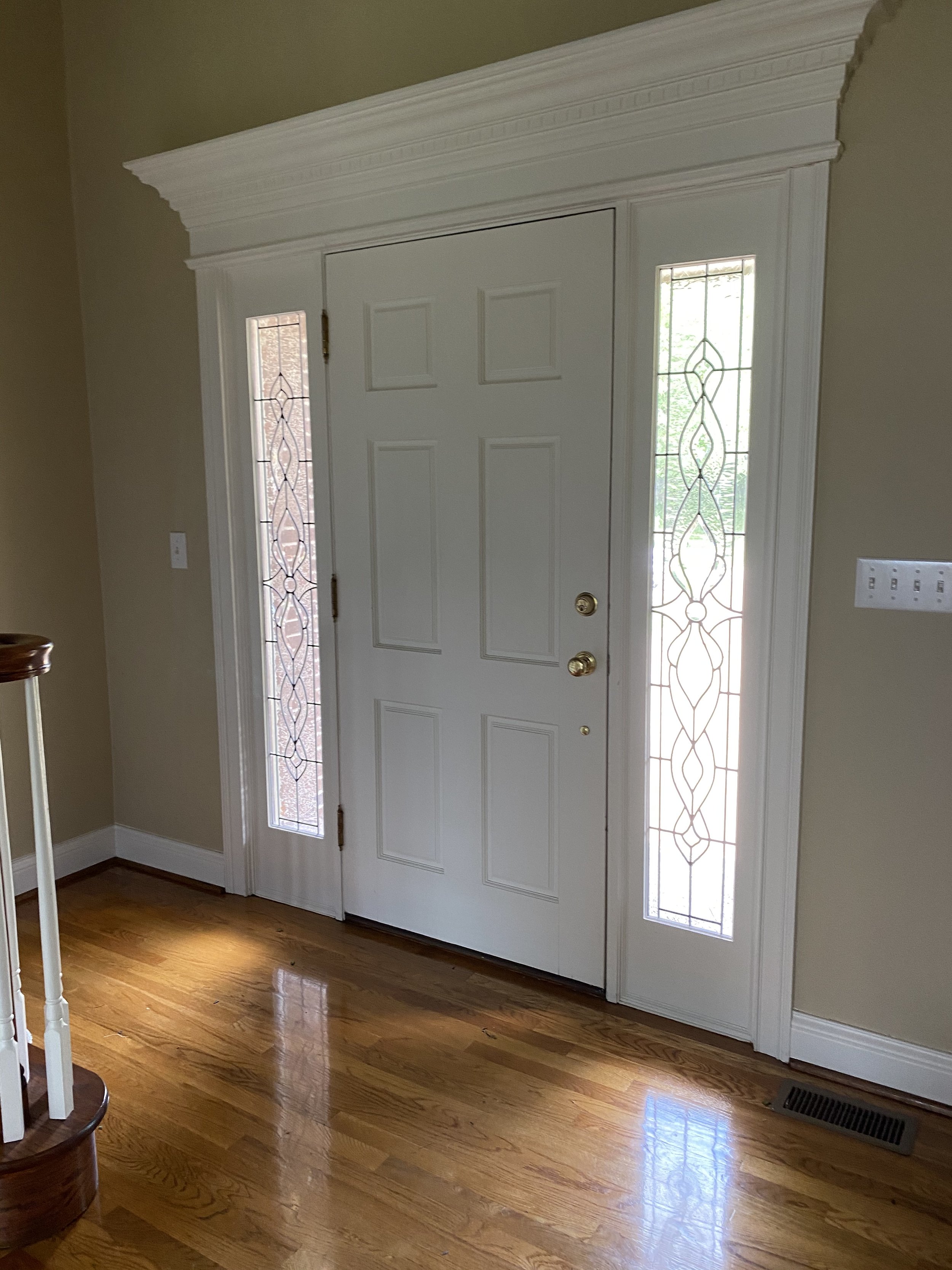
Before: A closeup of the front door.
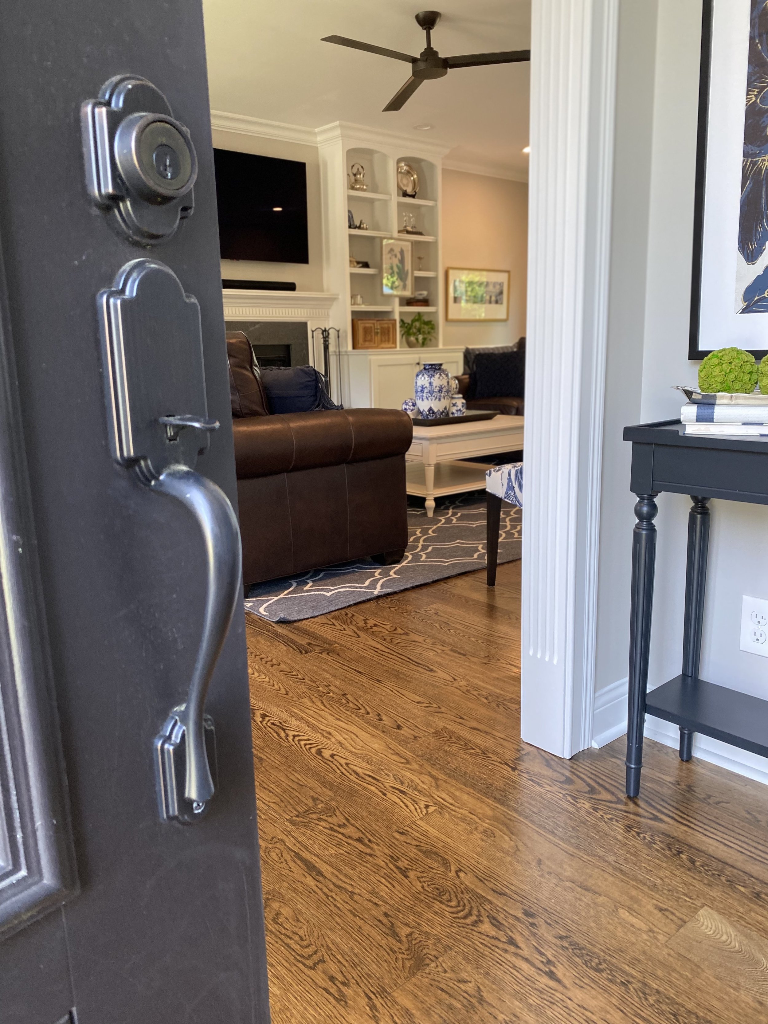
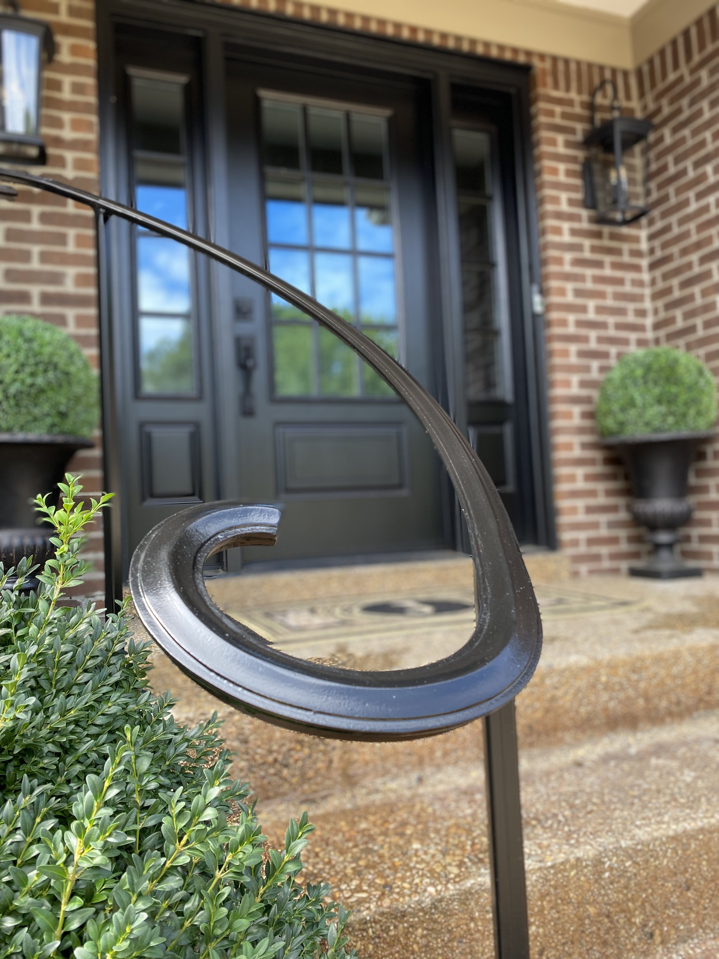
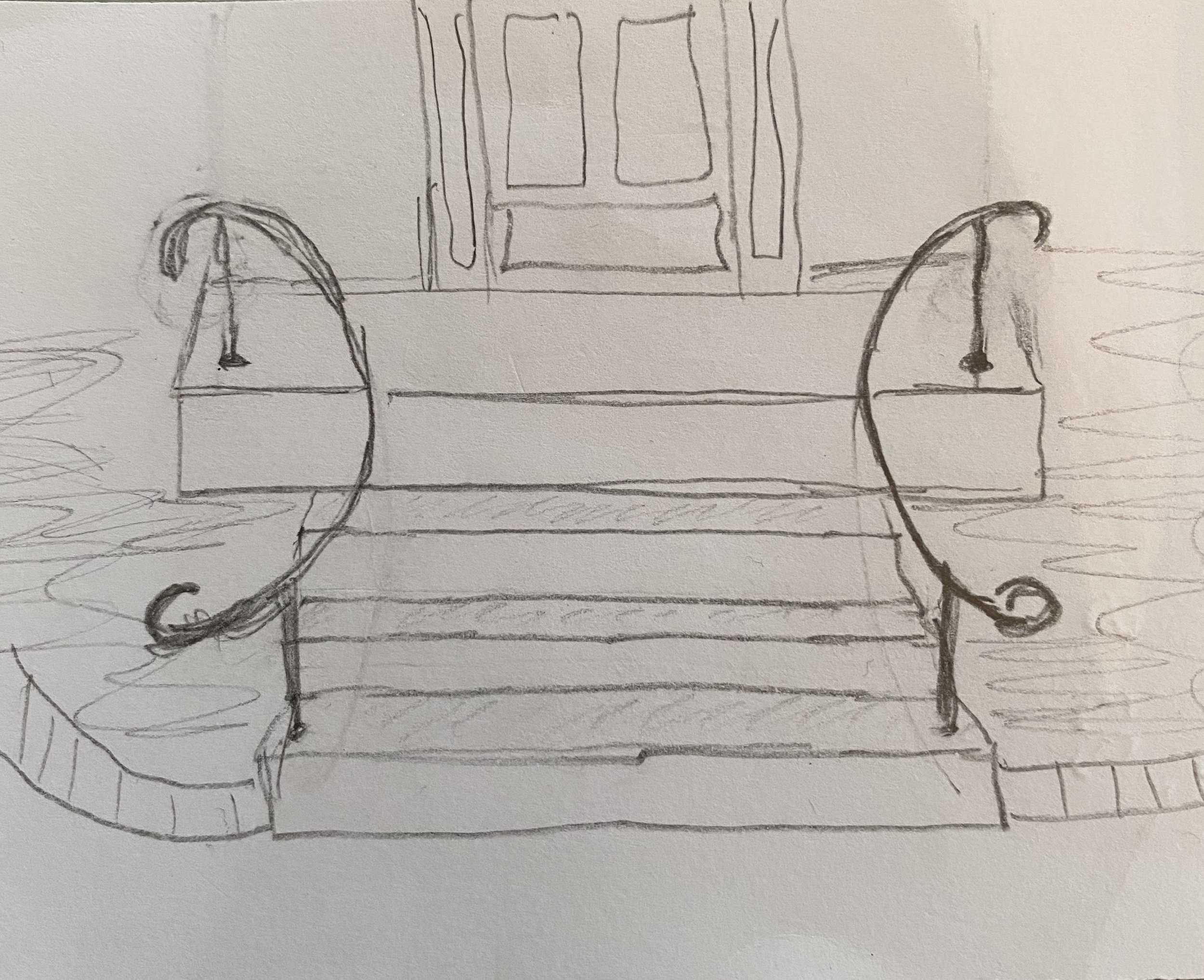
After: Oversized molding frames the new turquoise door. A wooden storm door, painted in the same hue, assures that the color isn't lost when the front door is open. The painted wood beadboard ceiling adds texture and character, and the modern font and "old-world" railway lantern offer a nice juxtaposition. The wrought iron knob and door handle tie into the iron railing and ceiling fan at the opposite end of the porch. The Loloi scatter rugs tie the gray, white and turquoise color scheme together.

After: The new sitting area, created by the two-piece railing, provides ample seating, storage and light for day or night time use.
Kitchen Remodel
Click on images to see full views.
Before: This kitchen was small, dark, and totally outdated!
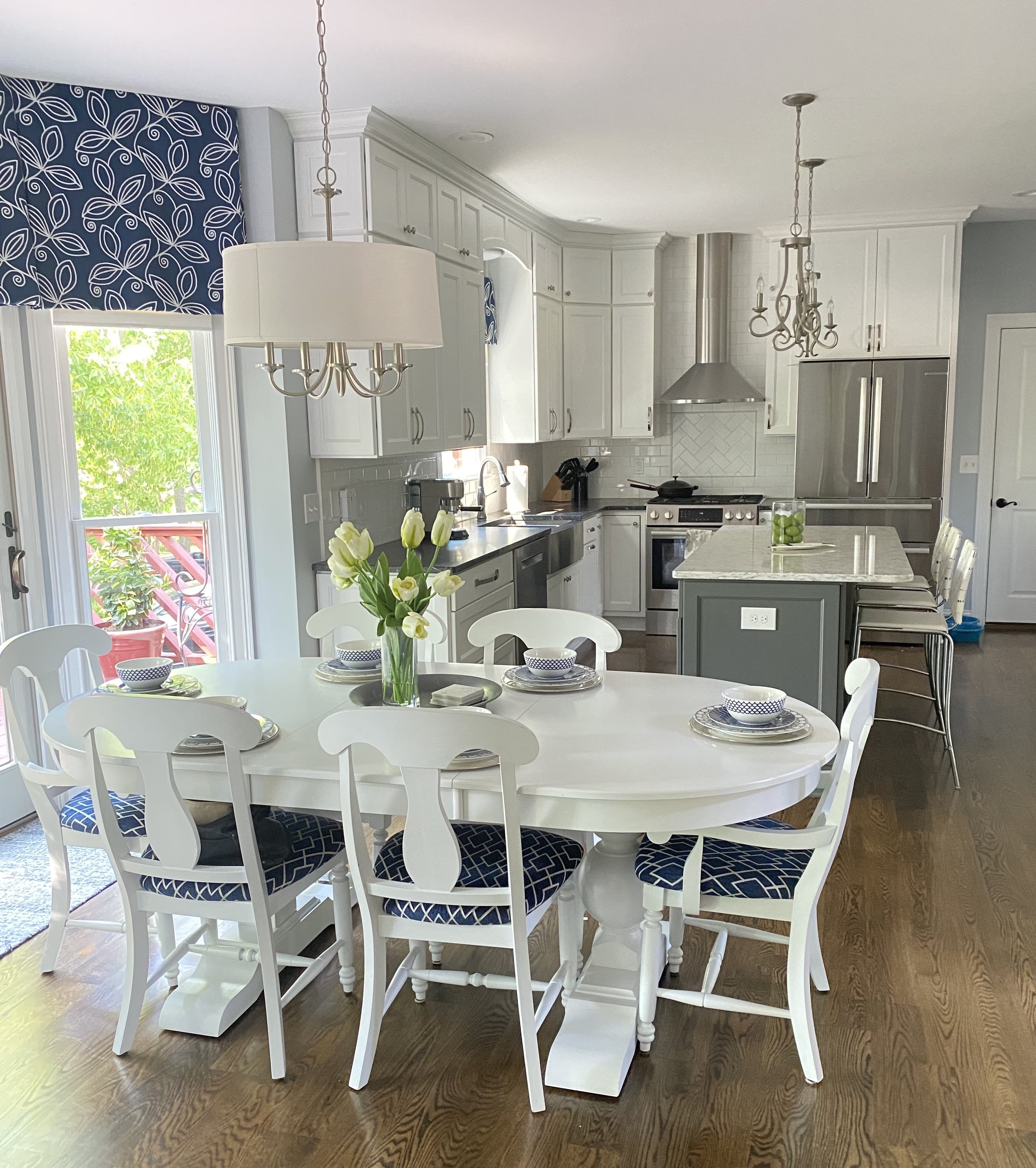
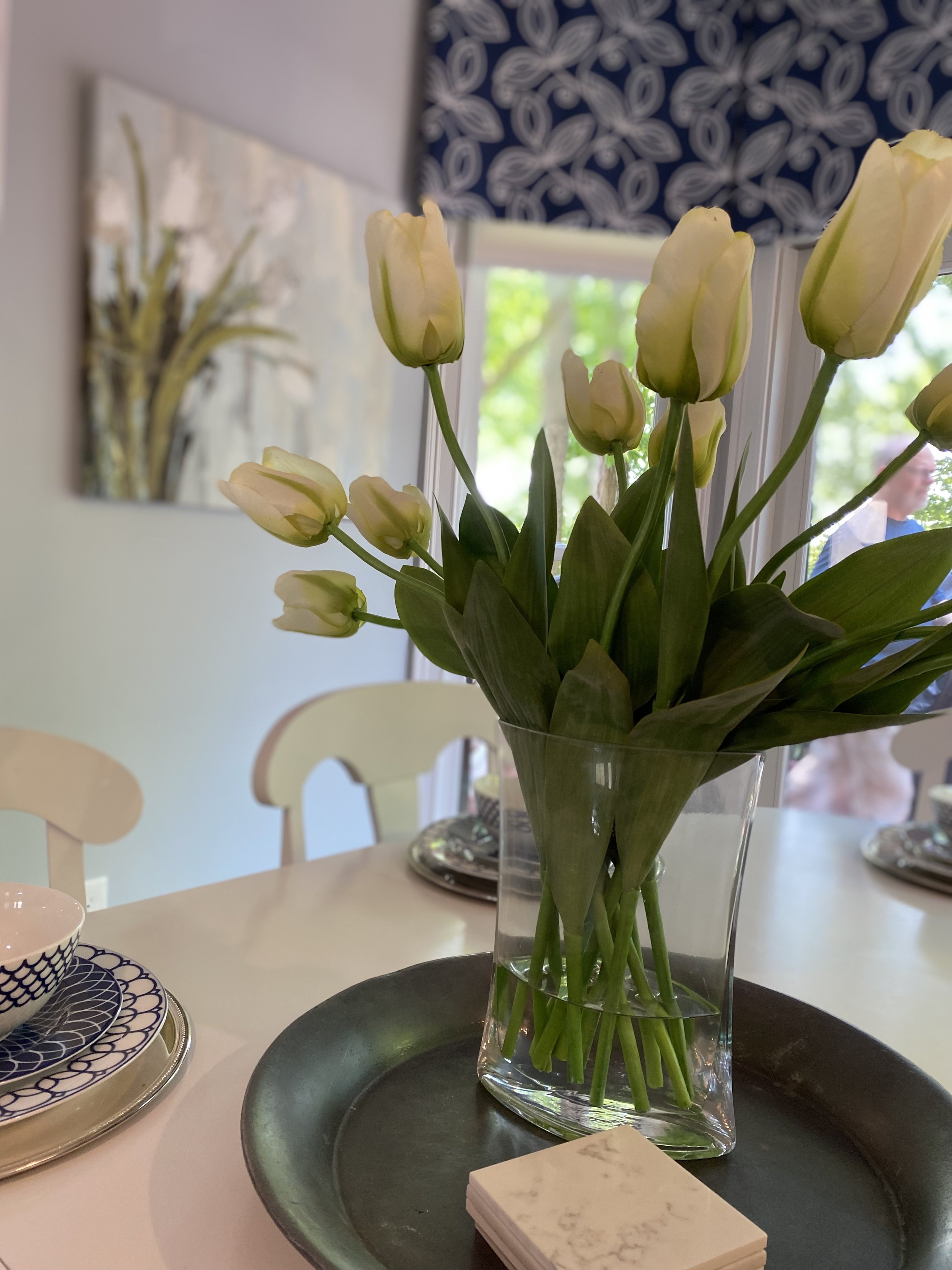
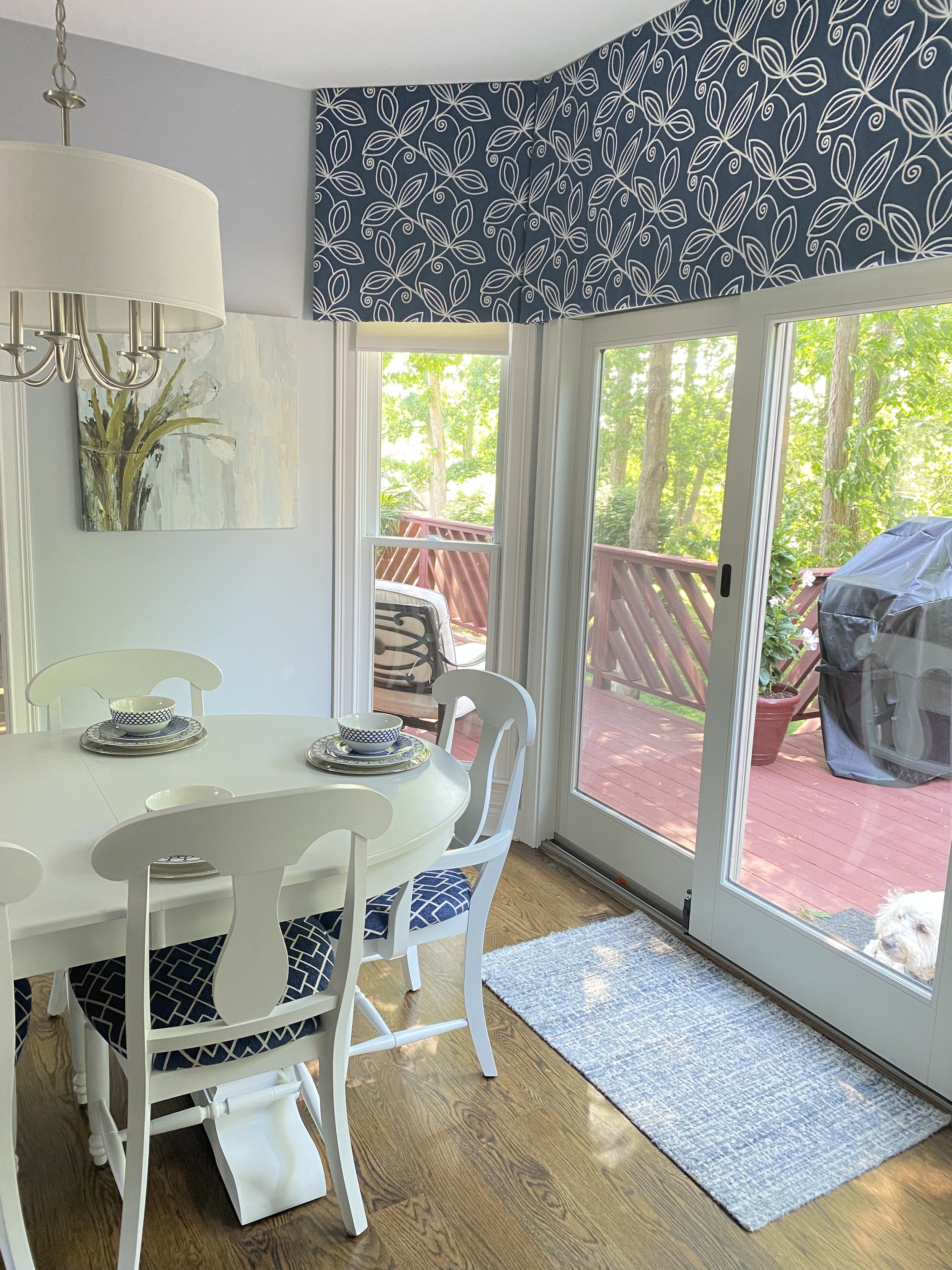
Before: Funny how and "After" picture can soon become a "Before." Though these built-ins were great for storage and display, there was 16 inches of wasted space on either side and the round table took up a lot of the room's width without providing much seating.
From this direction you see how disproportionate this table arrangement is in the space and how the room "opens up" with the narrower table.
Before: An incredible yard sale find.....
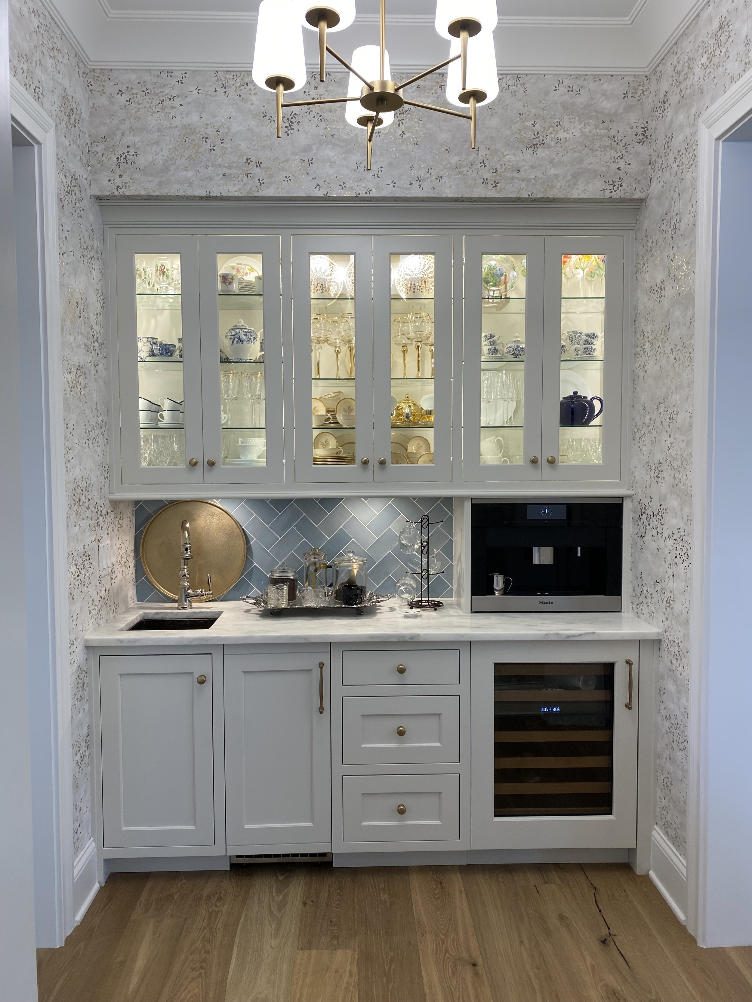
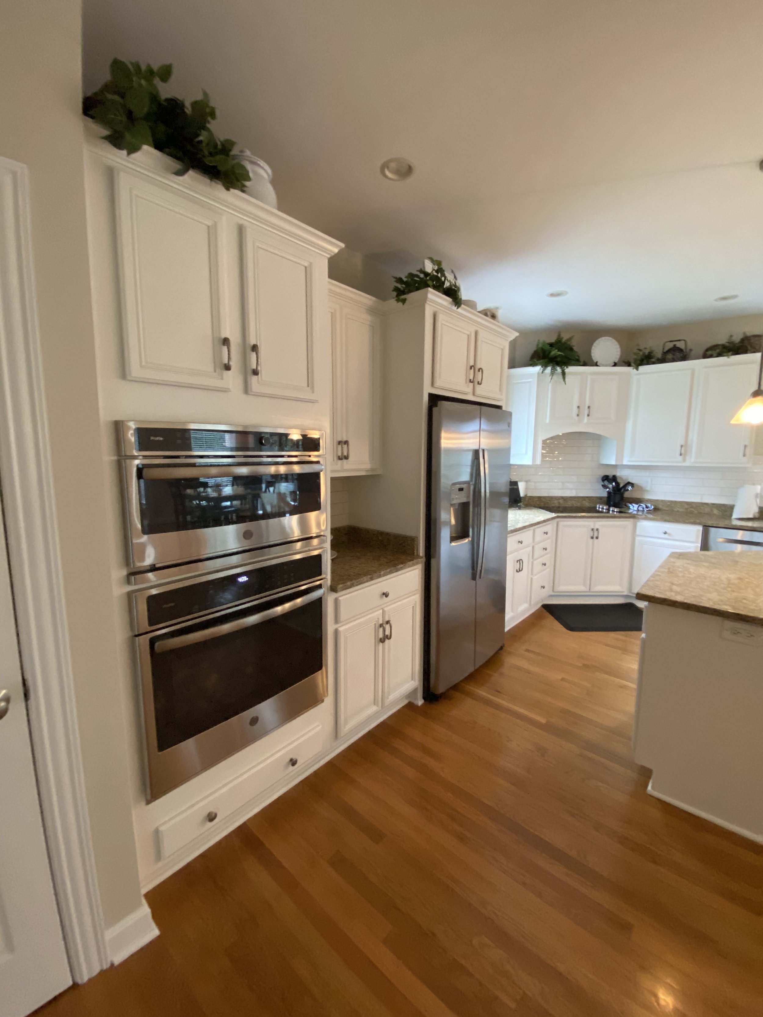
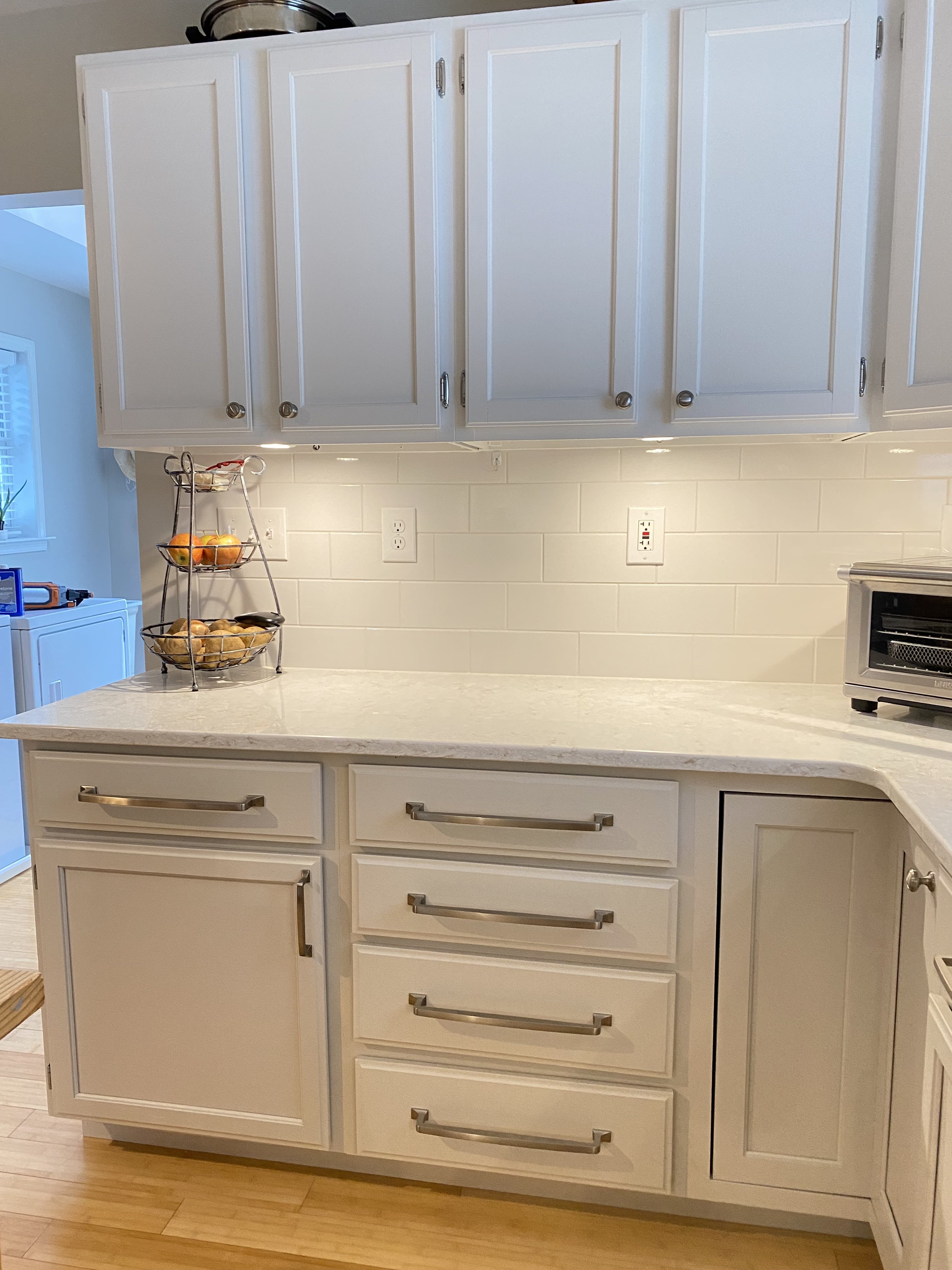
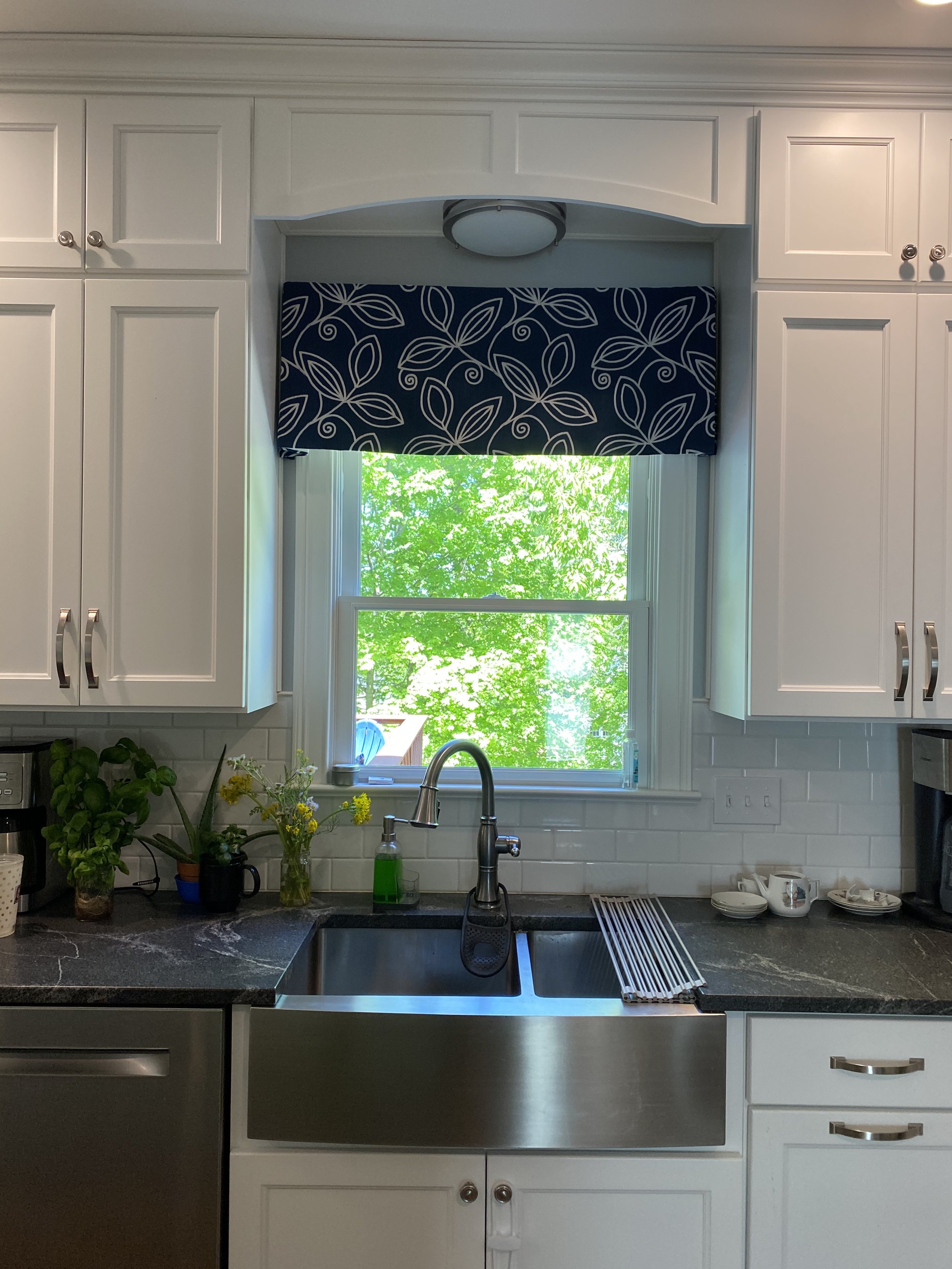
After: The only thing that stayed in this kitchen was the window and location of the sink! By removing a wall which separated the kitchen and dining room, the kitchen is now flooded with light. New flooring, lighting, cabinetry, quartz countertops, and stone wall complete the renovation.
After: Custom cubbies, by an extraordinary carpenter, Tony Brown, provide an additional 17 feet of linear storage and display space. Because one's eye is now drawn outward from the original cabinets, the entire room appears larger. The new rectangular table allows for two more permanent seats while taking 6 inches less of the room's width.
After:....made even better, with a little elbow grease and coat of Brushed Nickel.
KITCHEN MAKEOVER
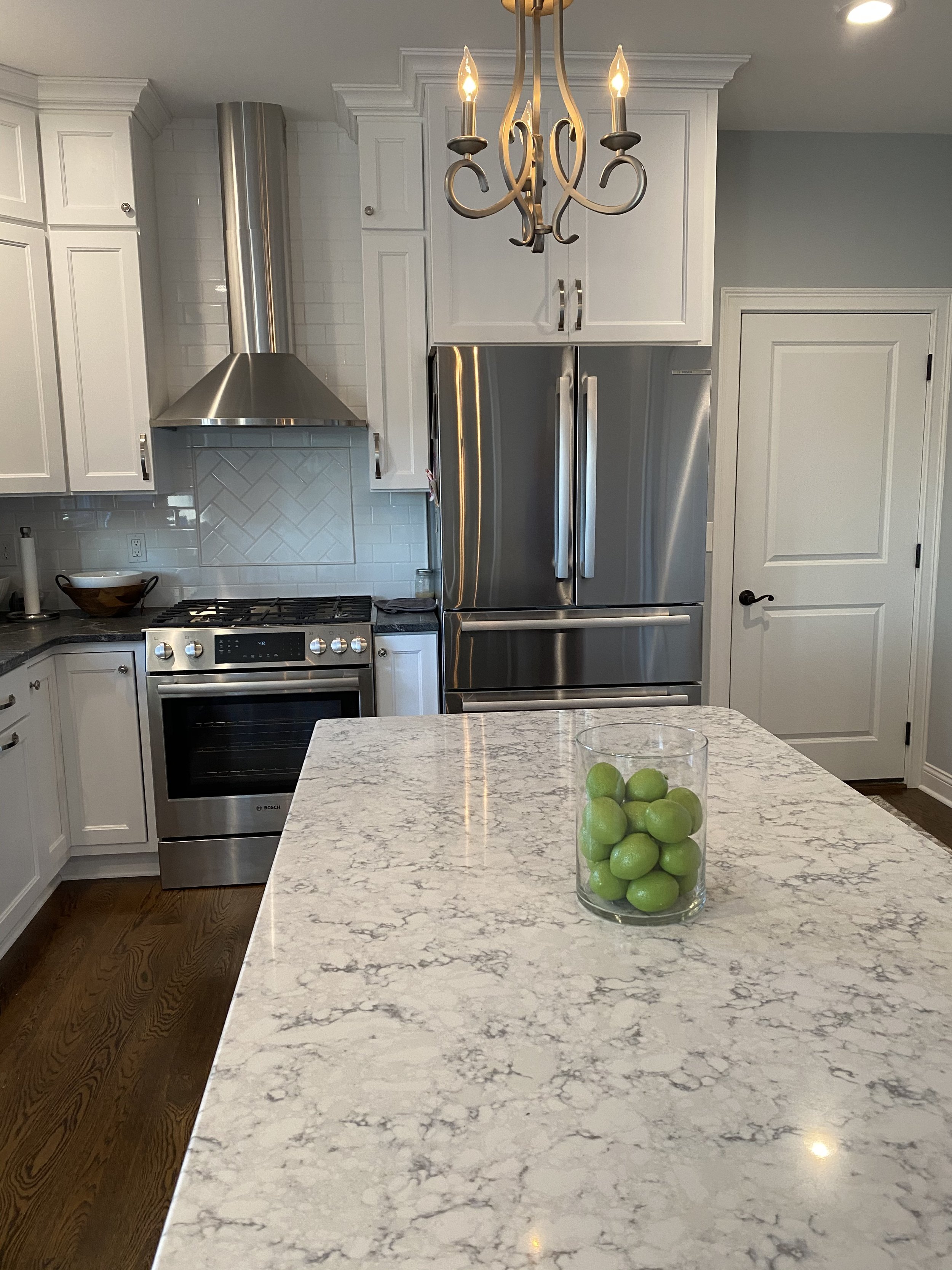
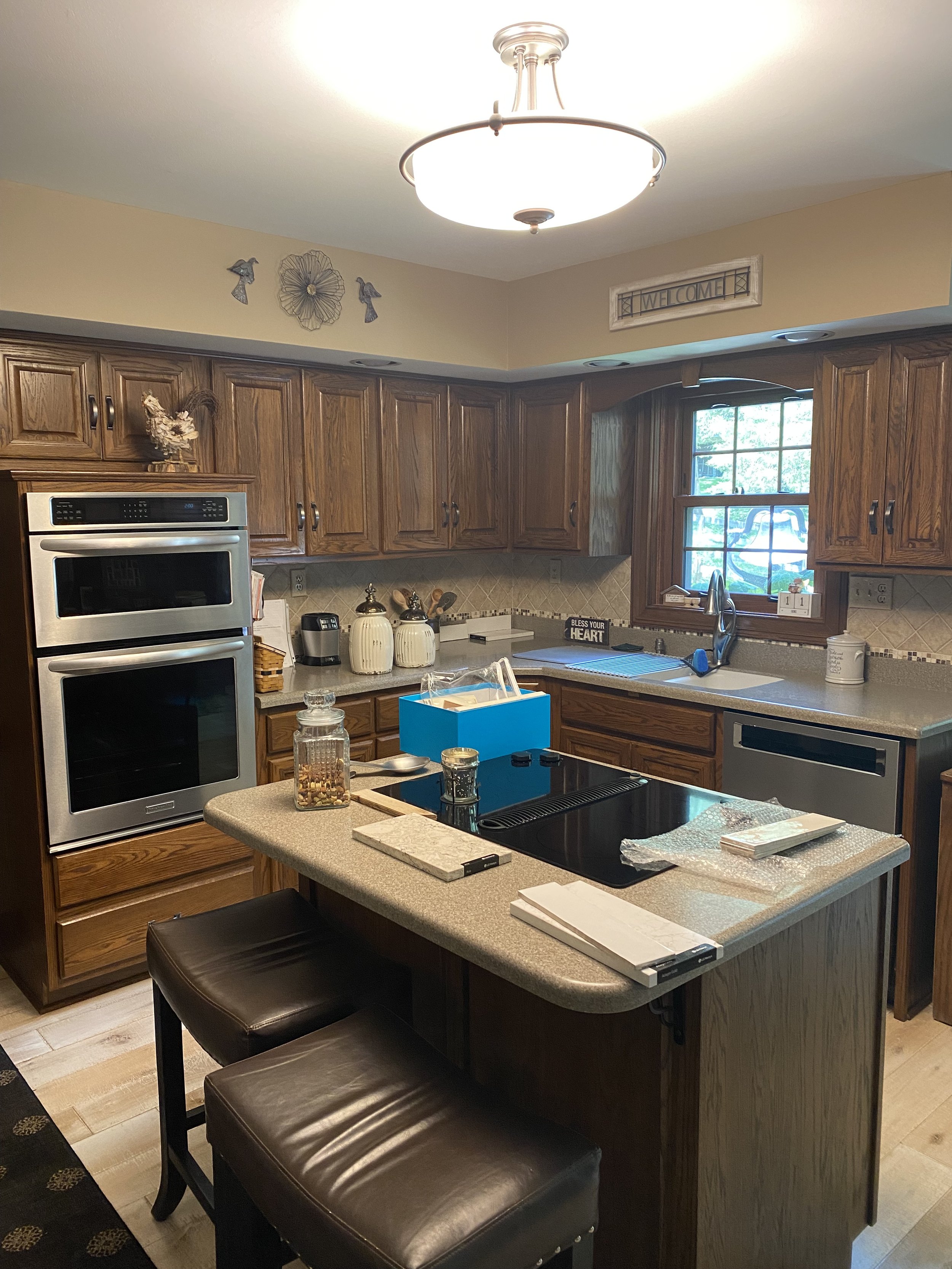
Before: This large kitchen already had a great layout, it just needed to be brought out of the 80's.
Before: Deep double ovens and standard depth refrigerator protruded into the space.
Before:
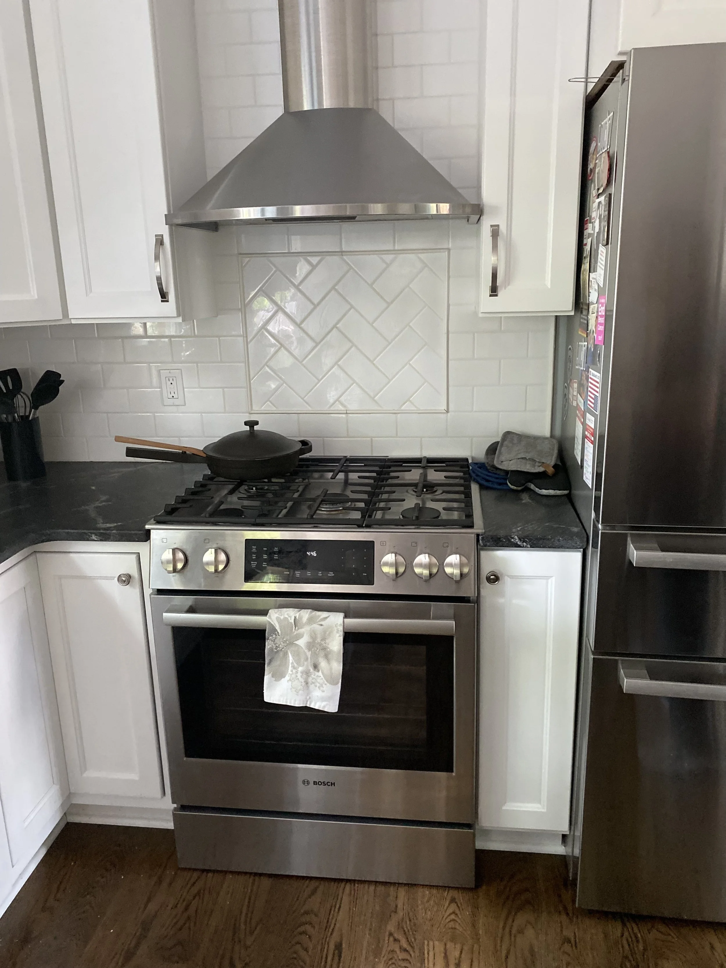
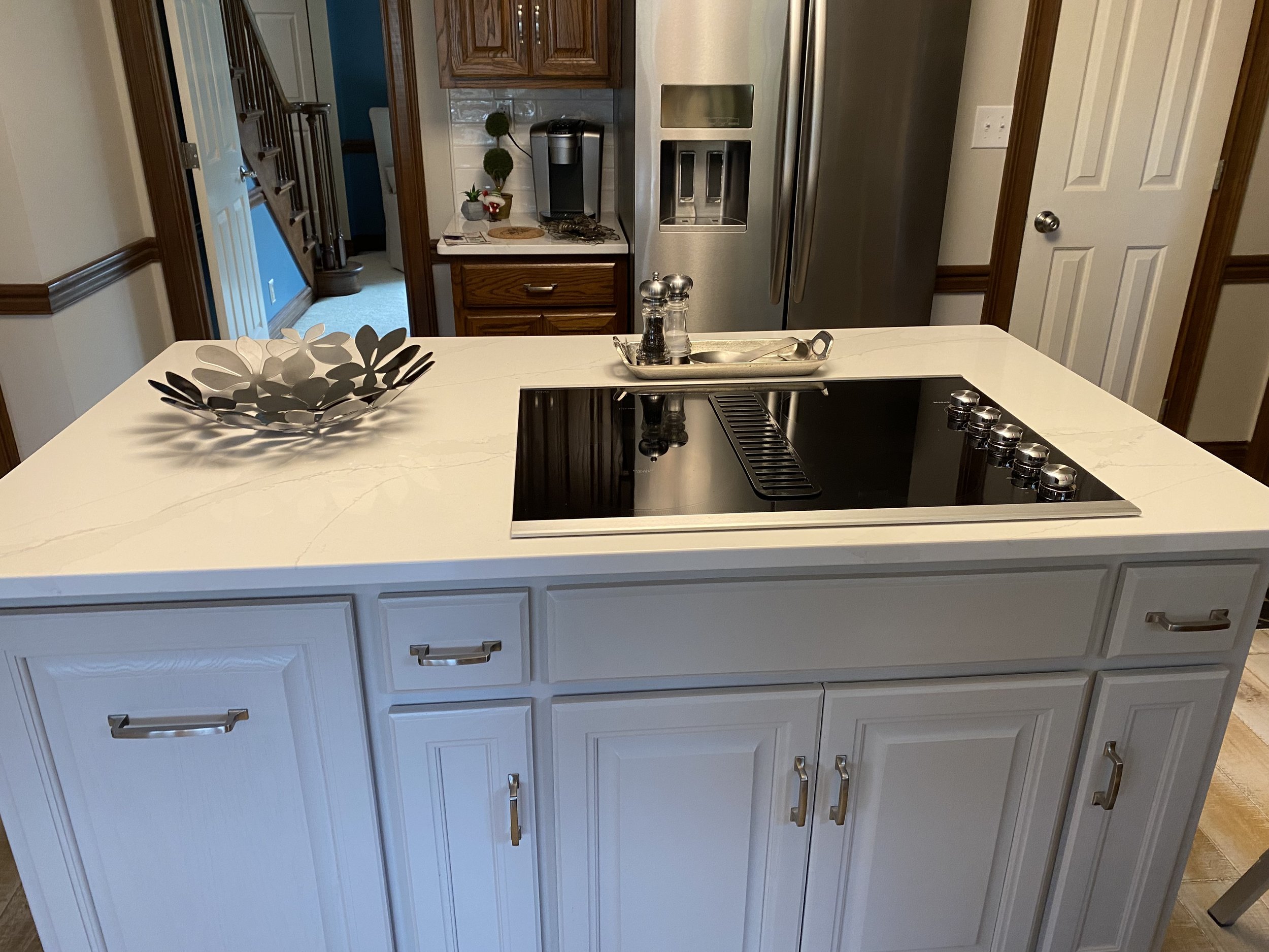
After: Soffits were removed to allow for more wall cabinets. Two variations of wood cabinetry add interest and the new backsplash, raised hood cabinet, and metal sculpture make the new range the focal point of the space. Sleek pendant lights replace the large outdated fixture.
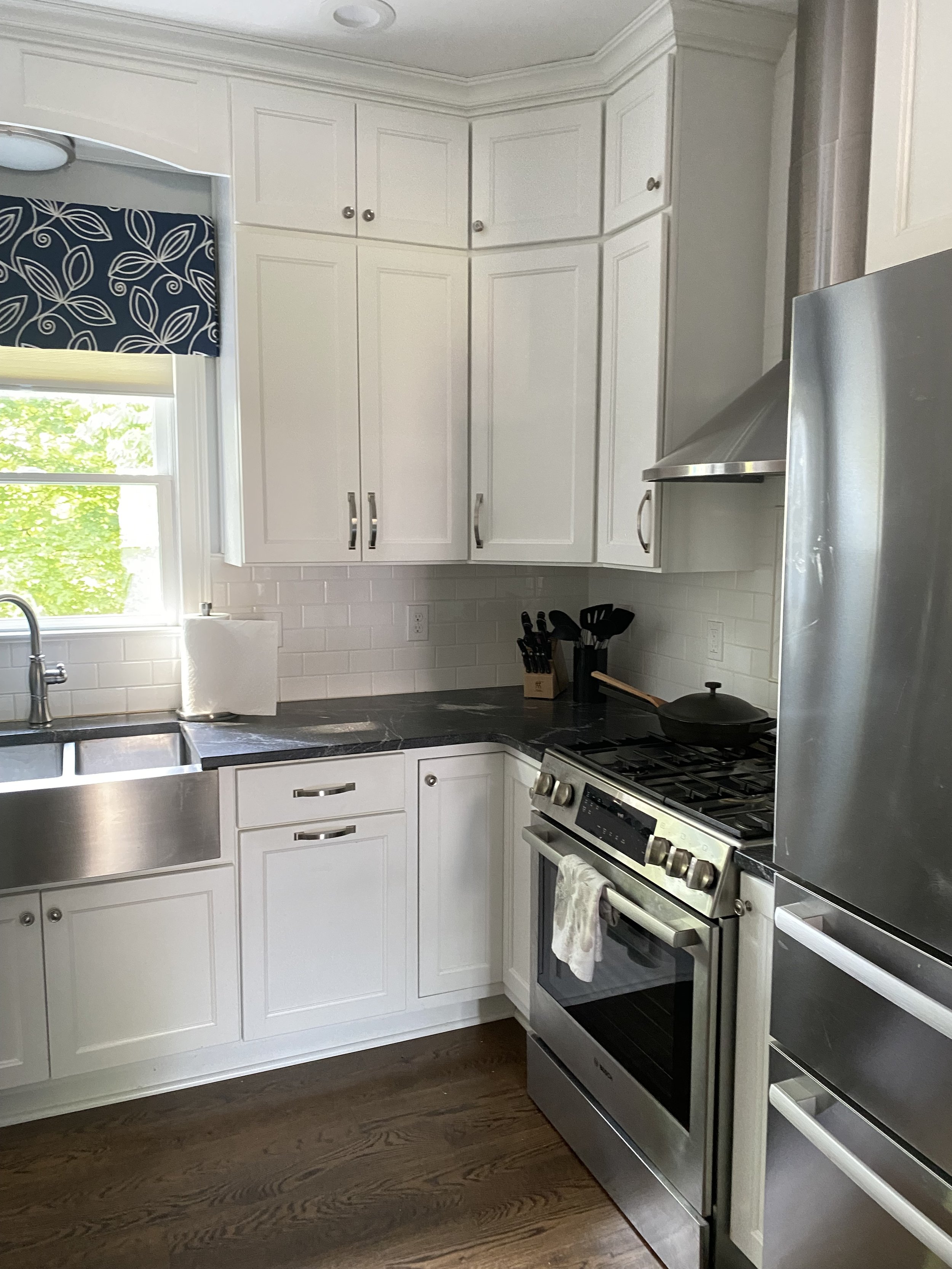
After: New, floor to ceiling pantry cabinets, a counter depth refrigerator, and built in microwave/convection oven, give a streamlined appearance and create a wider walkway into the eat-in area. The longer island is a better proportion for the space. Ceramic tile replaces the old linoleum and the new laminate countertops mimic granite.
After:
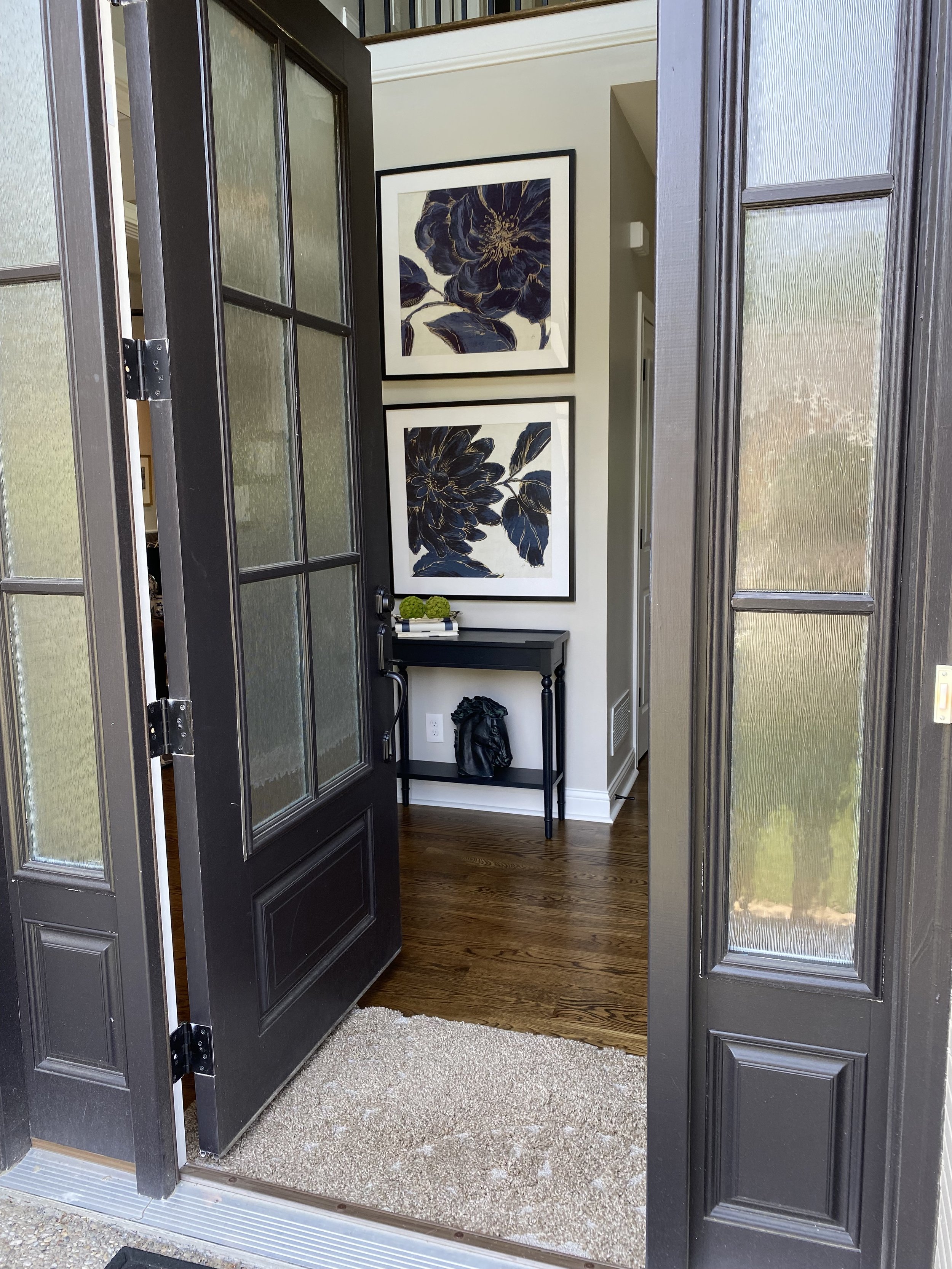
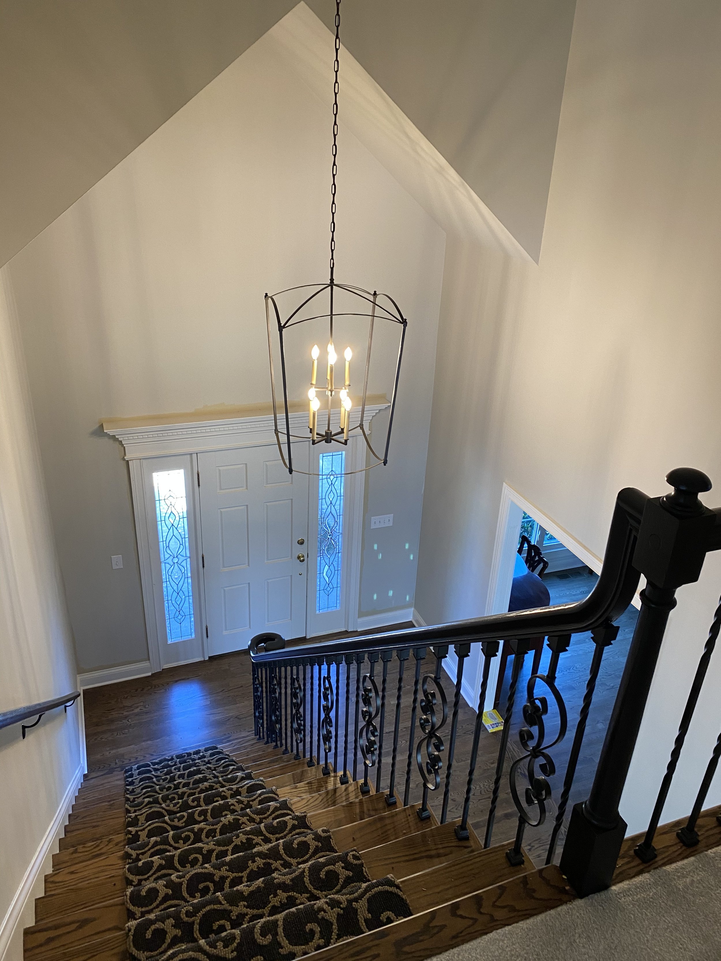
ENTRYWAY MAKEOVER
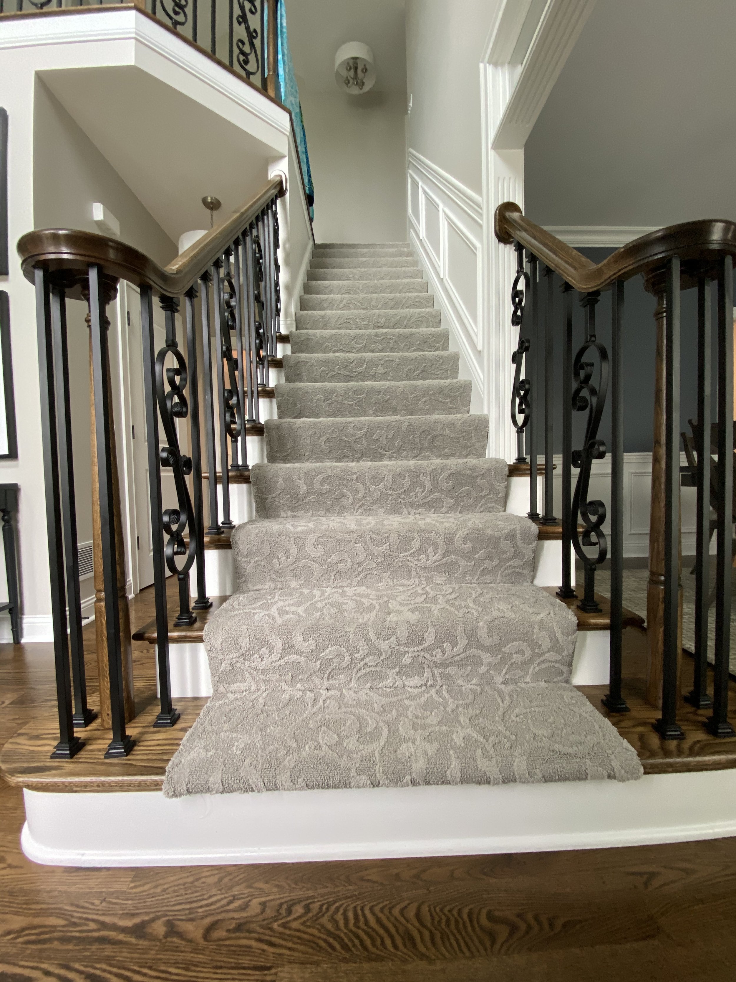
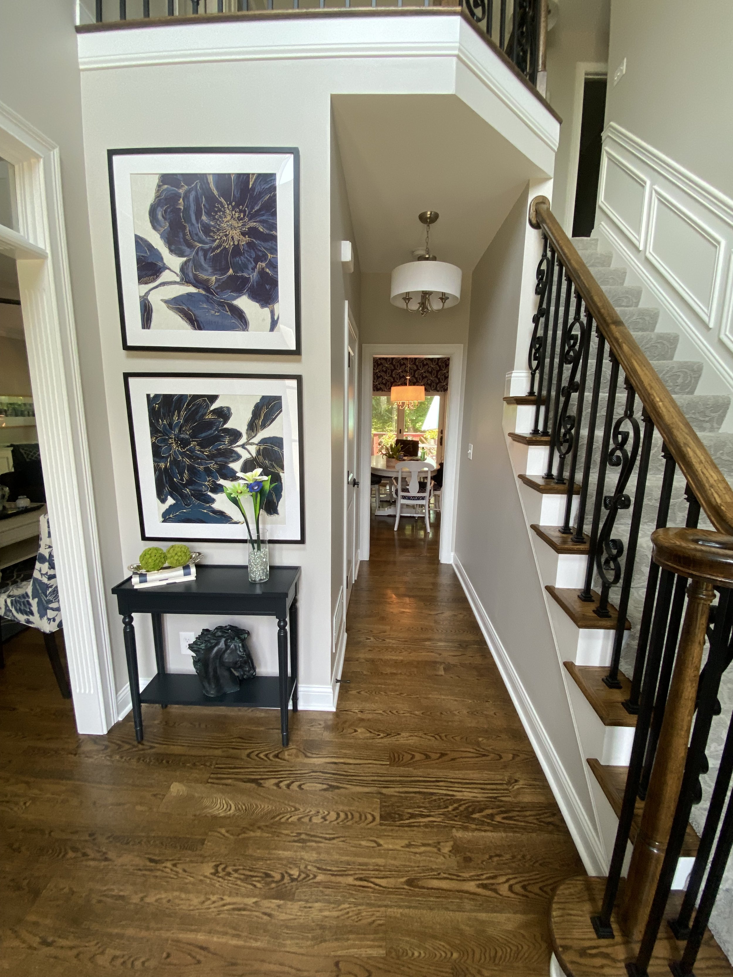
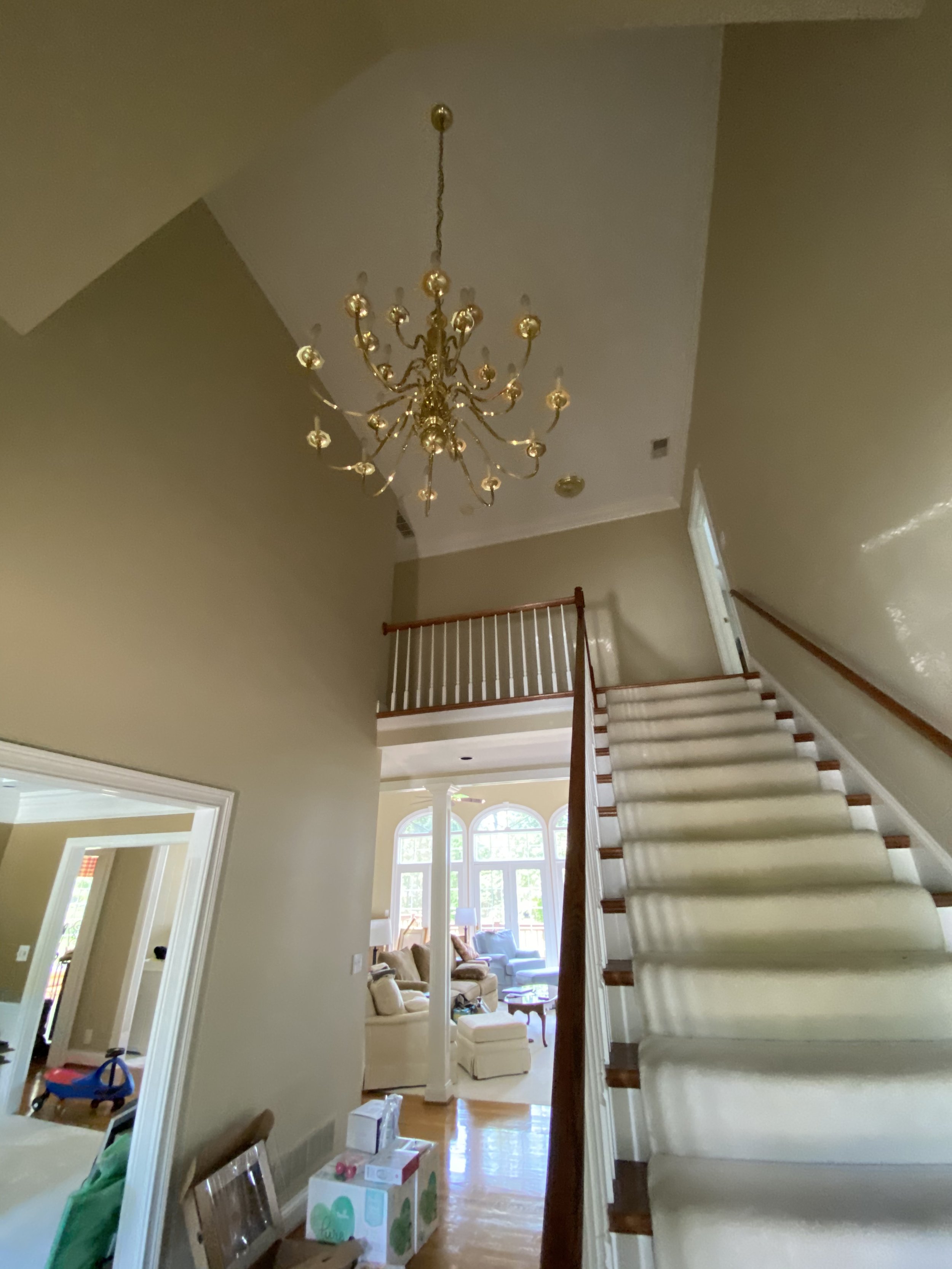
Before: This 1948 home had an open staircase but lacked any architectural interest.
Before: A typical newel post and balustrades found in many homes in this area.
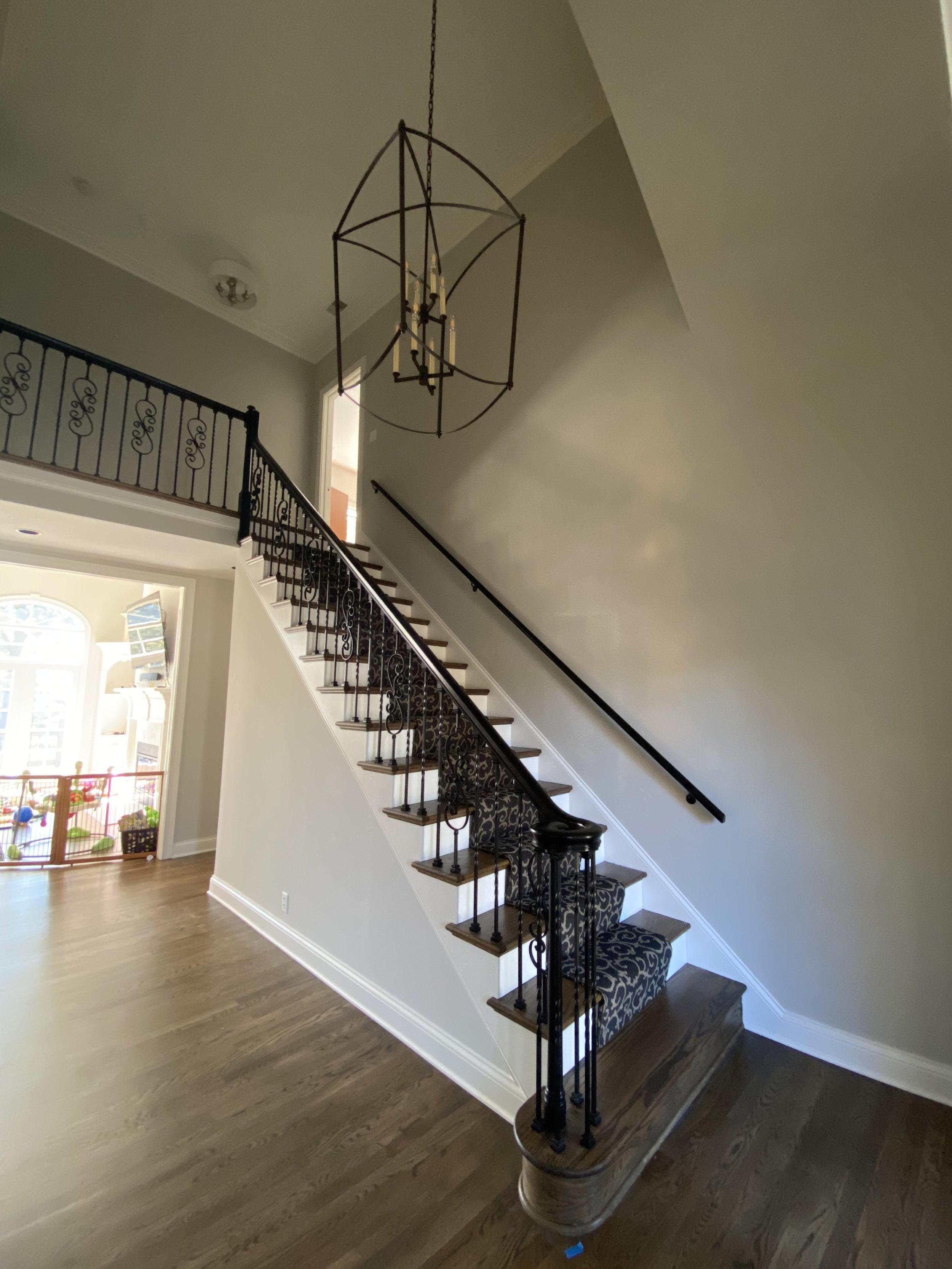
After: Crown molding was installed throughout the hallway. Chair and box molding were also added along the walls and up the staircase. The much larger newel post makes for a grander entrance and the papered ceiling adds pattern and depth to the space..
After: The custom newel post,installation of the wrought iron balustrades, and the new molding, mentioned before, created visual interest in the space. A shout out to Charlie Hydes of Hydes Renovations for his excellent craftsmanship!
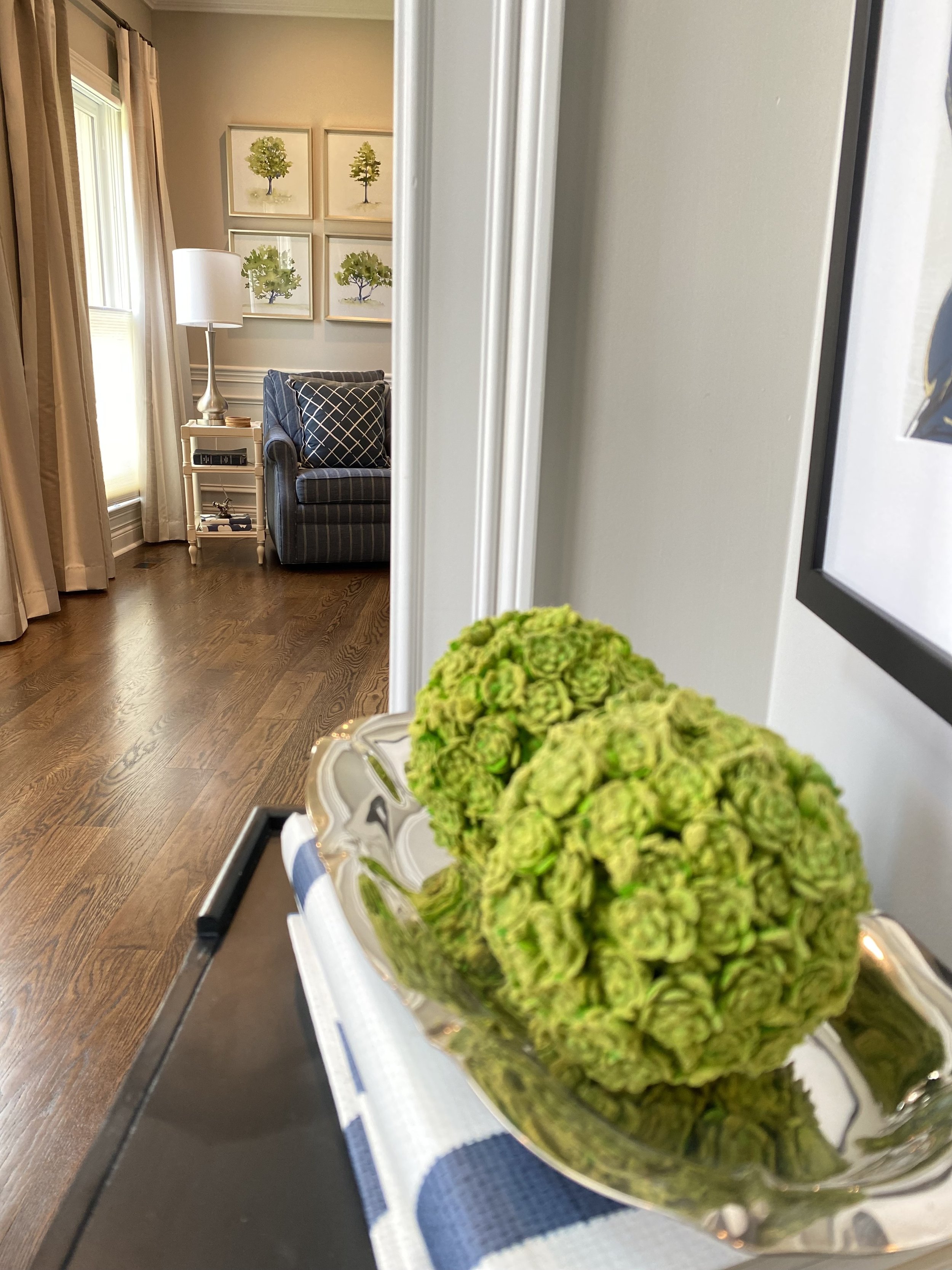
This large, silk organza, double drum light corresponds with the larger scale newel post. Housing three 100watt bulbs-this fixture offers plenty of light in a formerly dark entrance.
The large round mirror, repeats the curved lines of the iron balustrades and patterned paper.
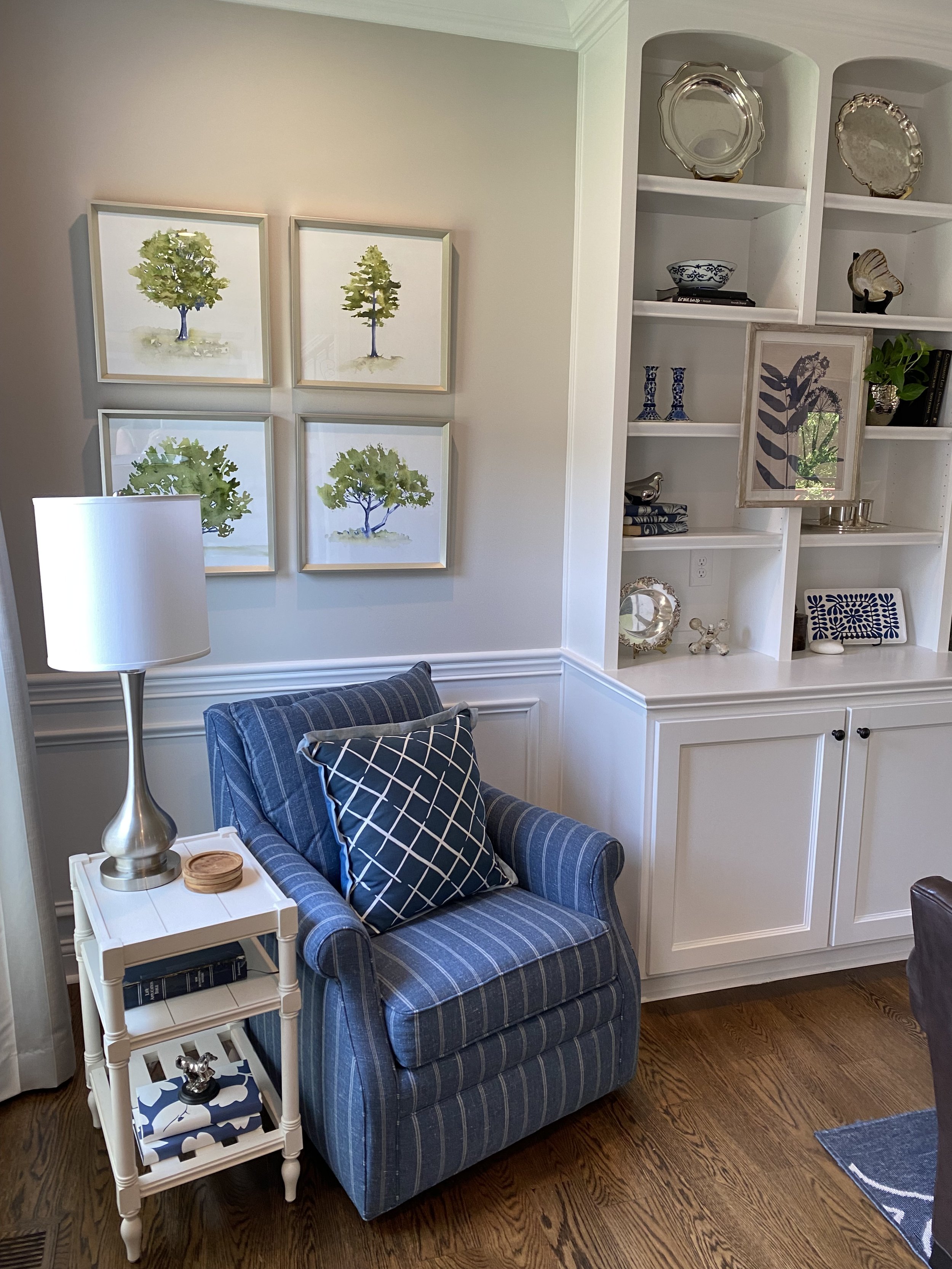
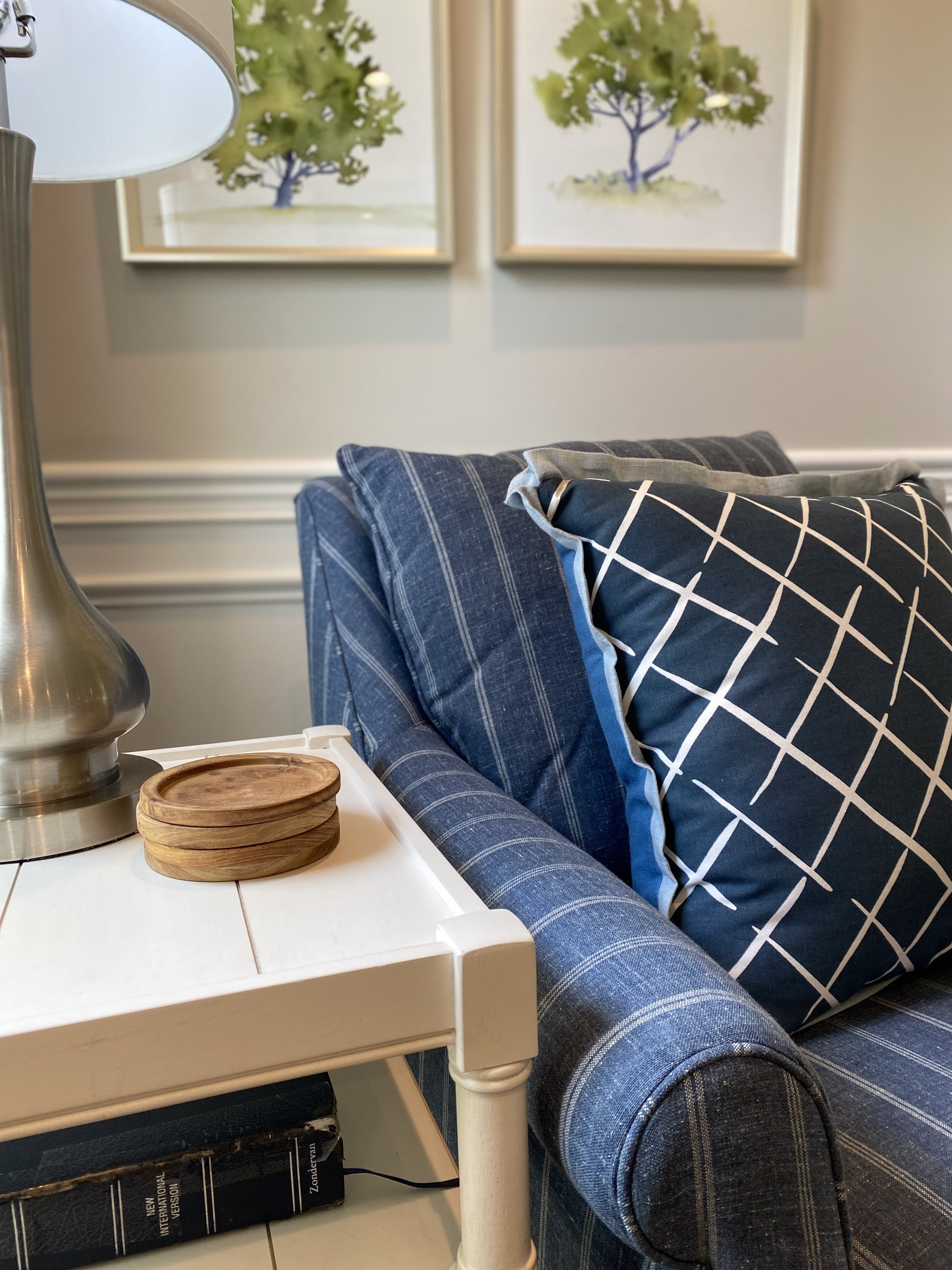
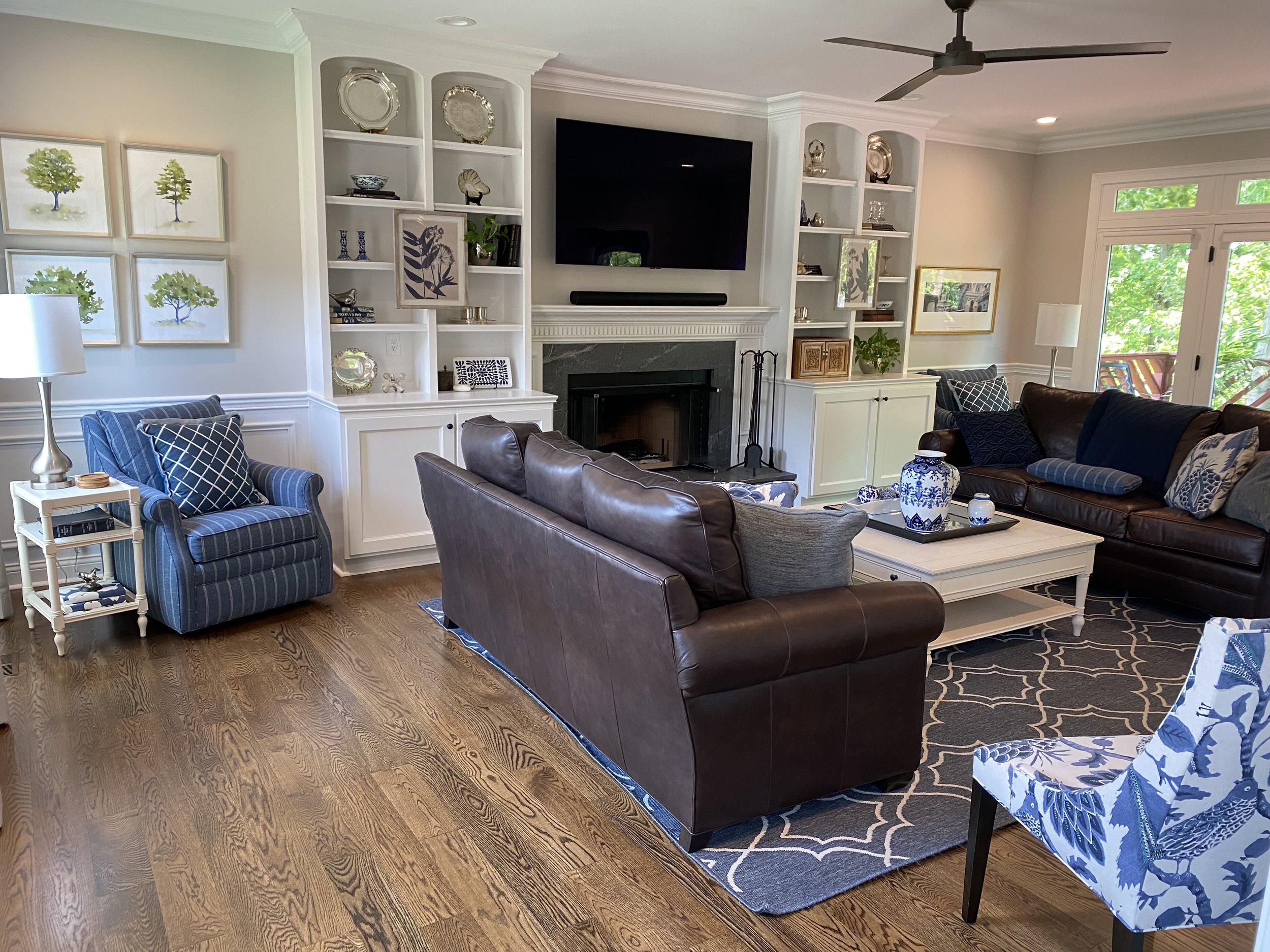
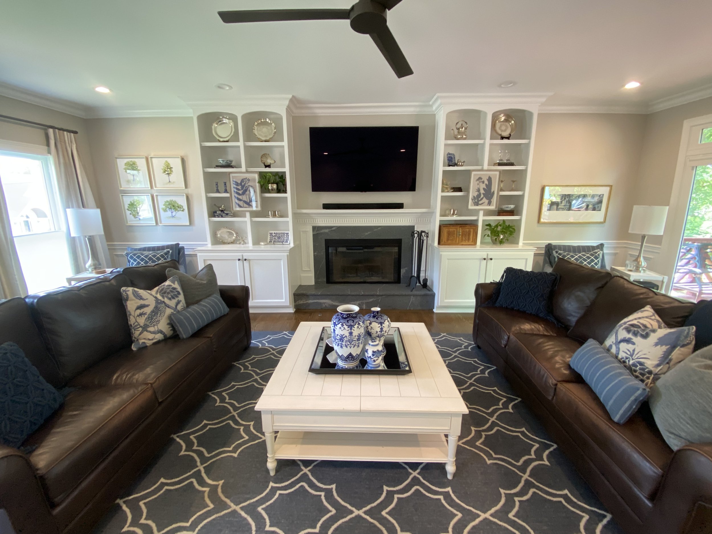
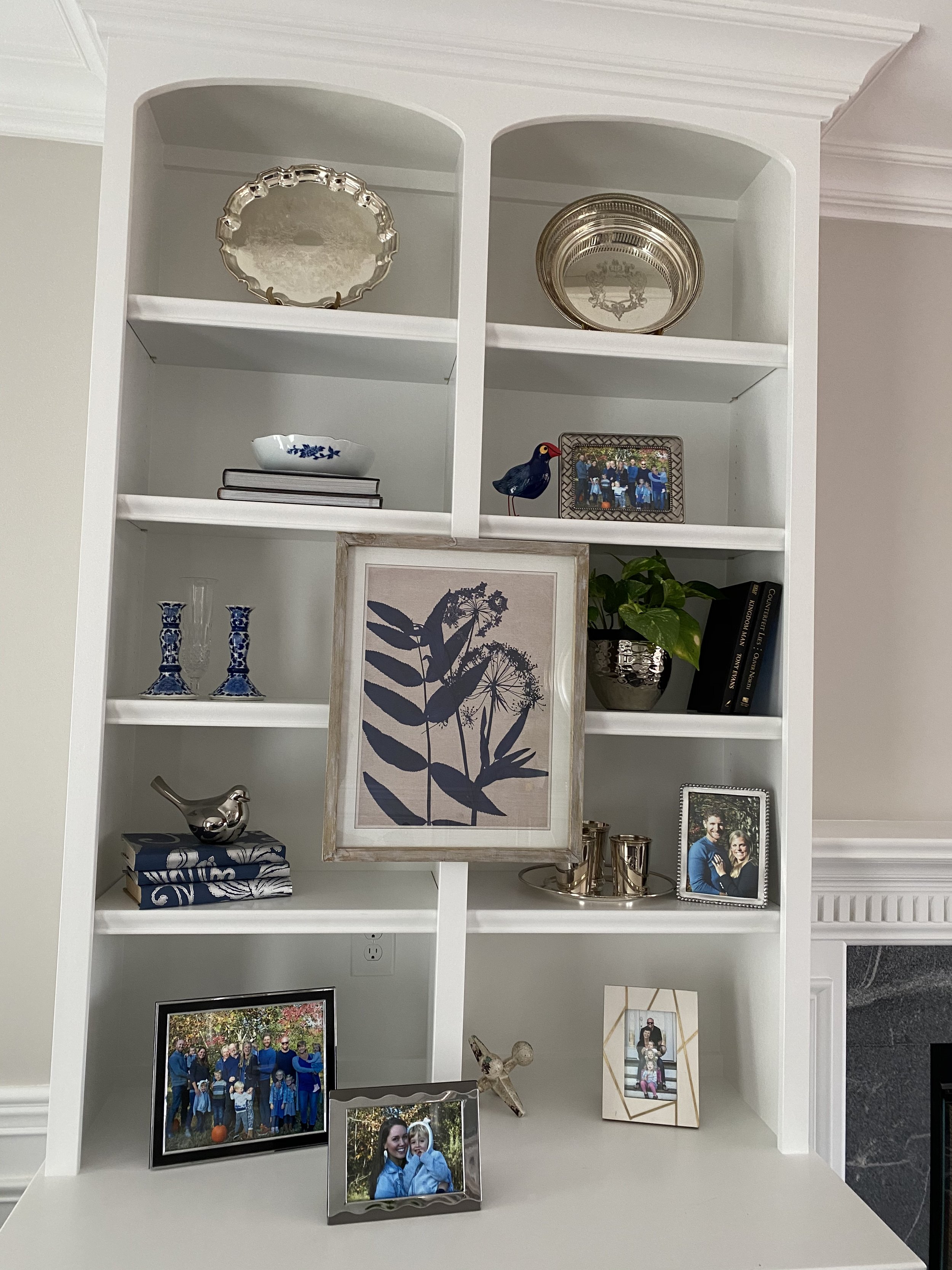
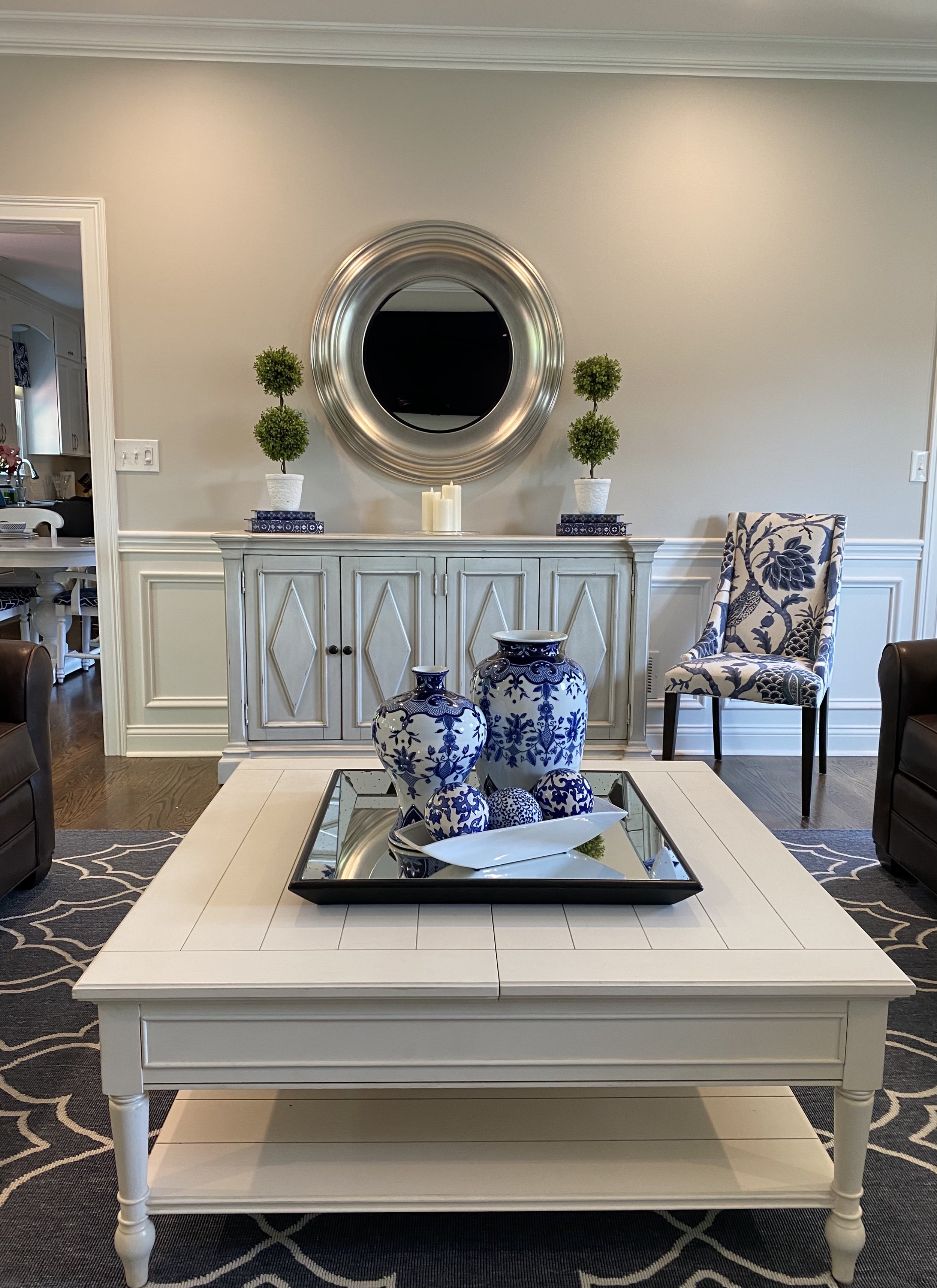
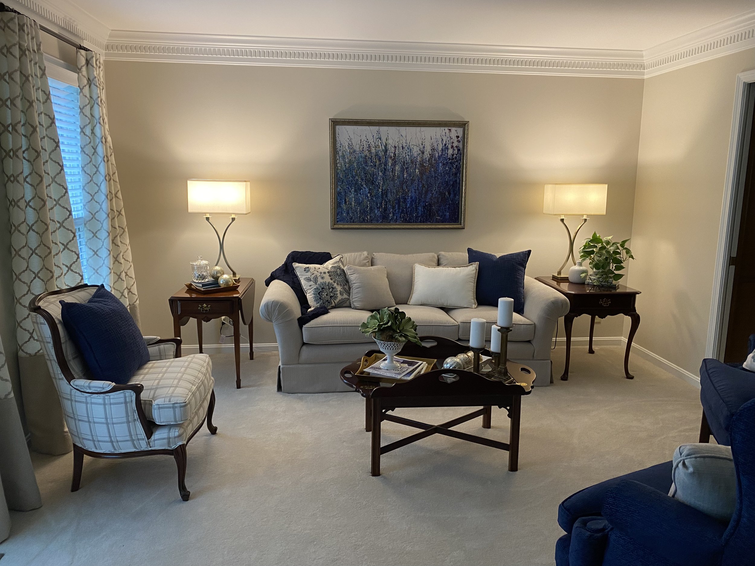
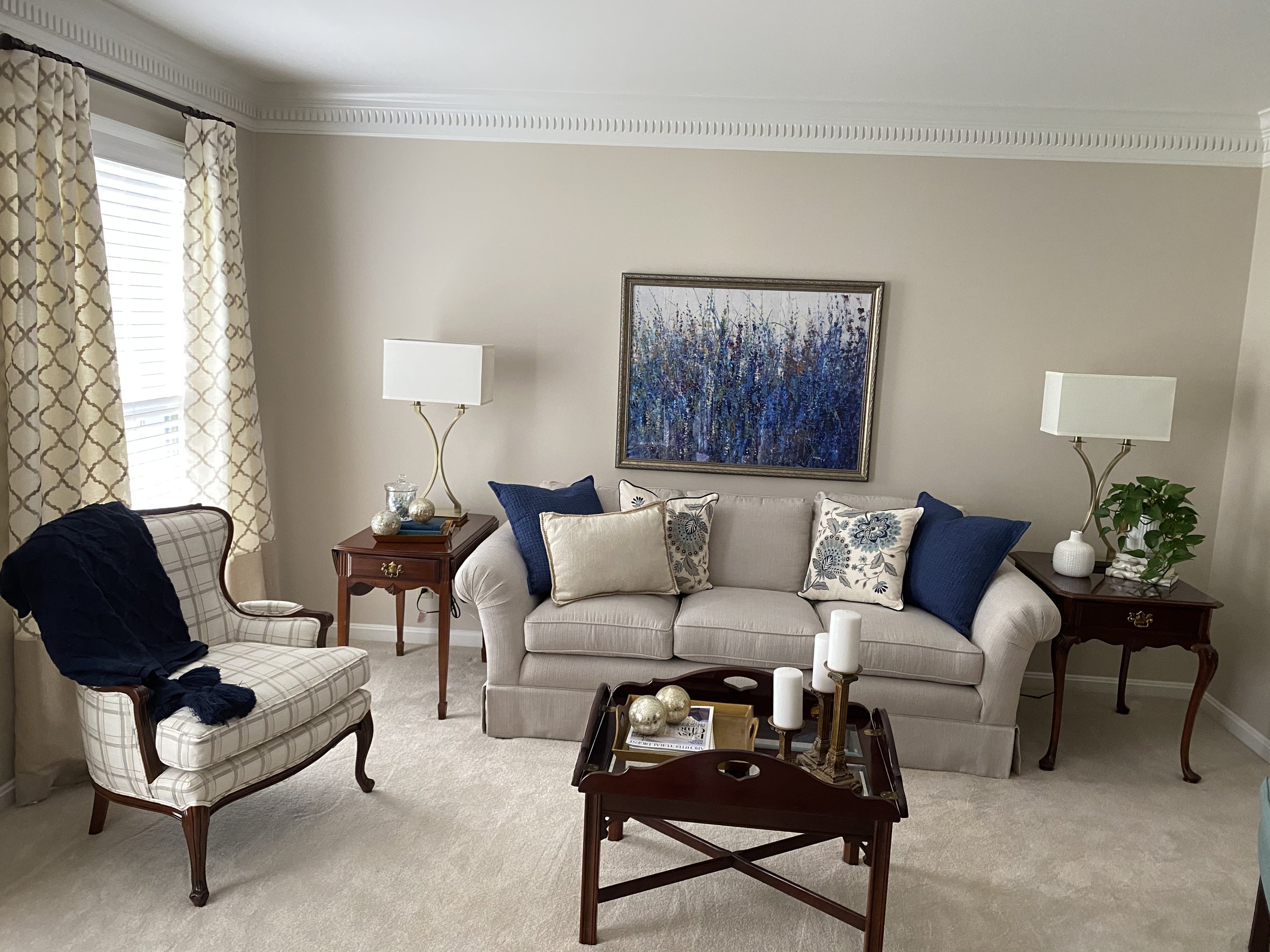
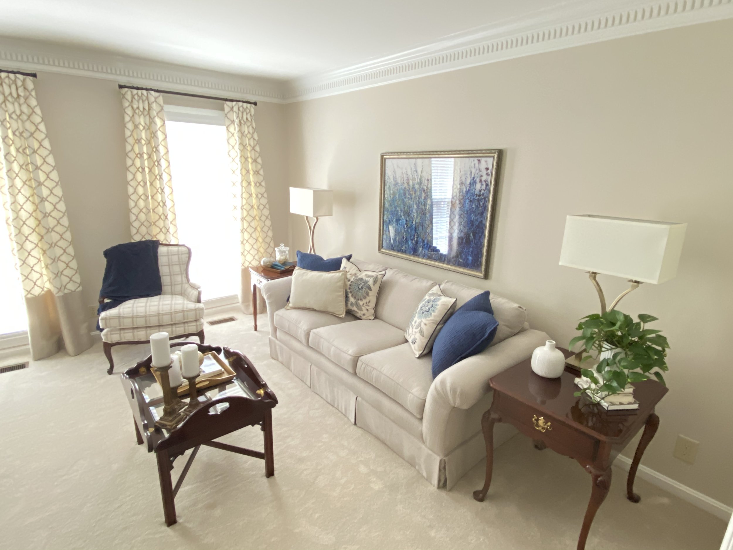
mANTLE Makeover
Before: The "focal wall" in the Living Room leaves much to be desired. Everything "special" gets lost in the sea of knotty, orange wood!'
After: Painting the paneling a light gray allows the texture of the wall to come through while the mantel and built-in pop out with a coat of bright white. Deep crown molding was installed around the perimeter of the room and the ceiling was painted a slightly lighter tint than the walls to showcase the crown even more.
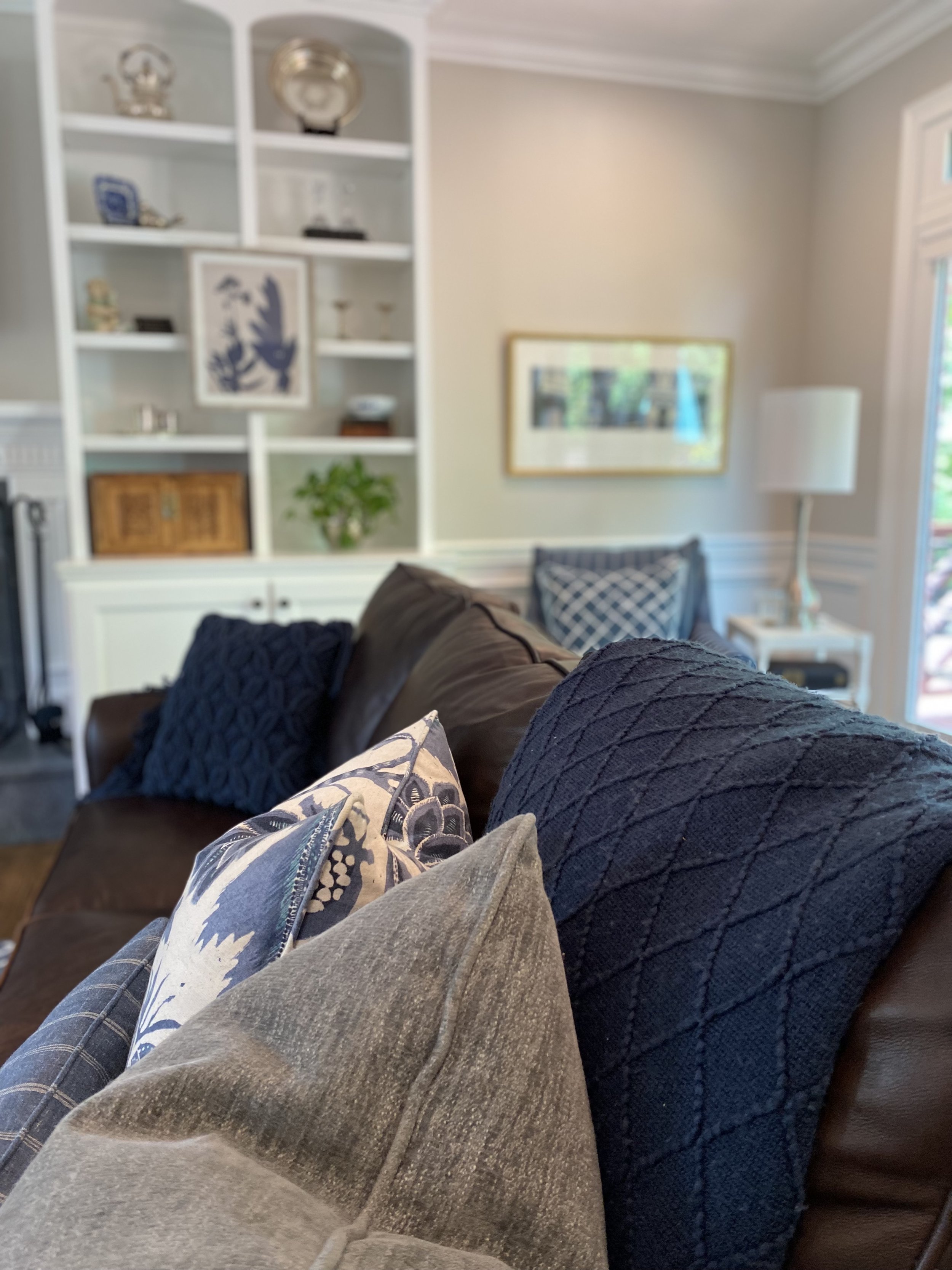
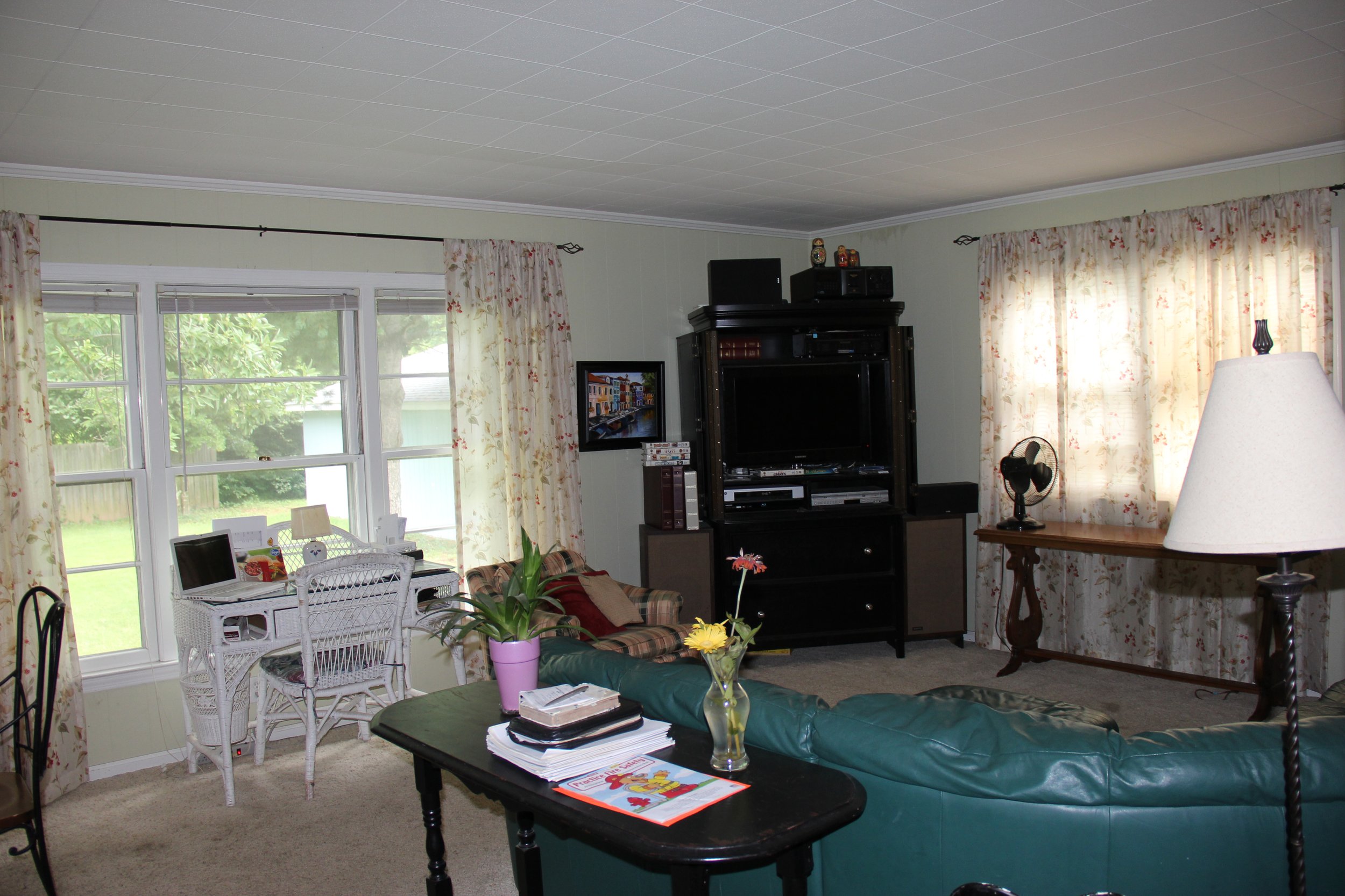
FAMILY ROOM MAKEOVER
Click on images to for larger views.
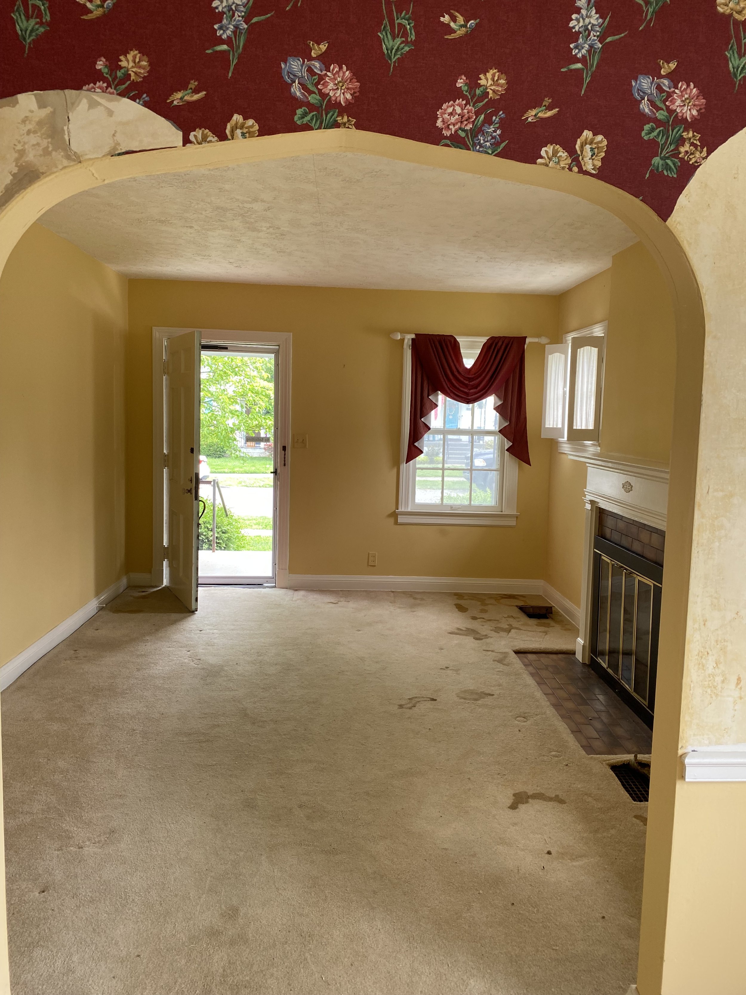
Before: This large room, which is the hub for this family, was not measuring up to it's potential...either in function or aesthetics!
Before: The green, beige, and red color scheme was not very inviting. A much loved table and chair set of the client's was being used without the leaf, the 2" crown appeared measley in the large room, and the window sheers provided little light control, in the family's main television area.
Before: A small corner closet took up much needed seating space in the room and also made it difficult to line up ceiling fixtures because of the asymmetrical shape of the space.

New flooring.
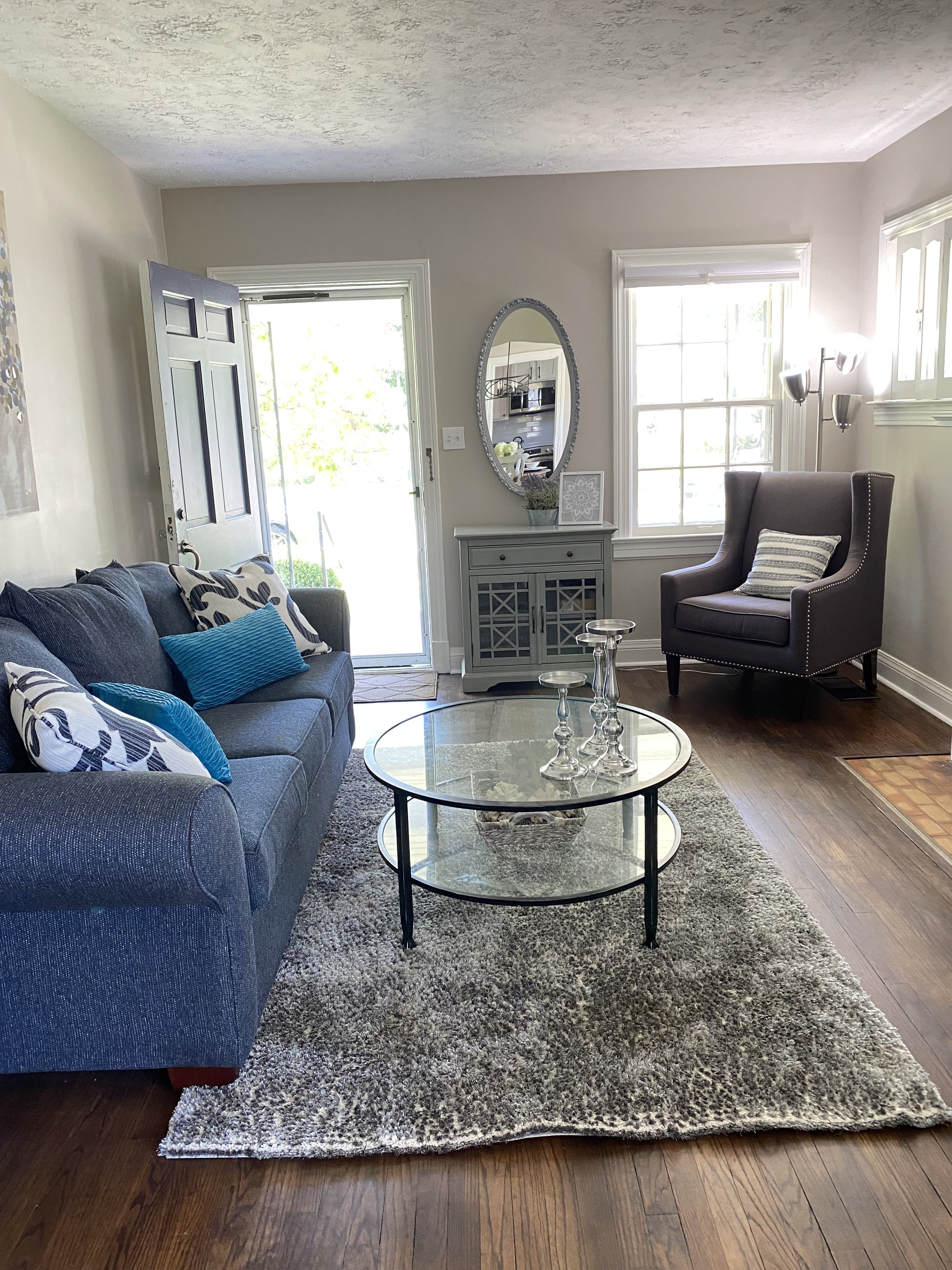
After: The carpet was replaced with dark chocolate engineered hardwood. The acoustic tile ceiling was removed and replaces with smooth drywall. The window was replaced with beautiful French doors leading to a new screened porch. Molding was built over each door jamb and window to add architectural interest. This case molding was then tied into new 7" deep crown that now circles the perimeter of the room.
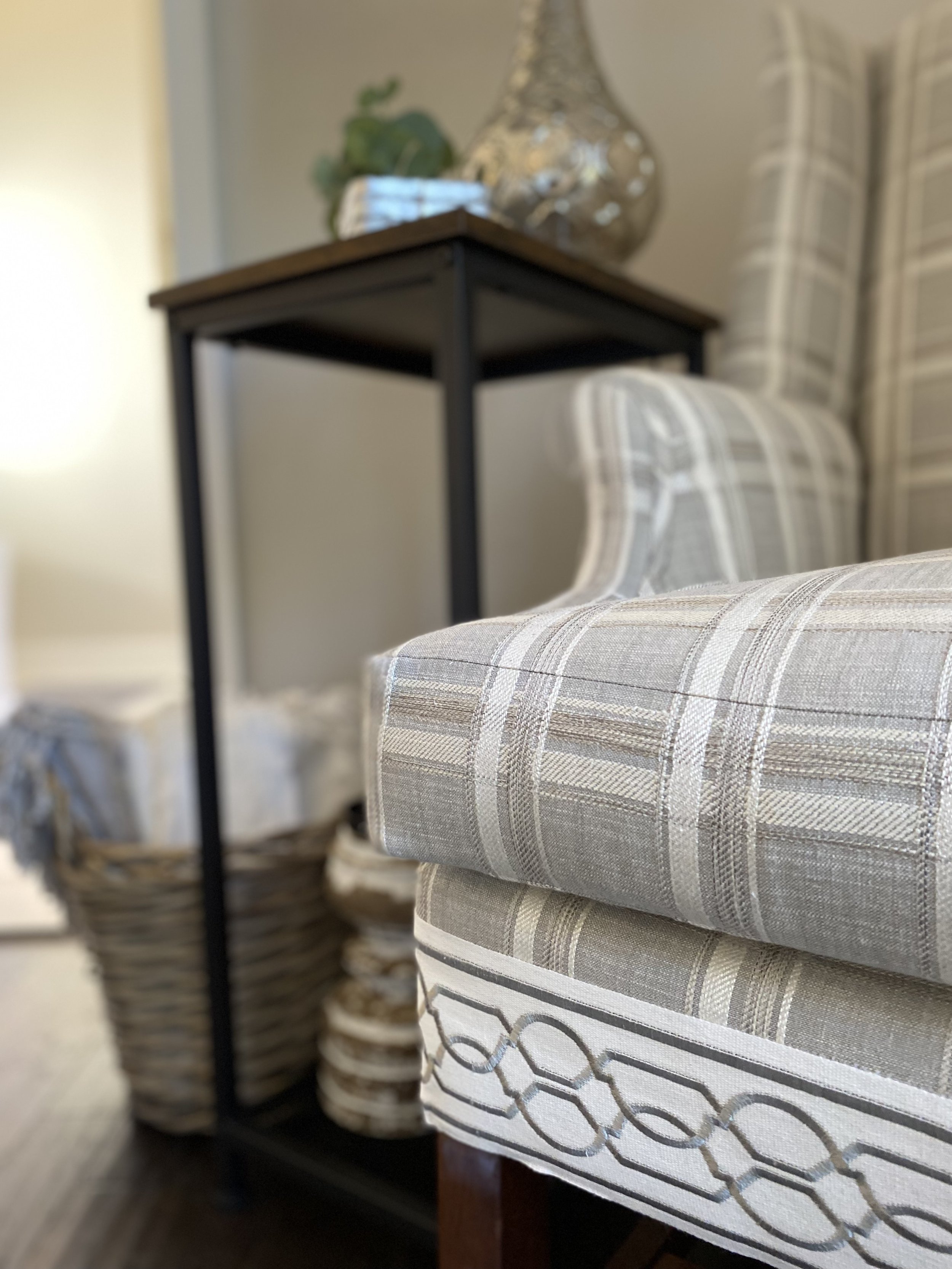
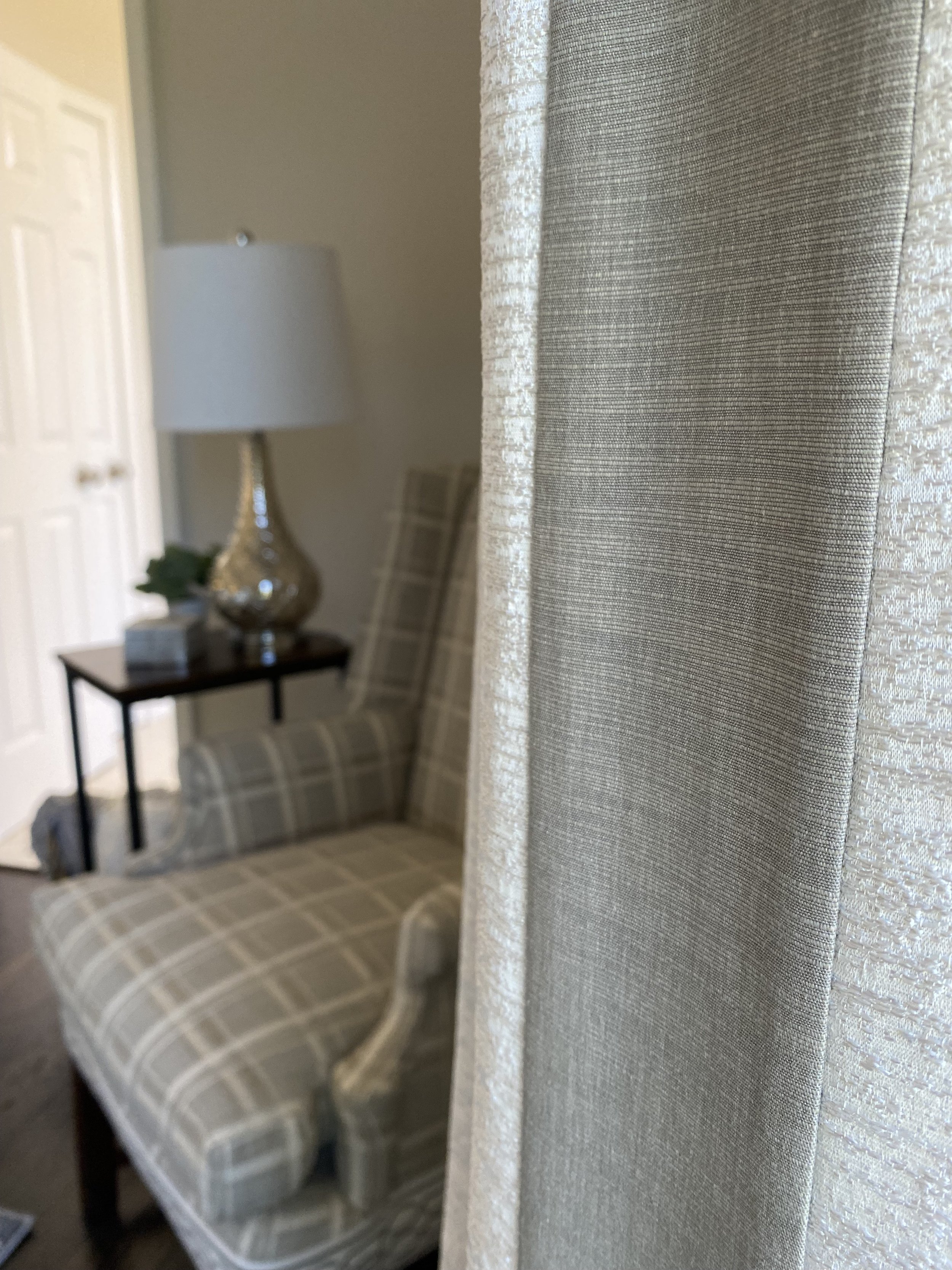
After: A fresh coat of Gray on the walls with a lighter gray ceiling gives a clean, modern look and allows the molding to "pop." The shape of the new sectional also gives a modern edge and a large area rug both defines the gathering space as ties the new color scheme together. Custom Roman Shades, in deep gray and silver, offer light control and elegance.
After: The closet was removed to open up the space. This allows for the leaf to remain in the table, providing more permanent seating and a new updated light fixture could be centered in the room and lined up with a new ceiling fan which was installed in the TV area.

Custom millwork.
Huntsman's Nursery
Rough barn wood and galvanized metal might not be the "typical" elements that come to mind when thinking of a nursery, but for the son of this big game hunter, they just made sense! The corresponding color scheme of grays and browns create a natural, peaceful, space and allow the varying textures of the room to take center stage.


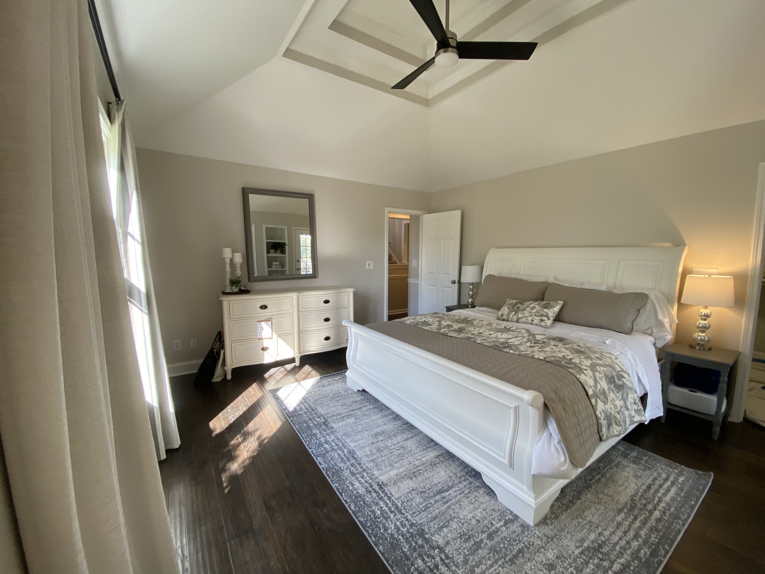
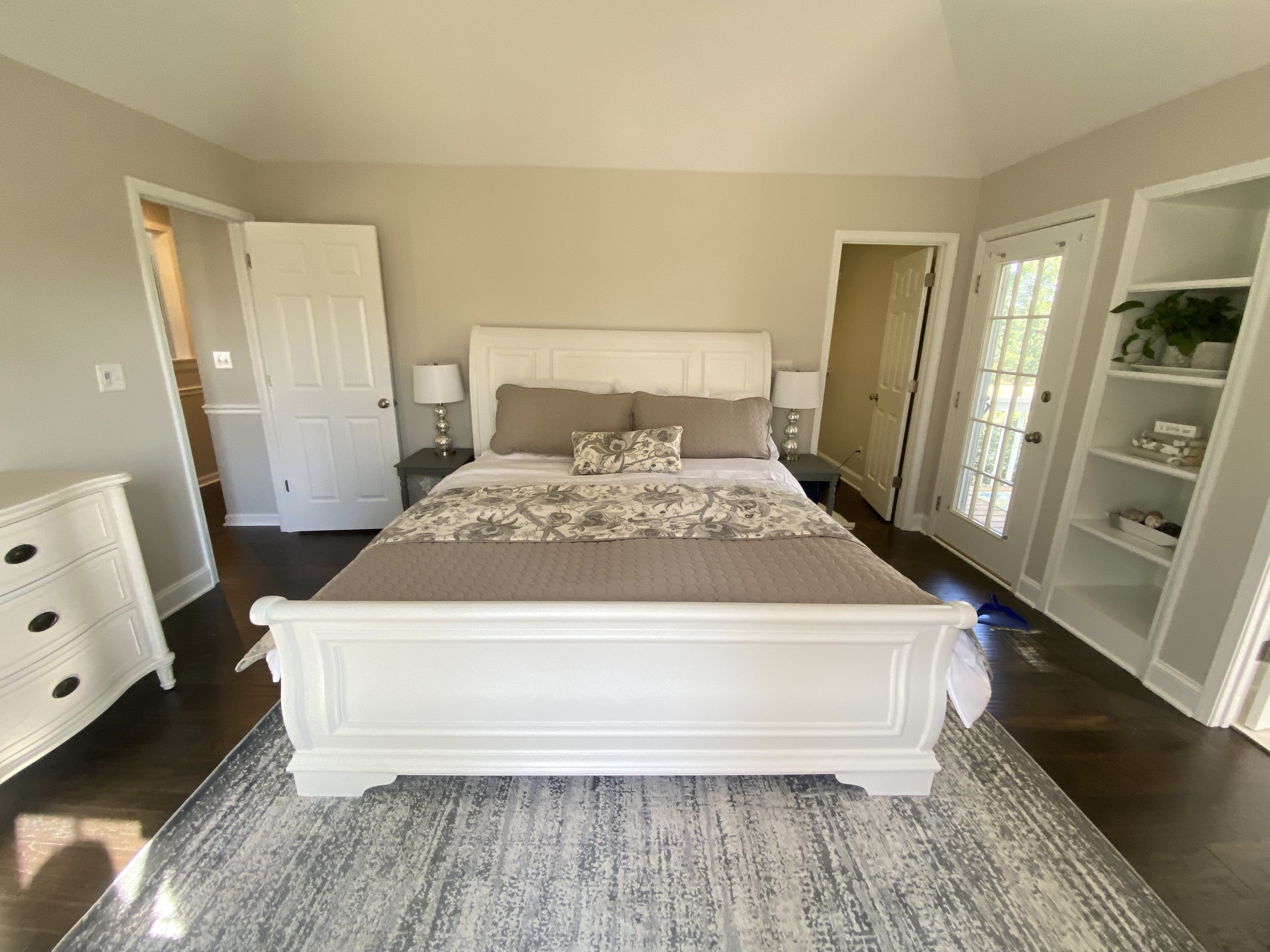
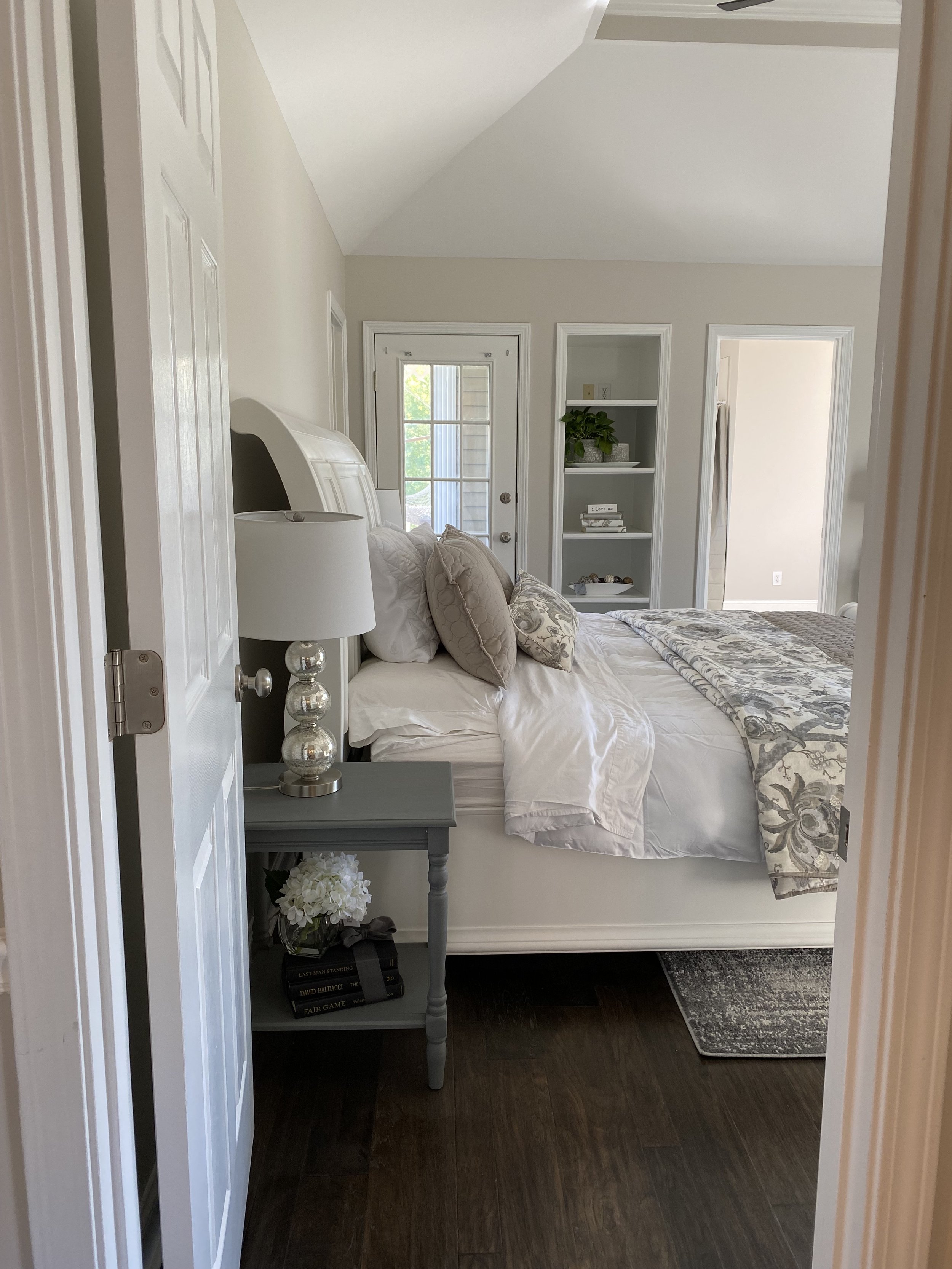
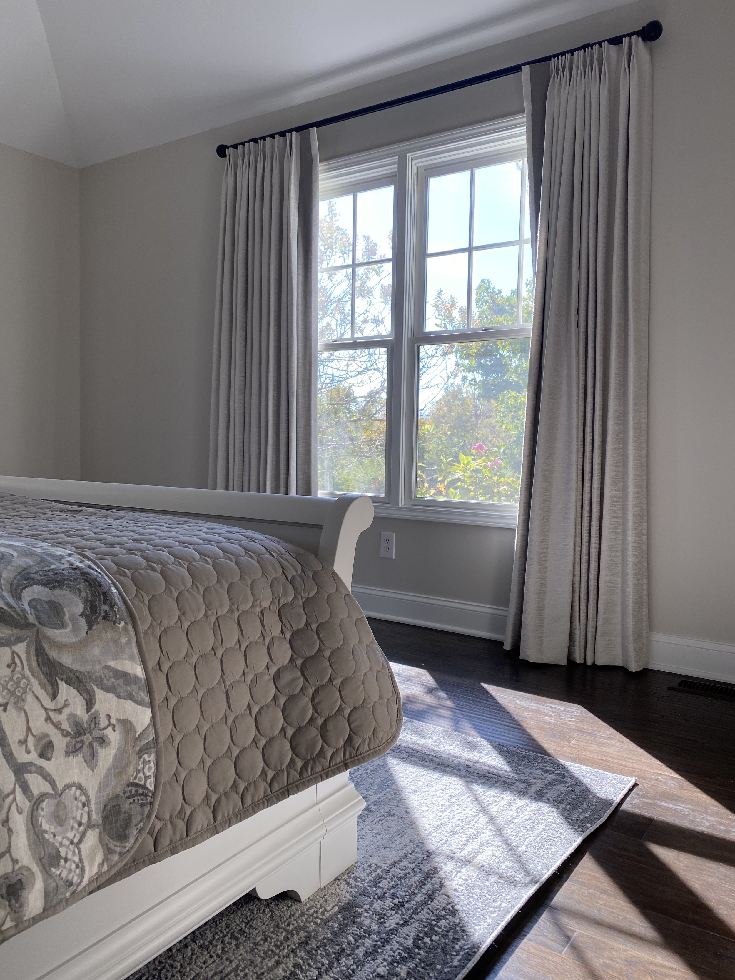
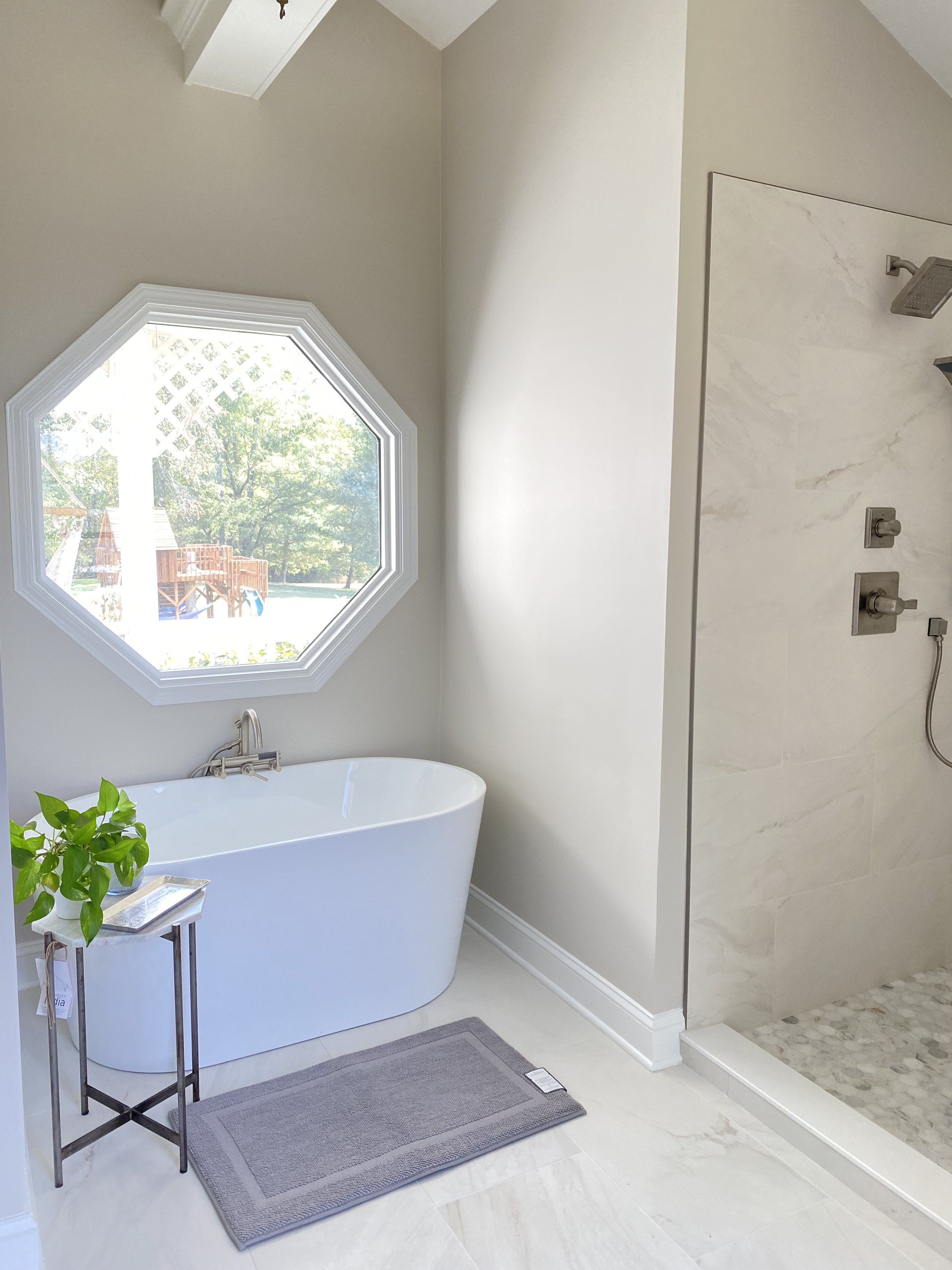
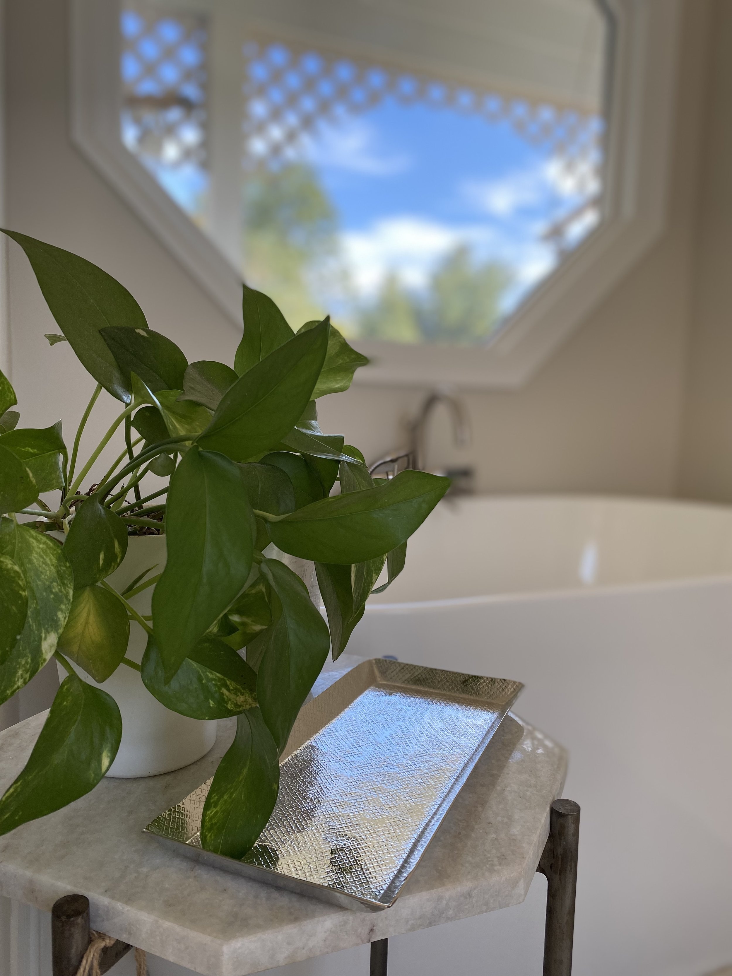
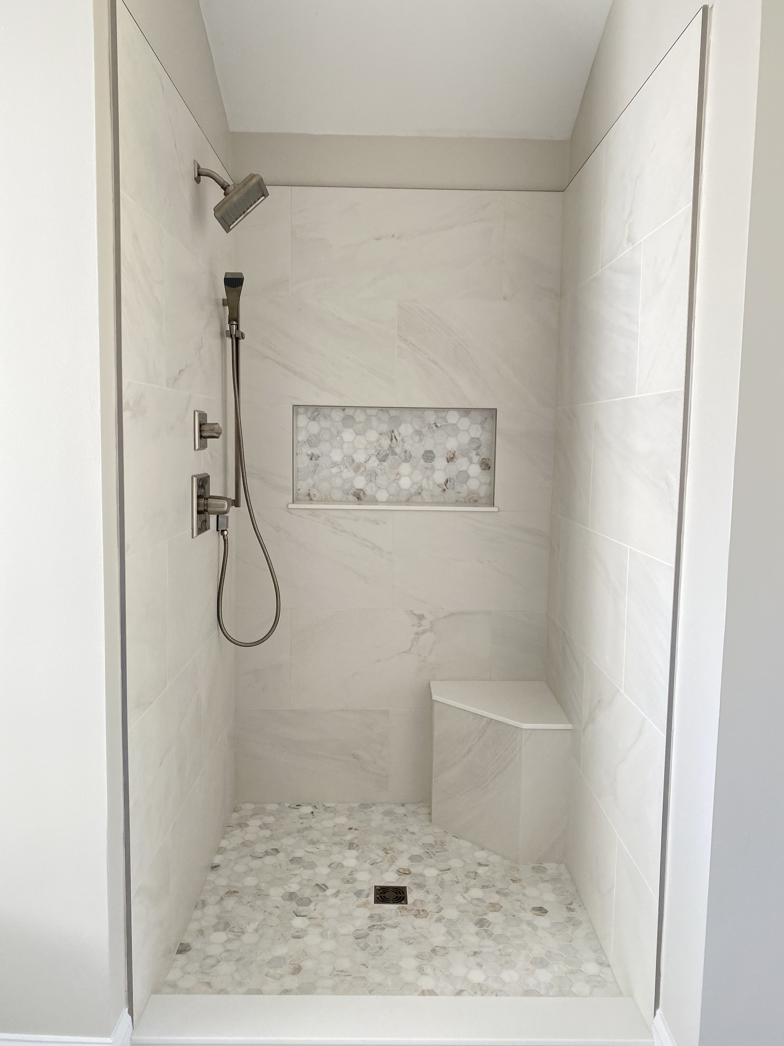
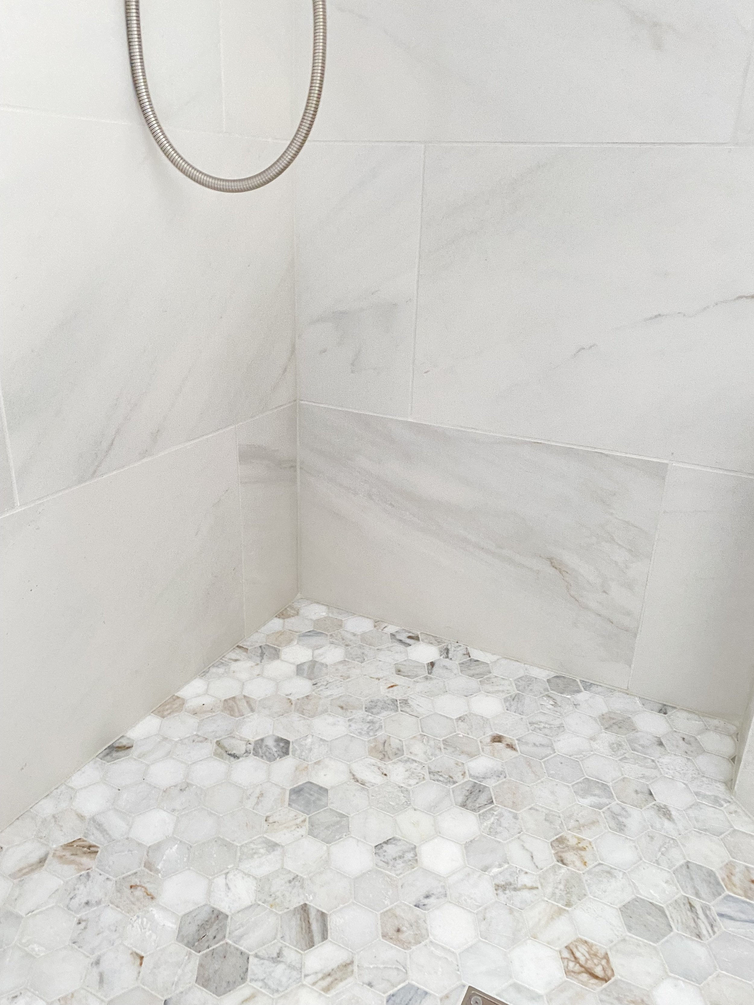
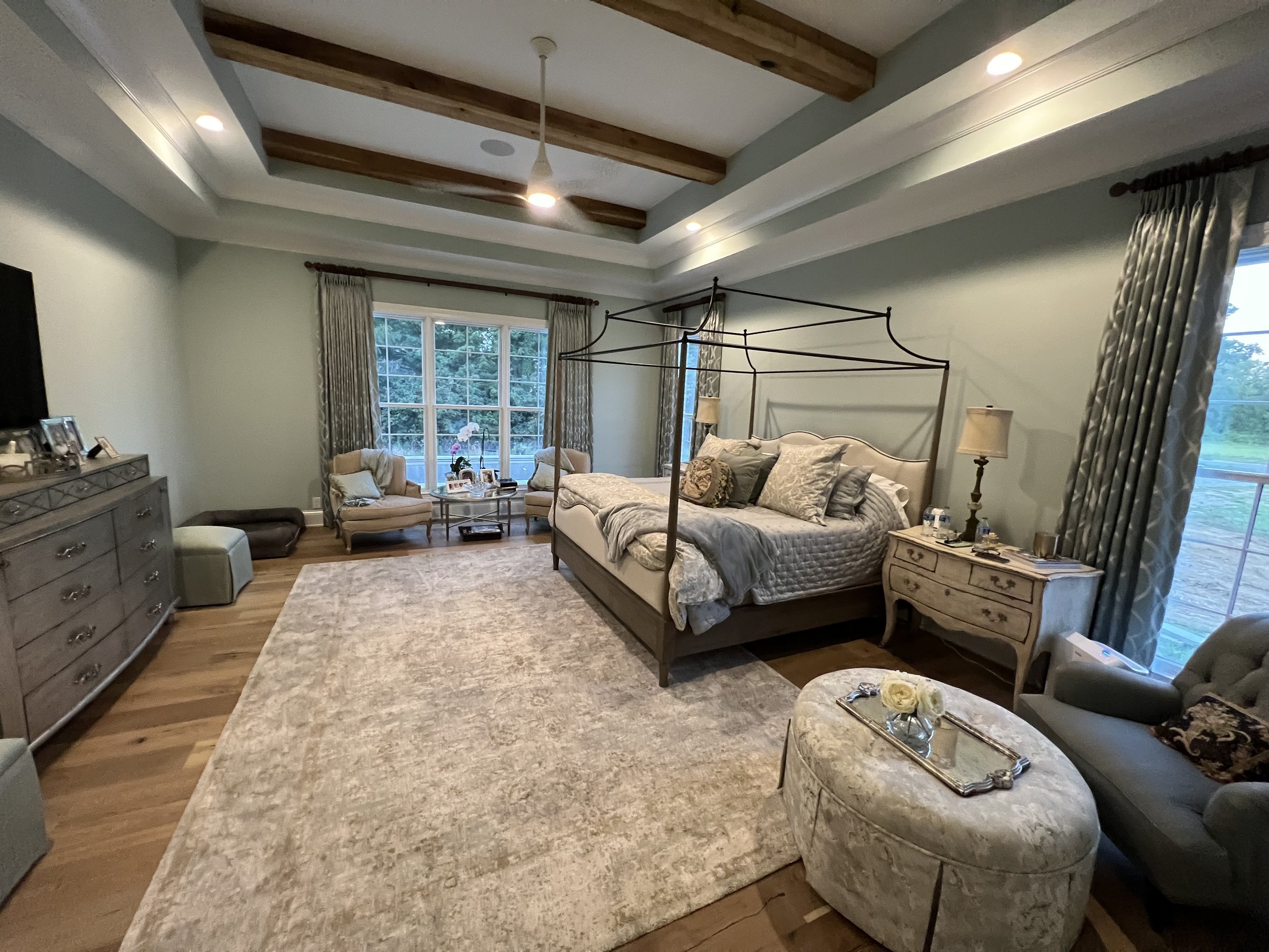
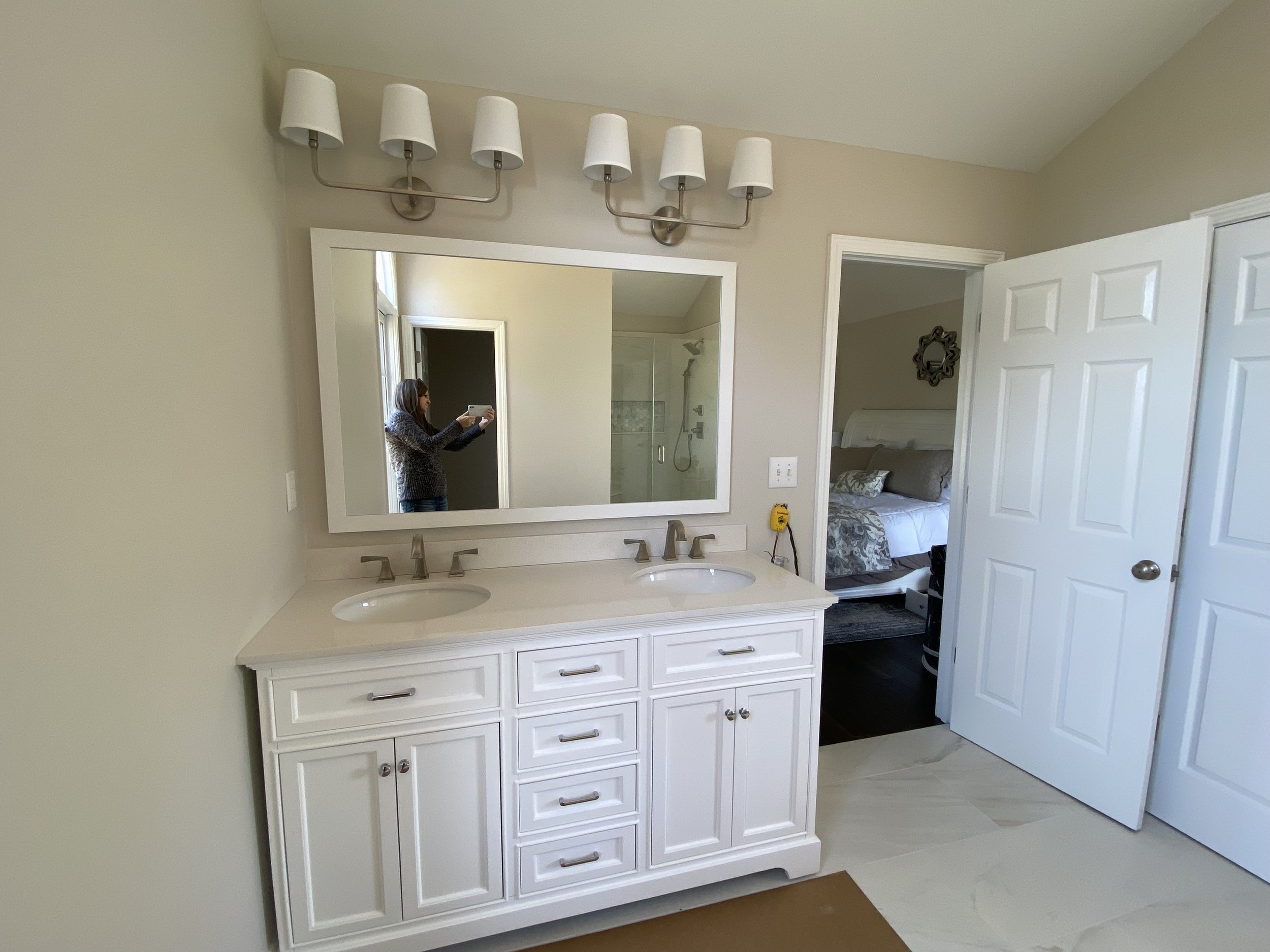
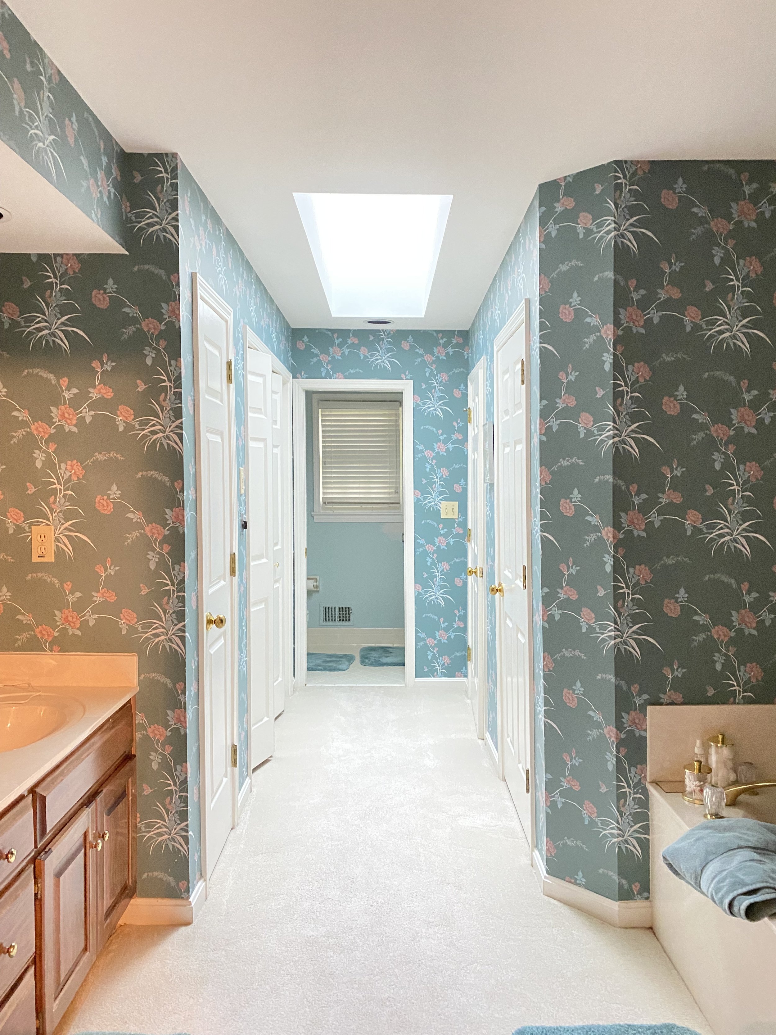
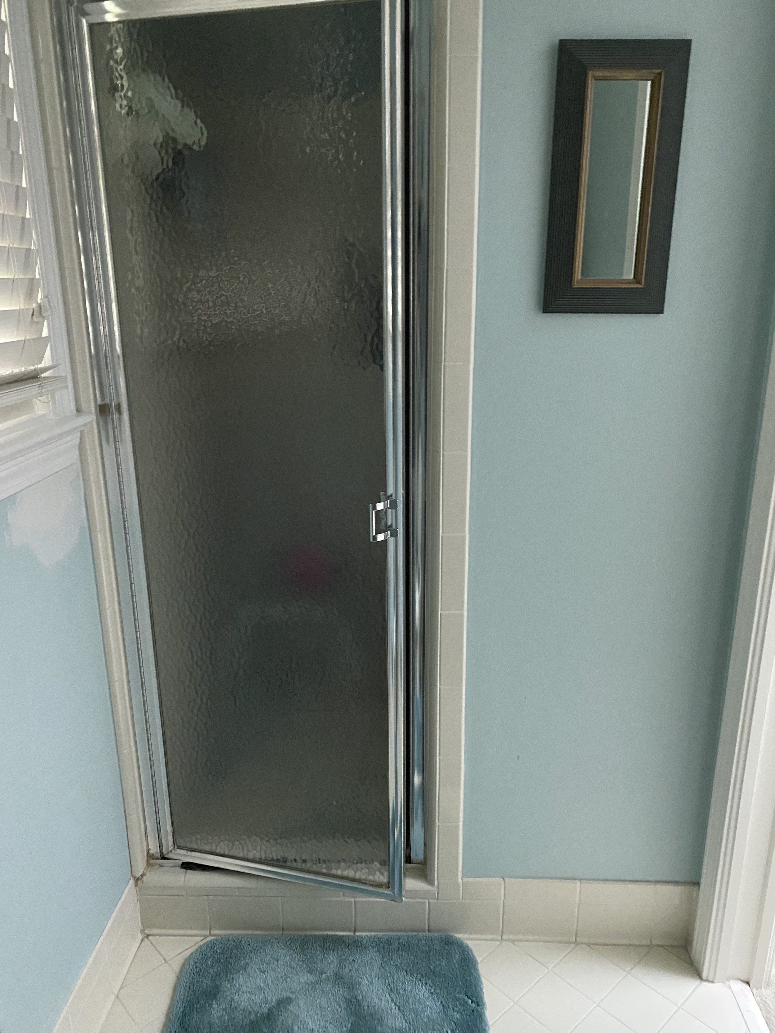
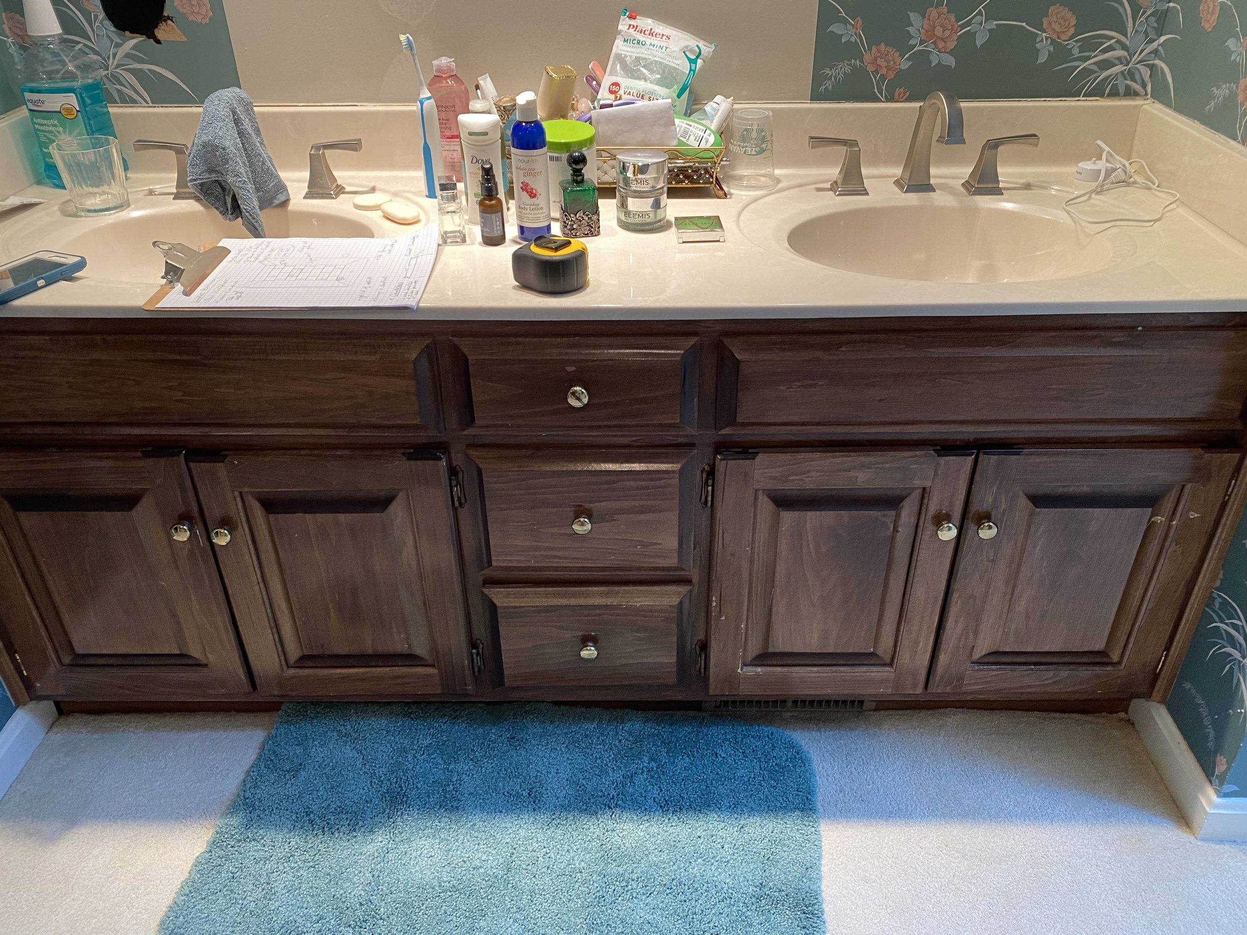
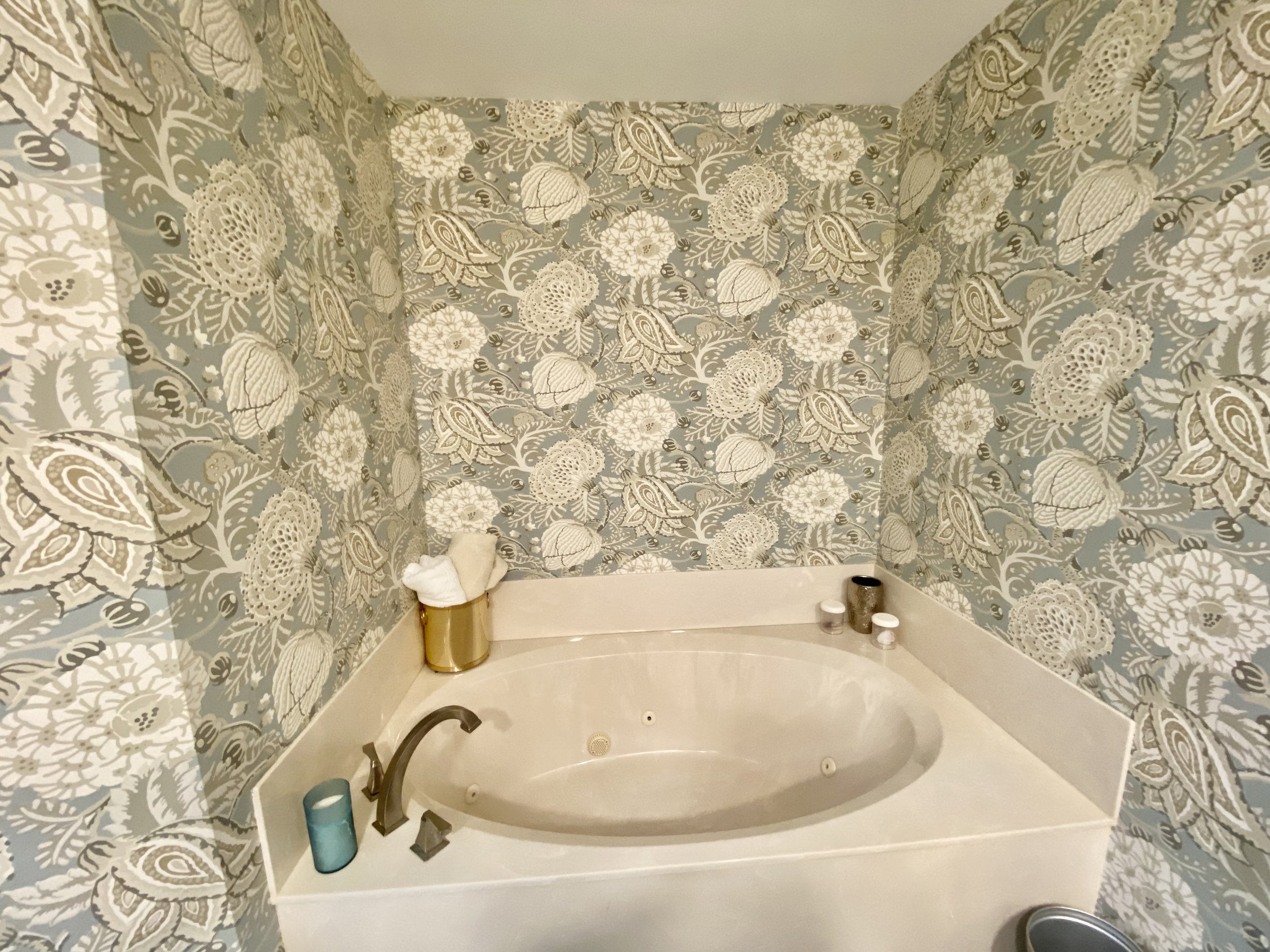
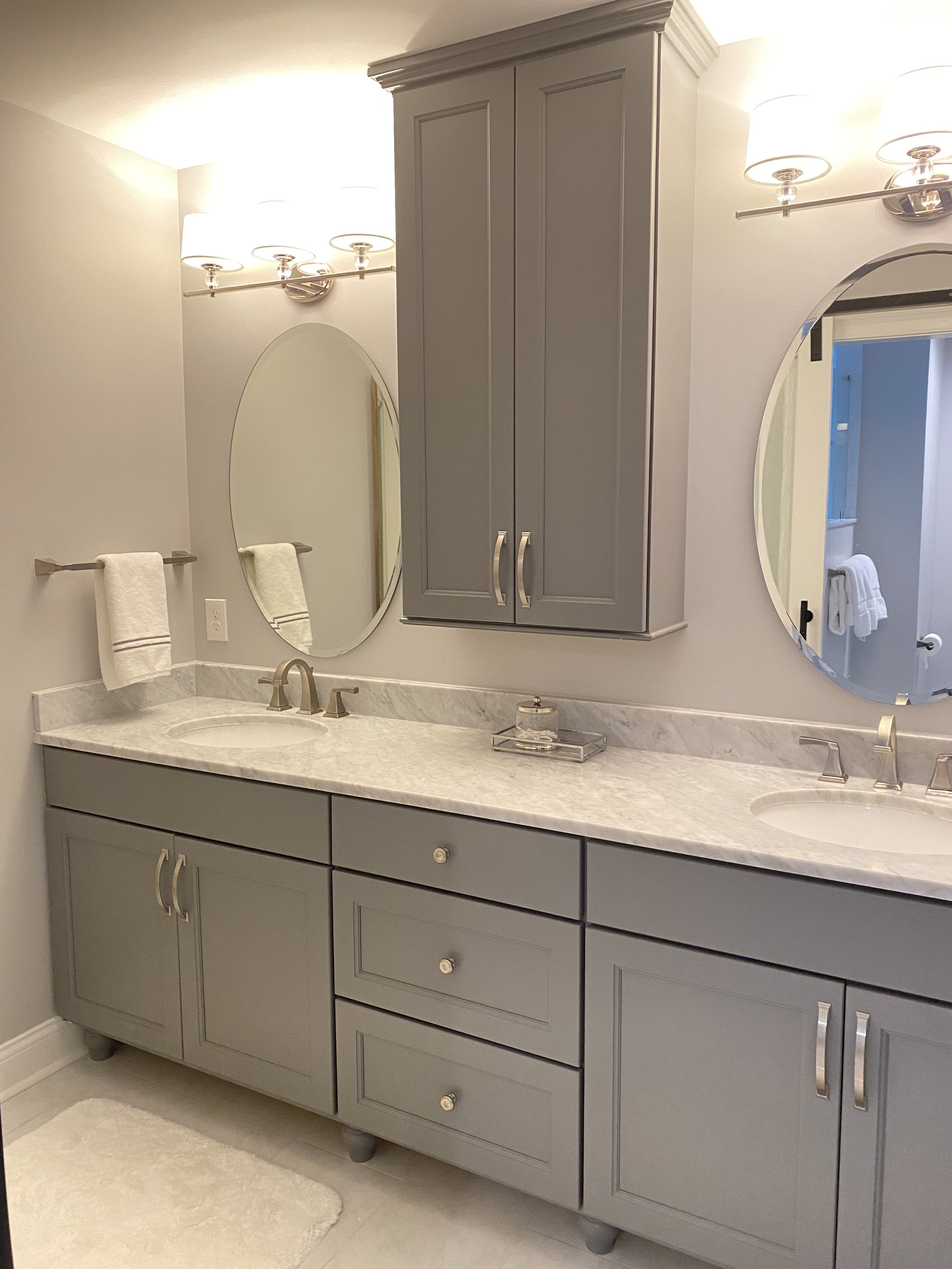
MASTER BEDROOM REMODEL
Walk through: Here you can see the Before Shots of a Master Bathroom project, the inspirational picture the client had pulled from a magazine, my drawings to present to the client, and the After Shots.
Prospect


kitchen remodel


Making "more" room
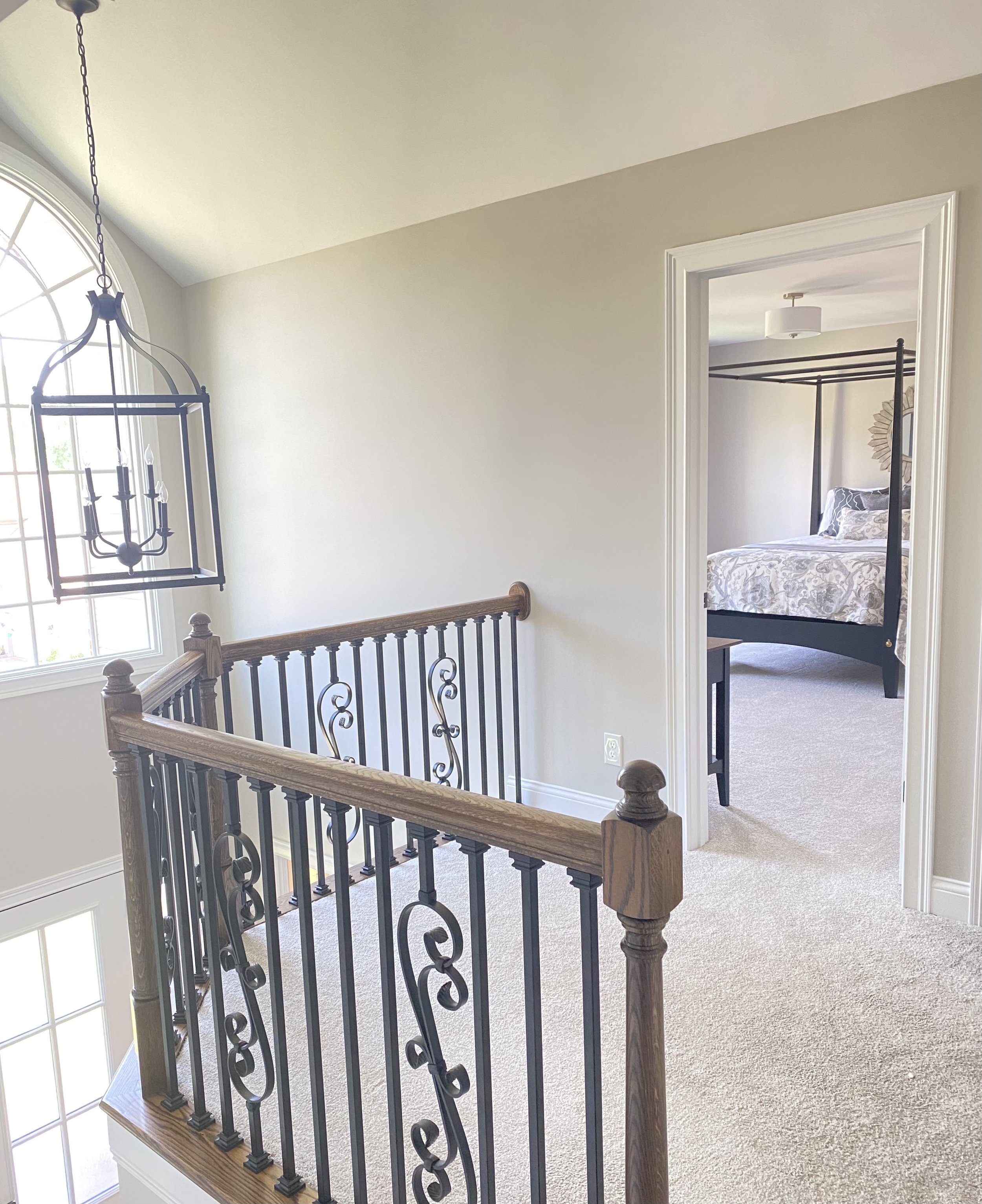
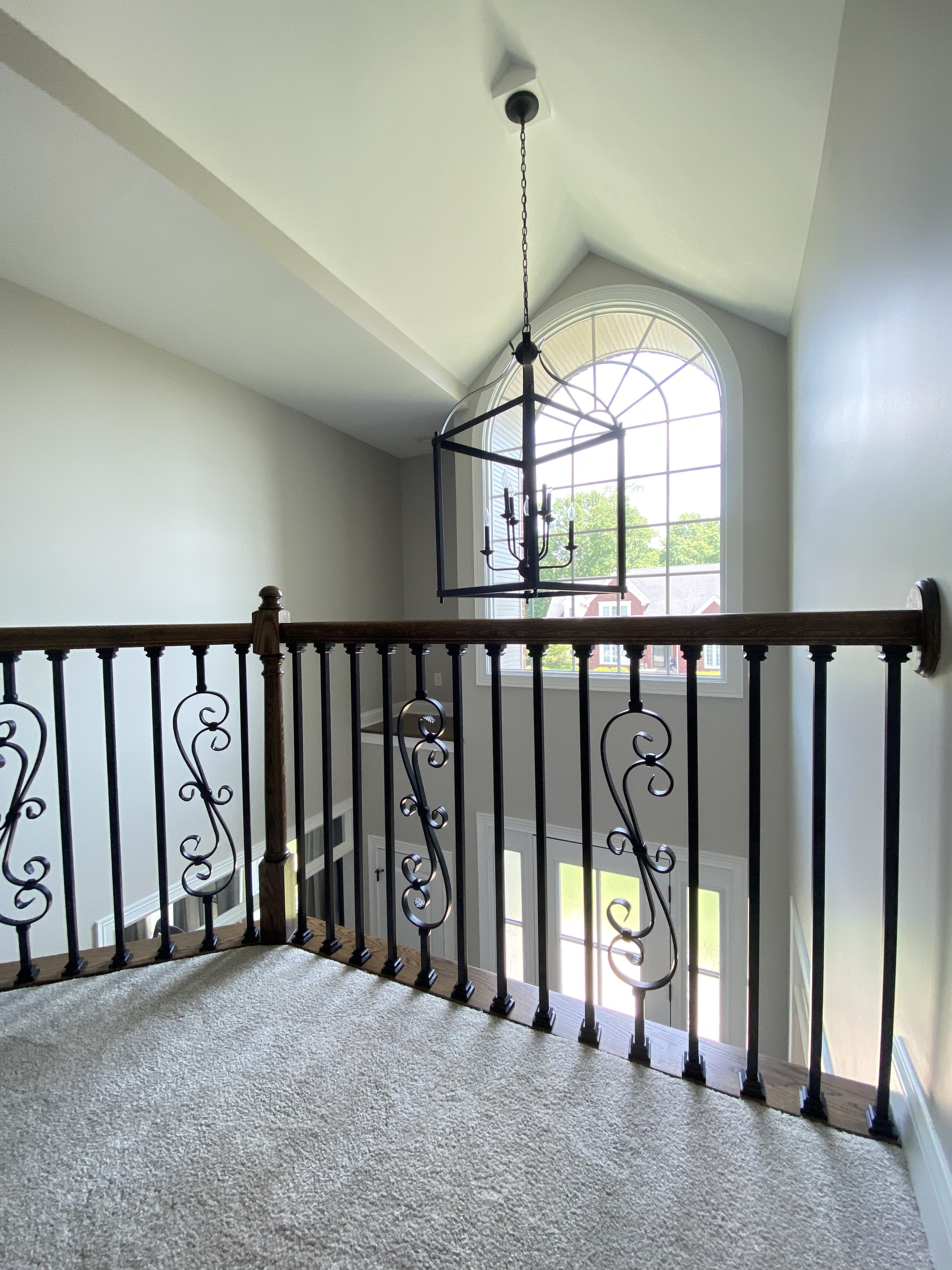
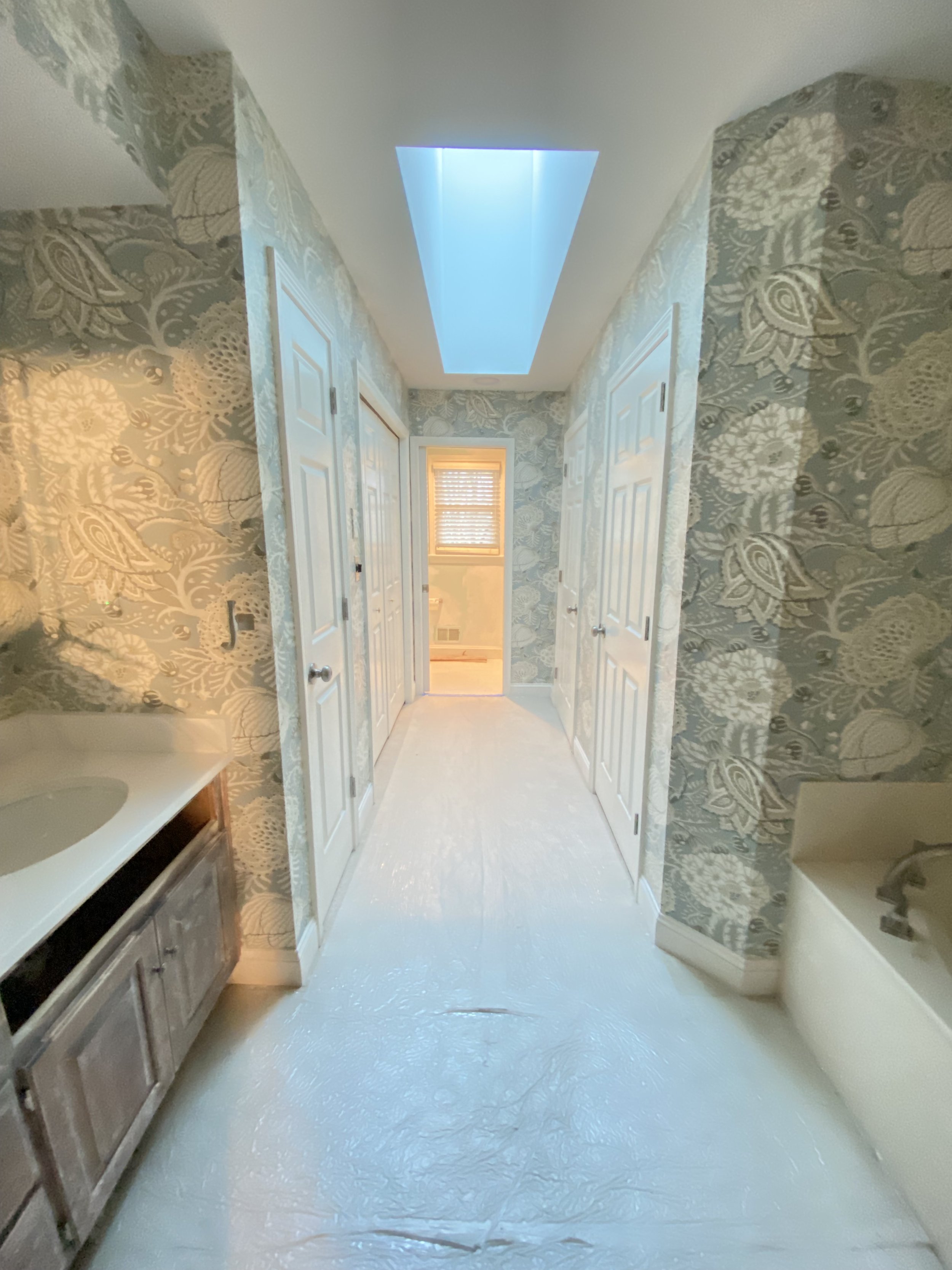
In this second floor renovation, more "space" was gained without adding any additional square feet. First, the HVAC room was relocated from the center of the room to a new closet right outside the bathroom door. Second, the solid banister wall was replaced with open railing.
Third, shelving was built into the attic so all free standing storage could be removed, increasing the visual width of the hall.

The newly situated furnace room, also increase the opening into the "hang-out" area for the kids, making the room itself feel larger.

Continuing the color scheme into the remodeled bathroom visually opens the space even more.

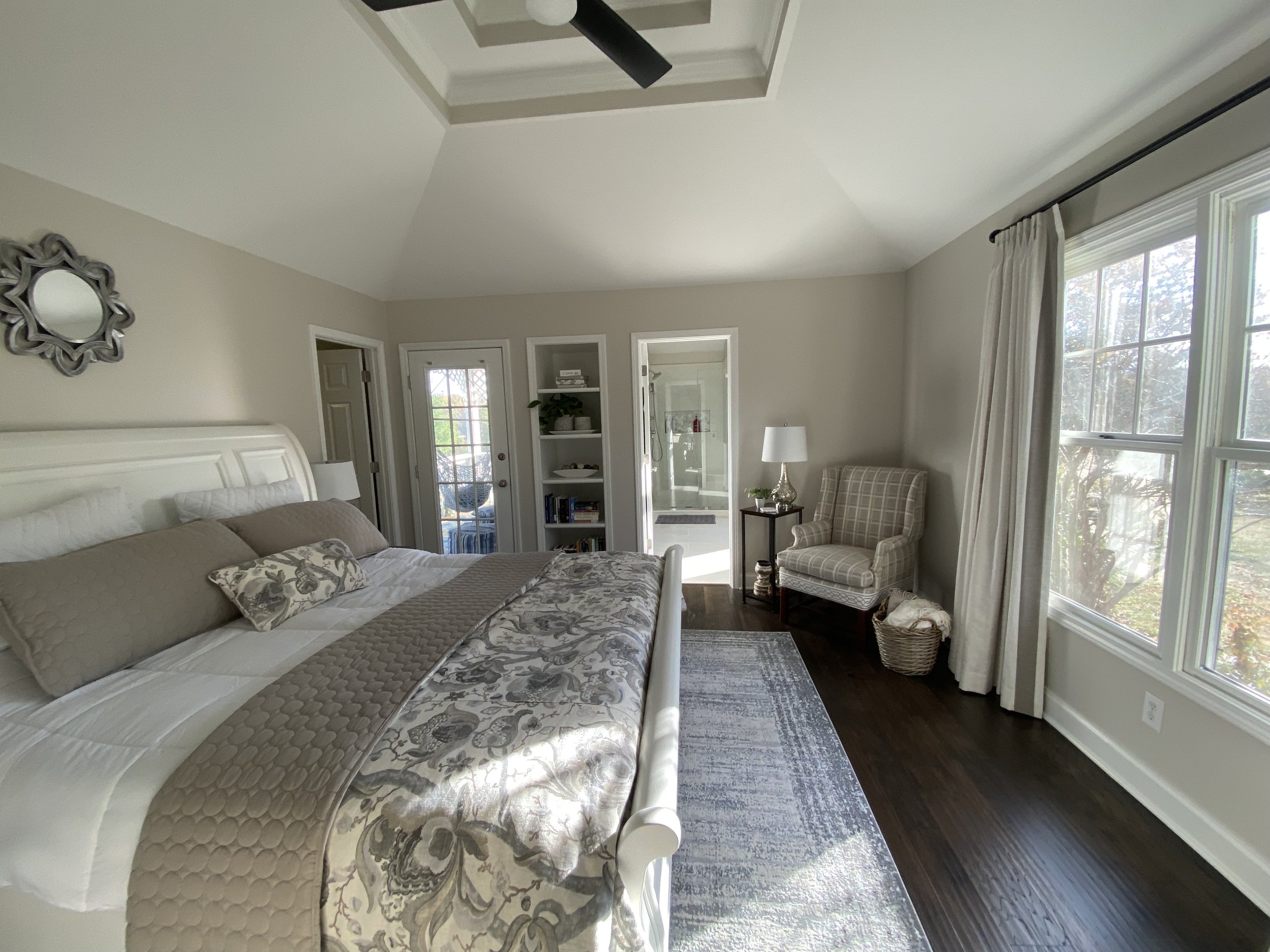
BEDROOM MAKEOVER

Before

MASTER BEDROOM MAKEOVER

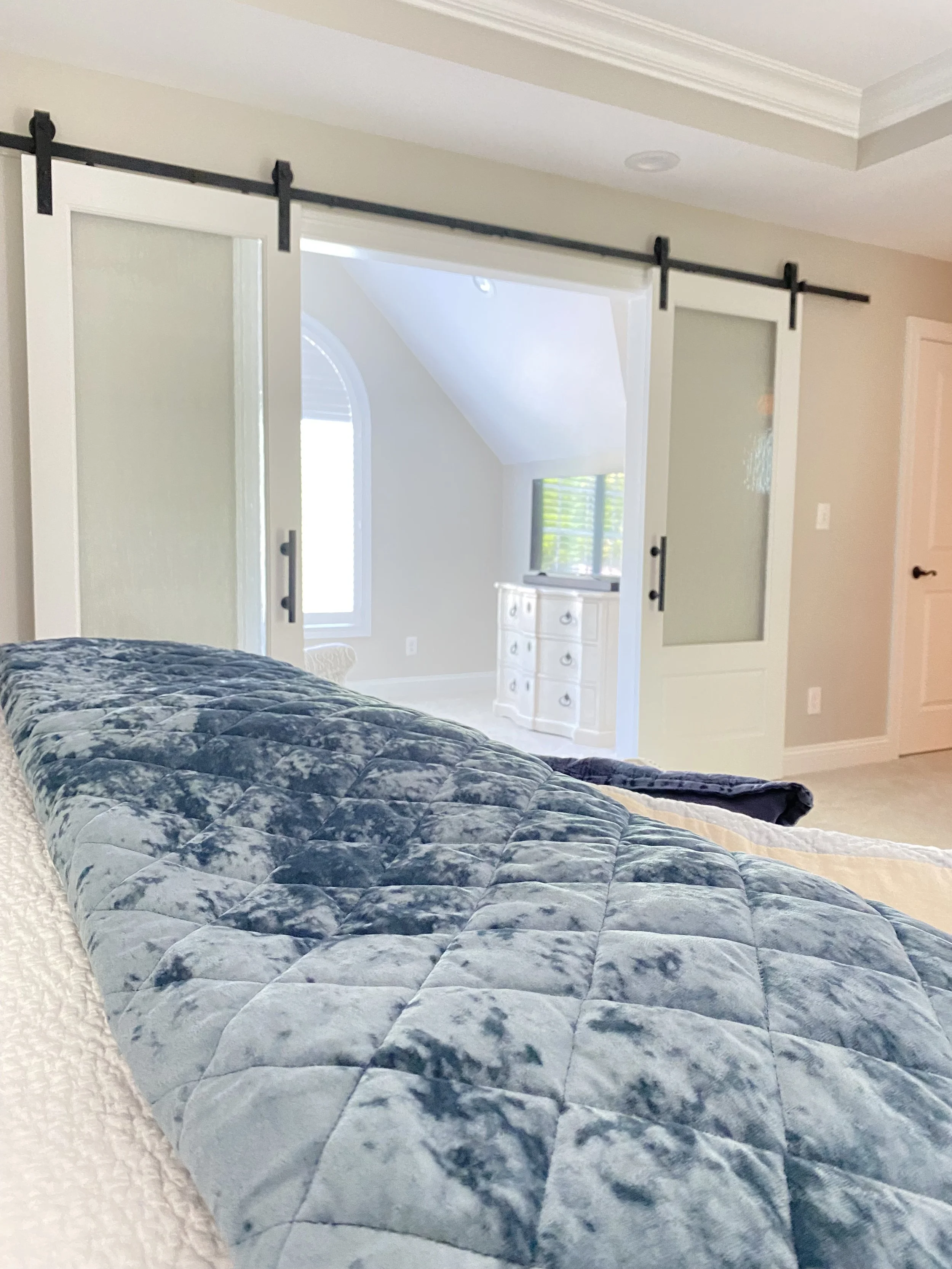
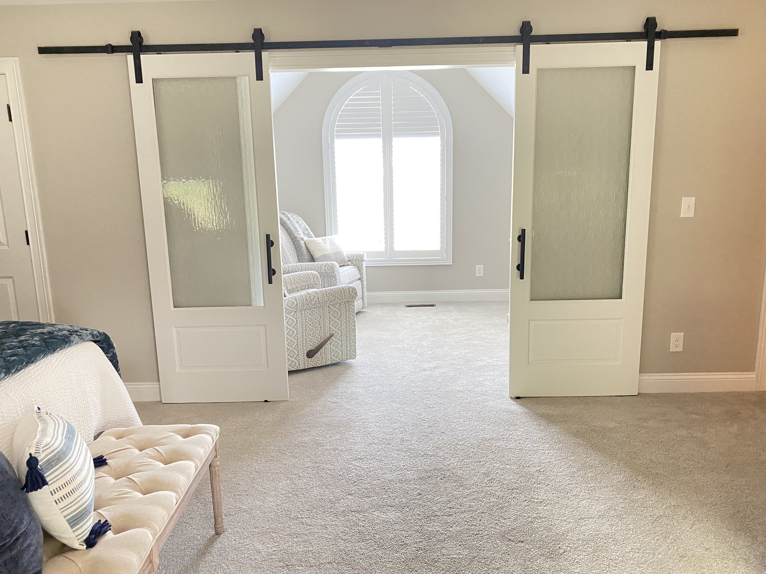
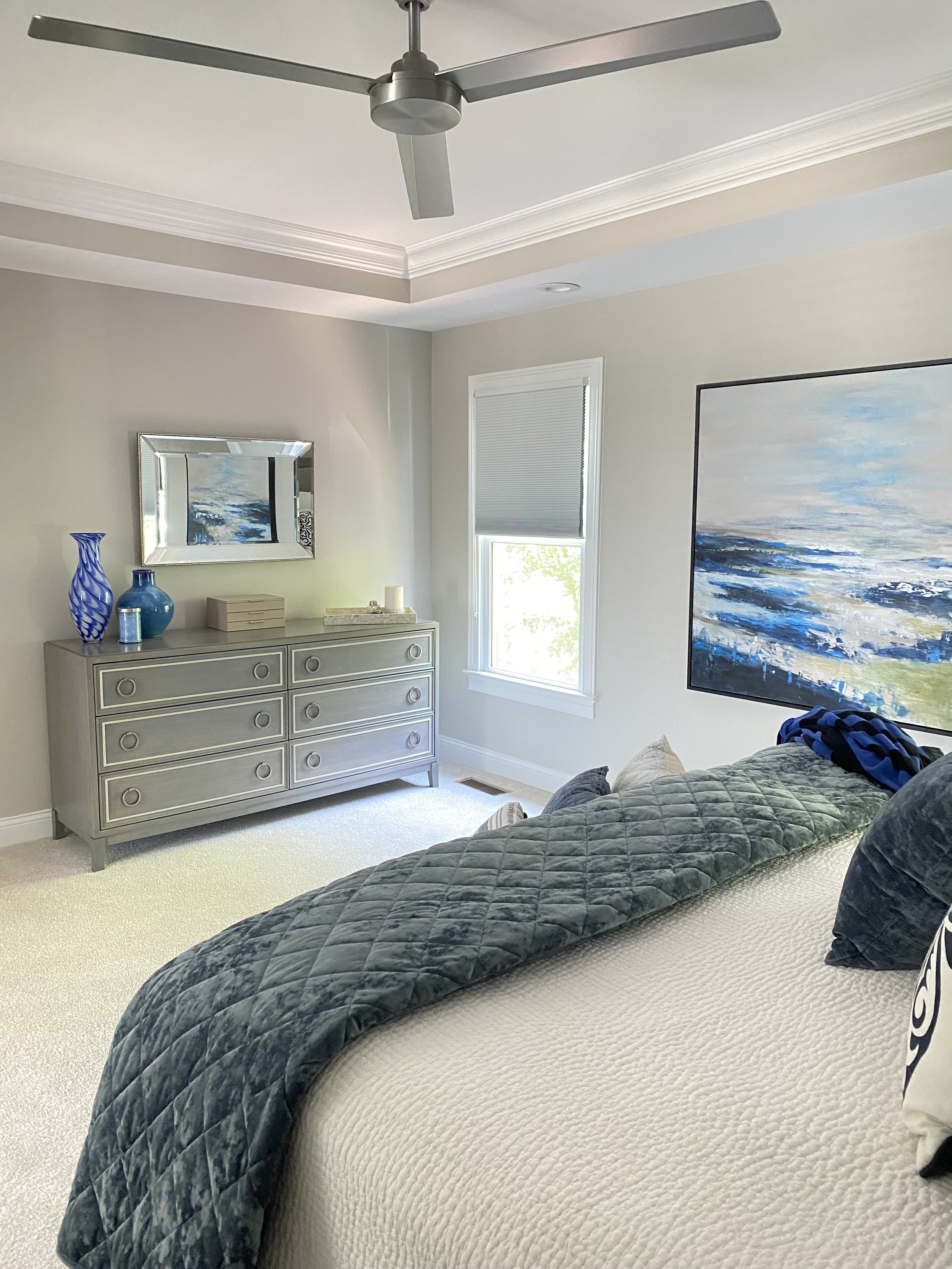
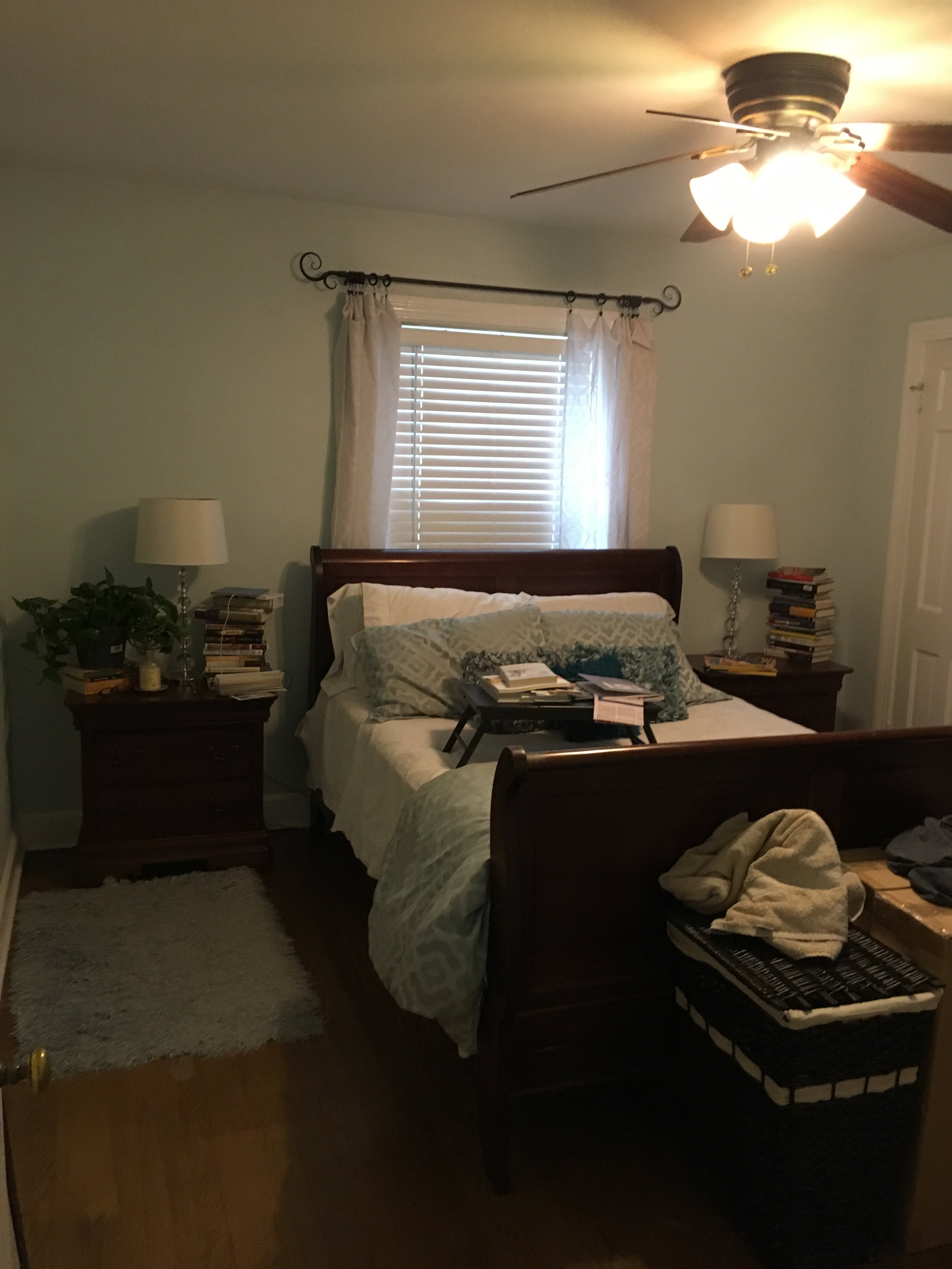
Because of the window placement in this small Master Bedroom, there was no way to arrange furniture without covering up one to two windows in the original room.

On the adjoining wall, small doors on deep closets posed issues for the homeowners. Again, because of lack of storage the other window in the room was covered with a dresser, and stacks of books always cluttered the nightstands.
Fourth, all light fixtures were recessed, giving the appearance of a higher ceiling.


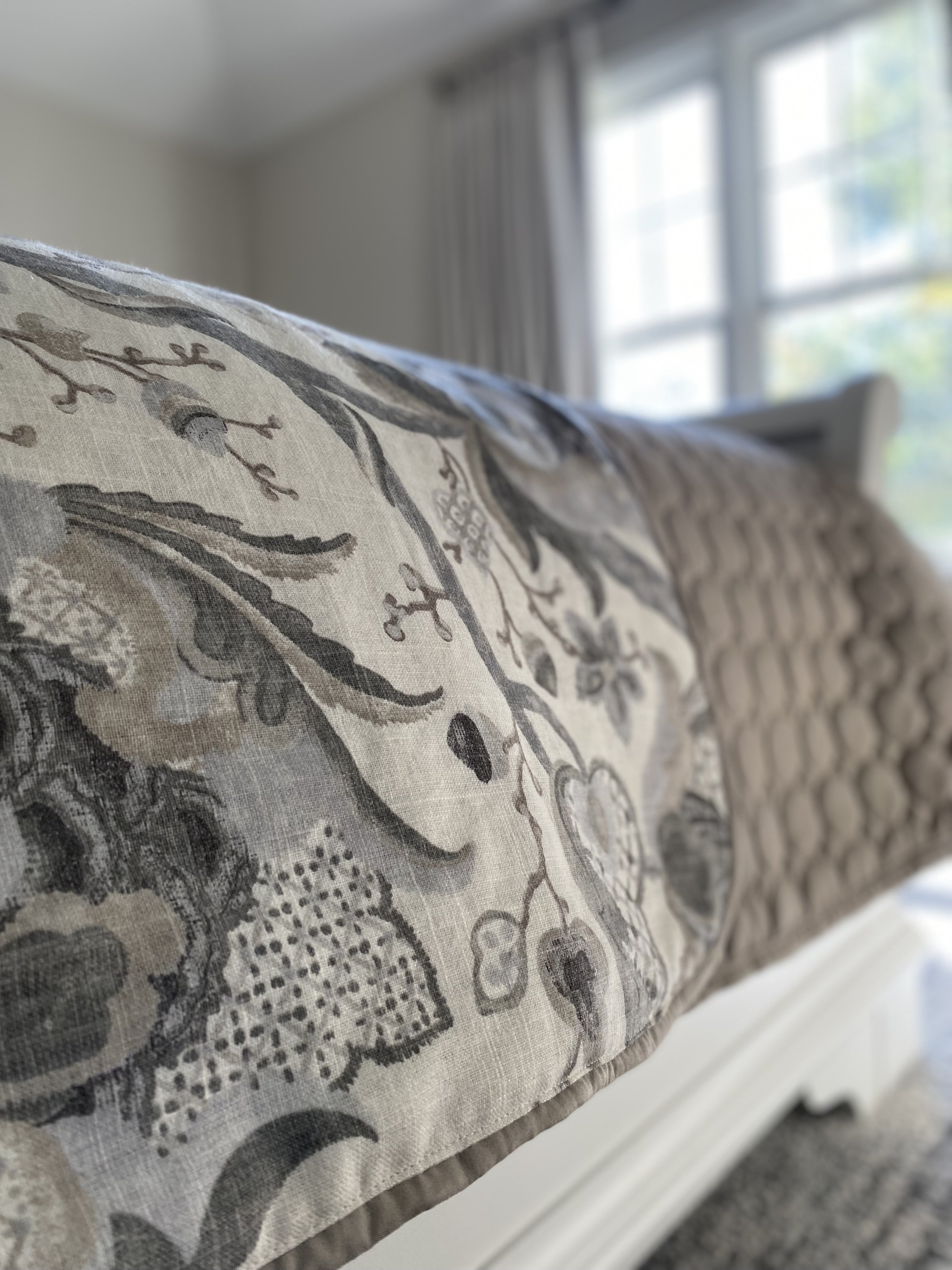
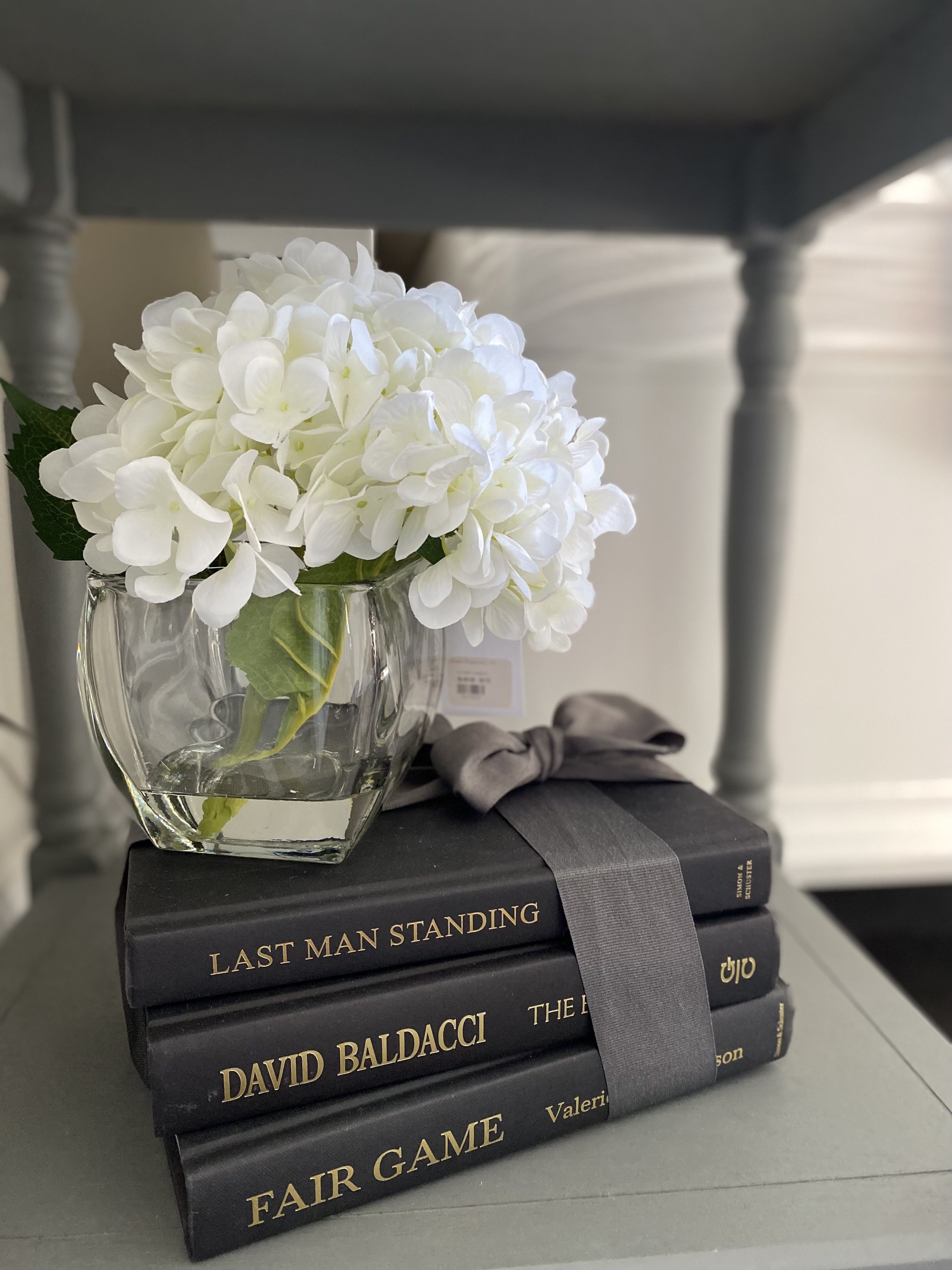
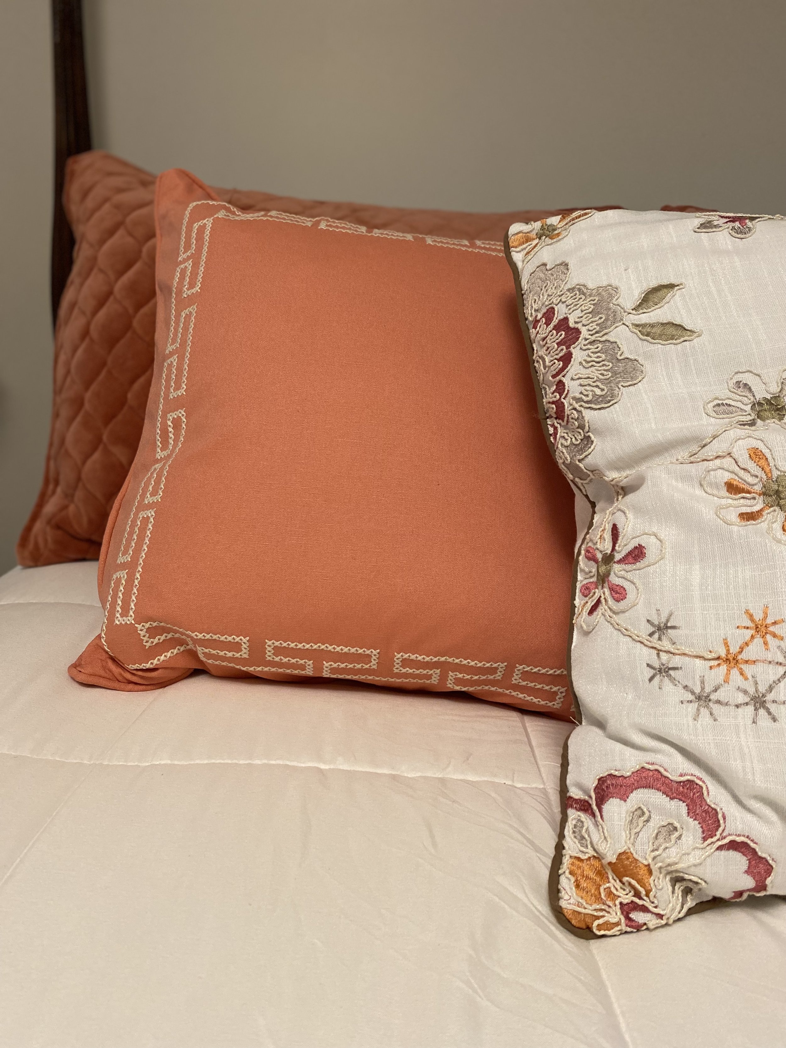
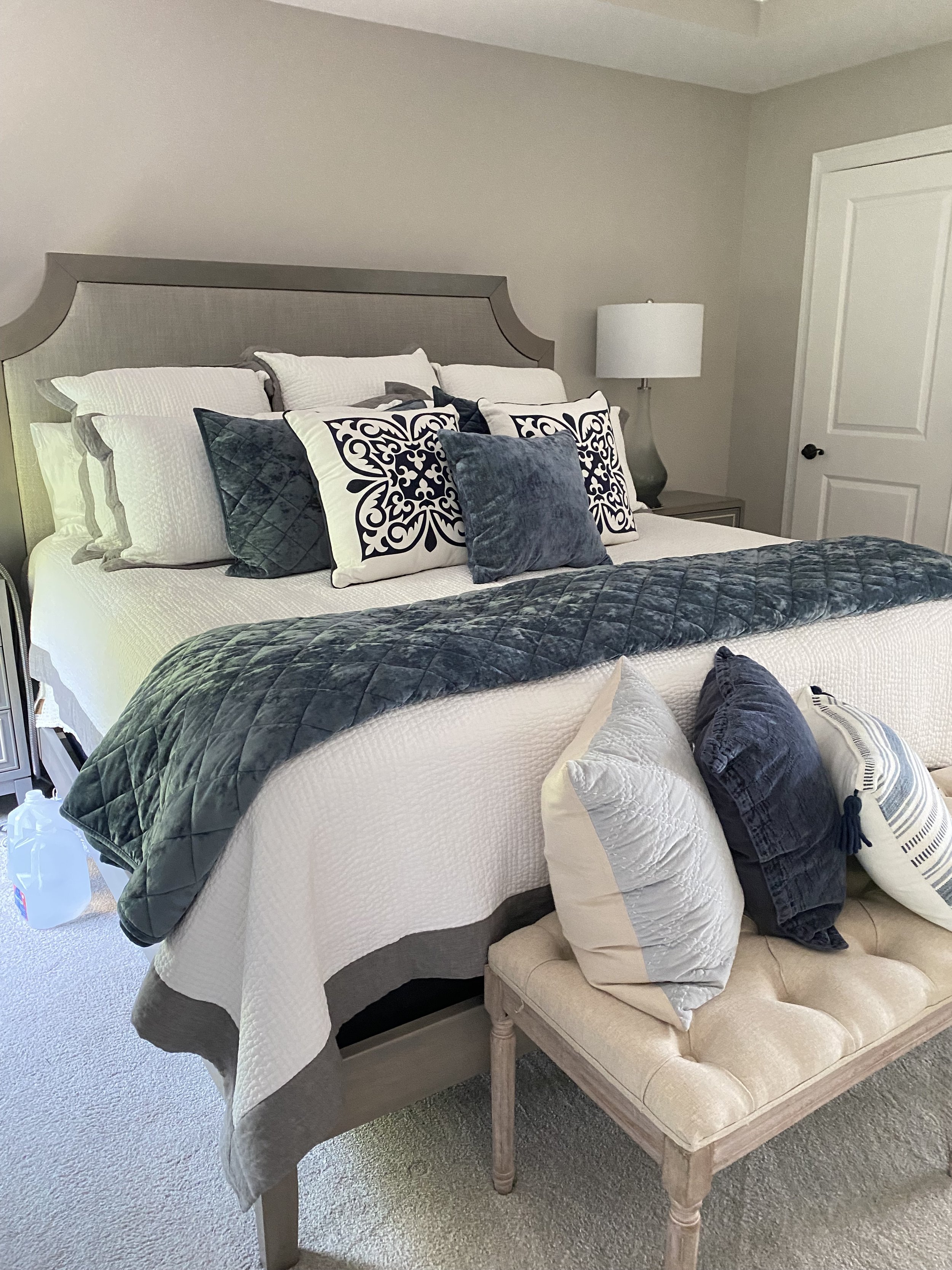
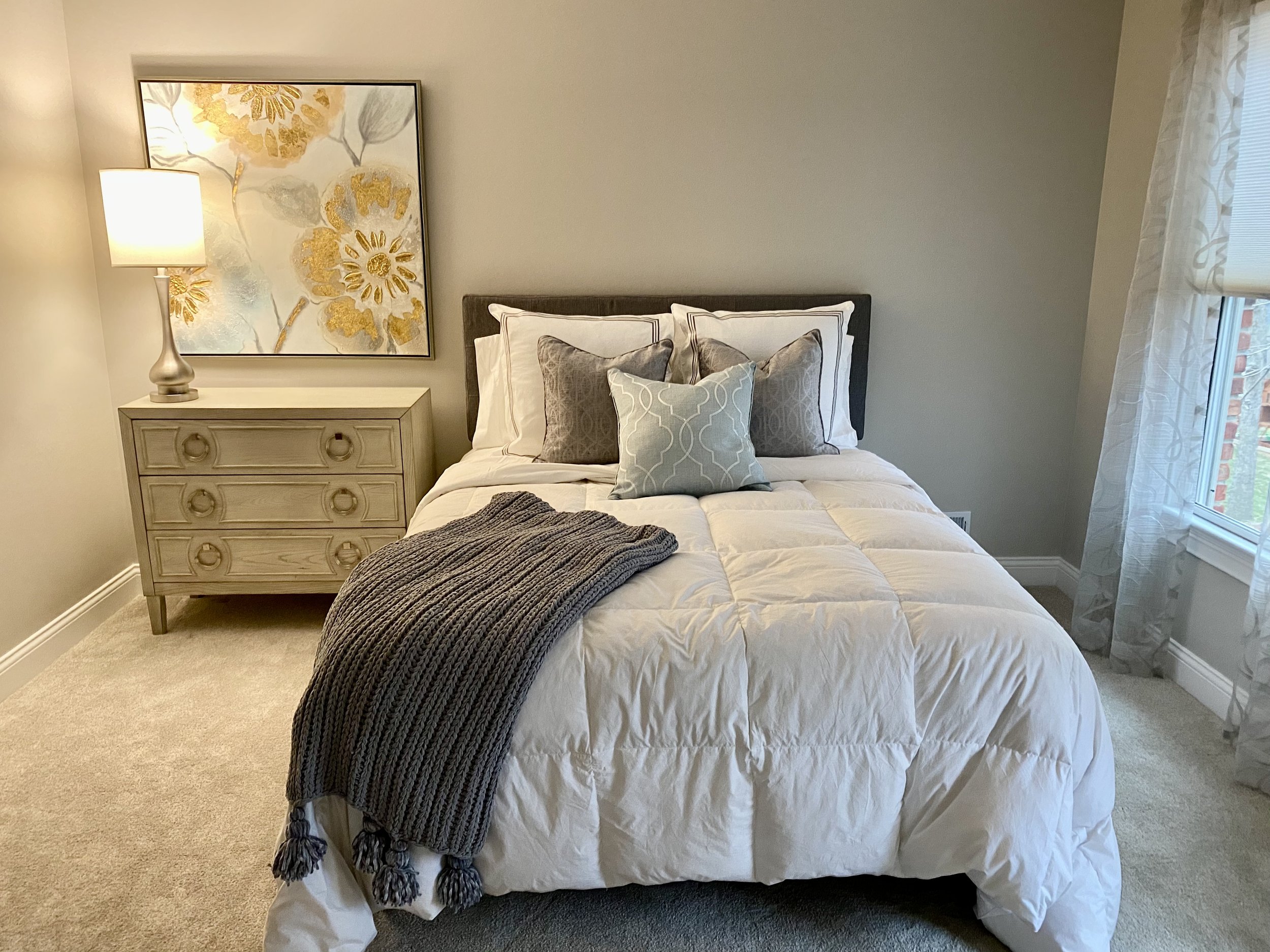
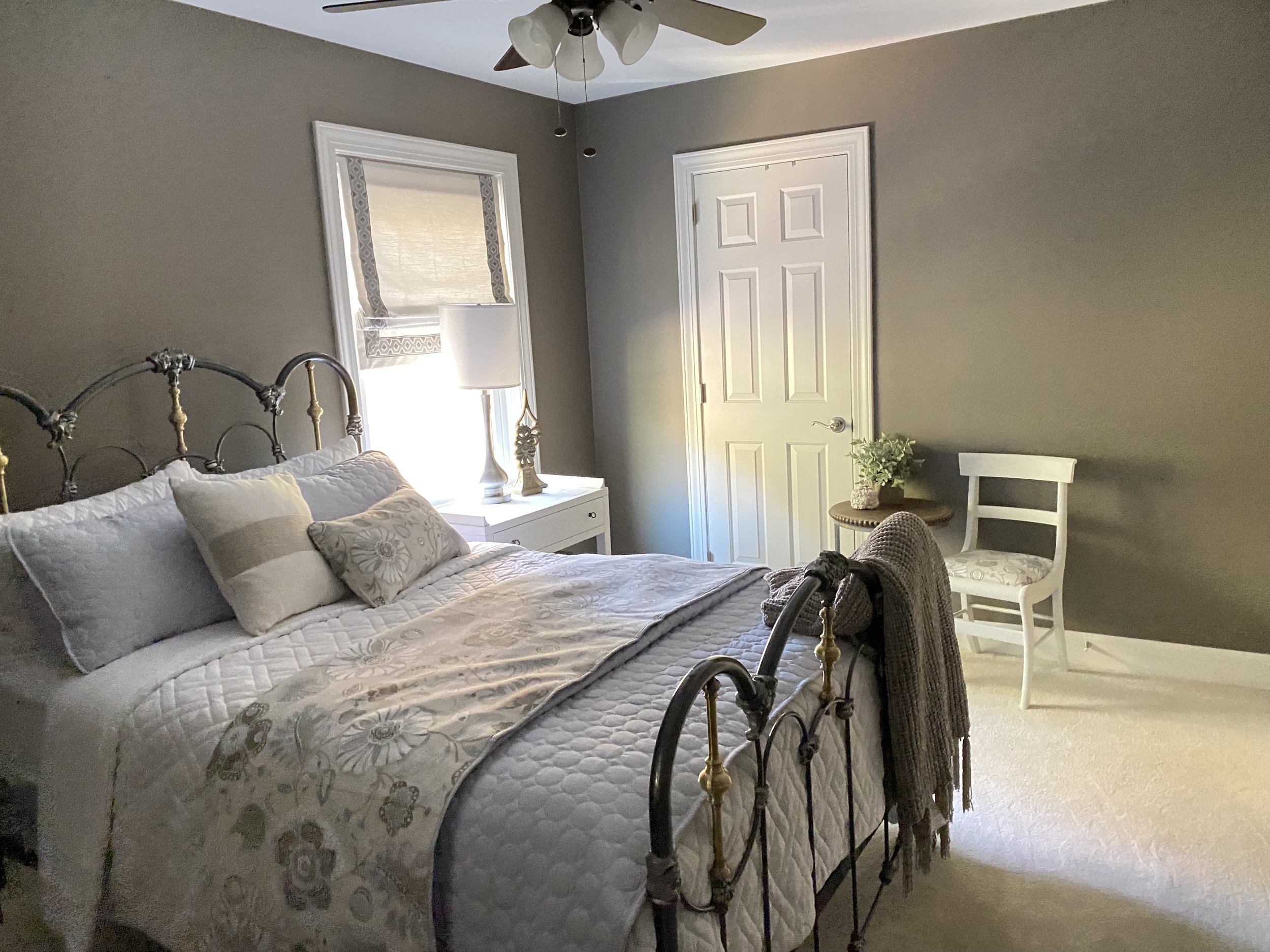
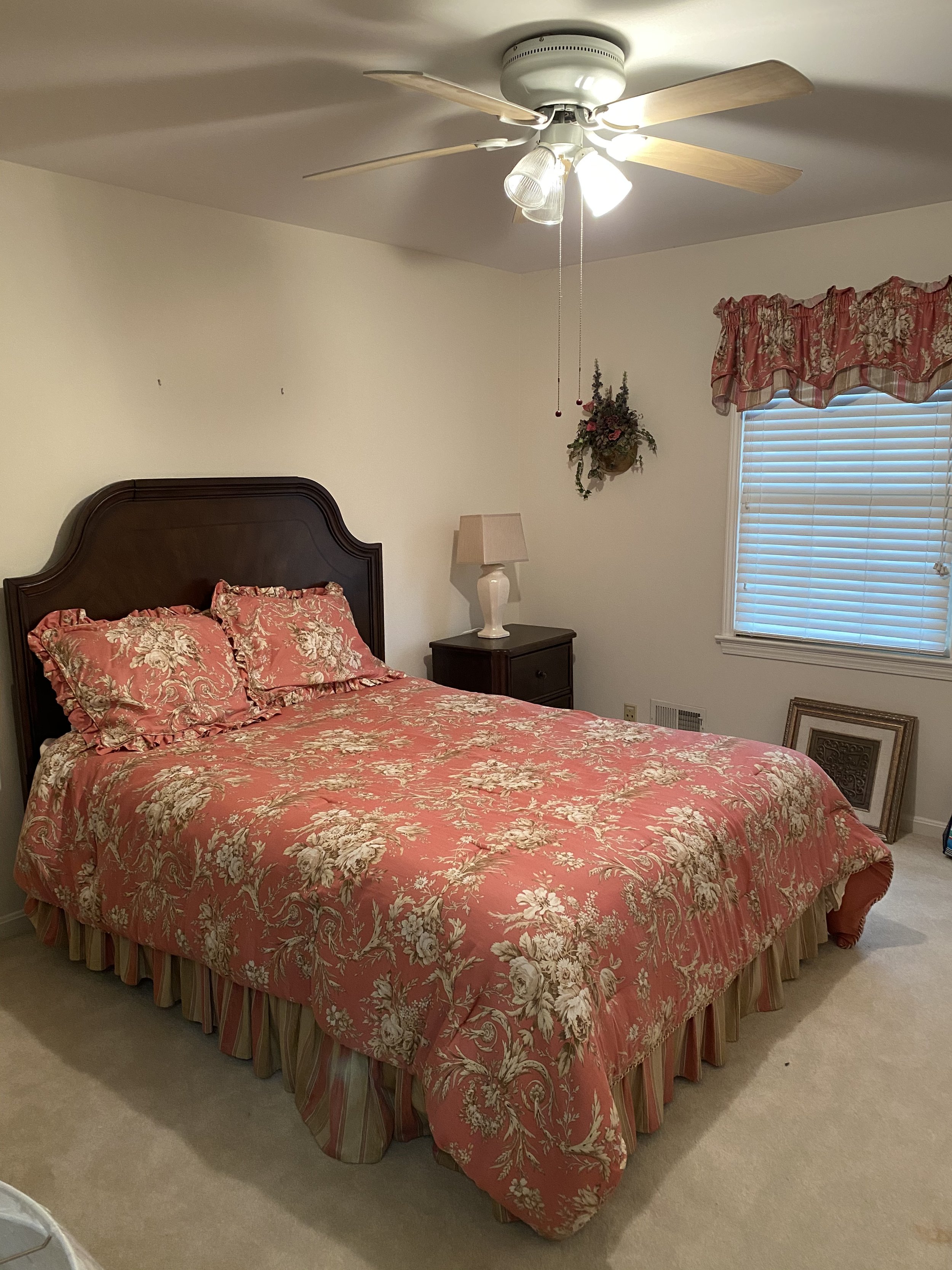
After: The beautiful antique bed in this client’s Guest Room remained center stage in the space. but was brought to life with a undated neutral hue on the walls, custom bedding and larger scaled lamps.

A Window Seat was brought up to date with coordinating fabrics in chocolate, mocha, and cream. An ornate valance was replaced with a tailored Roman Shade to make the room more appealing to a broader range of overnight guests.

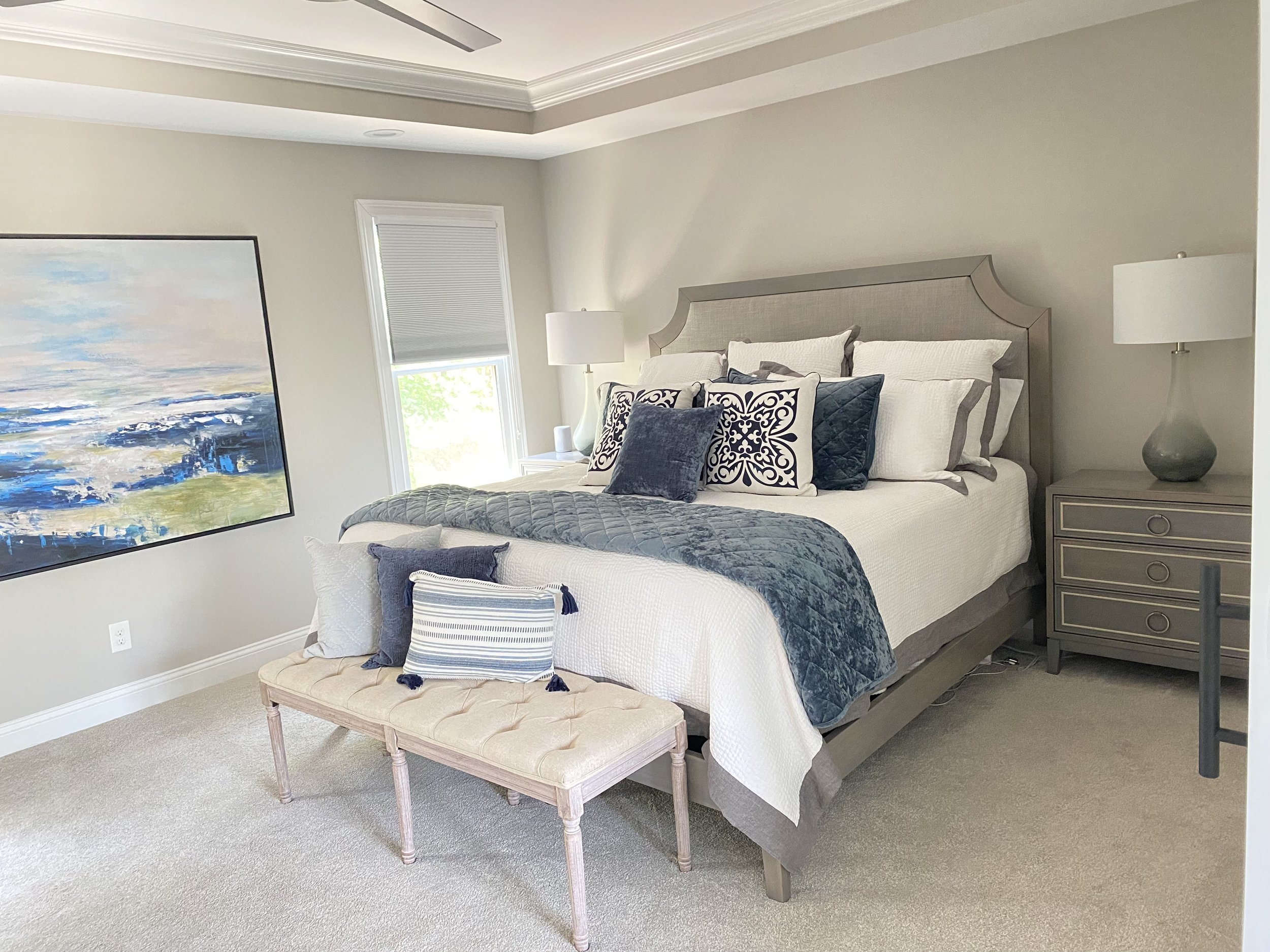
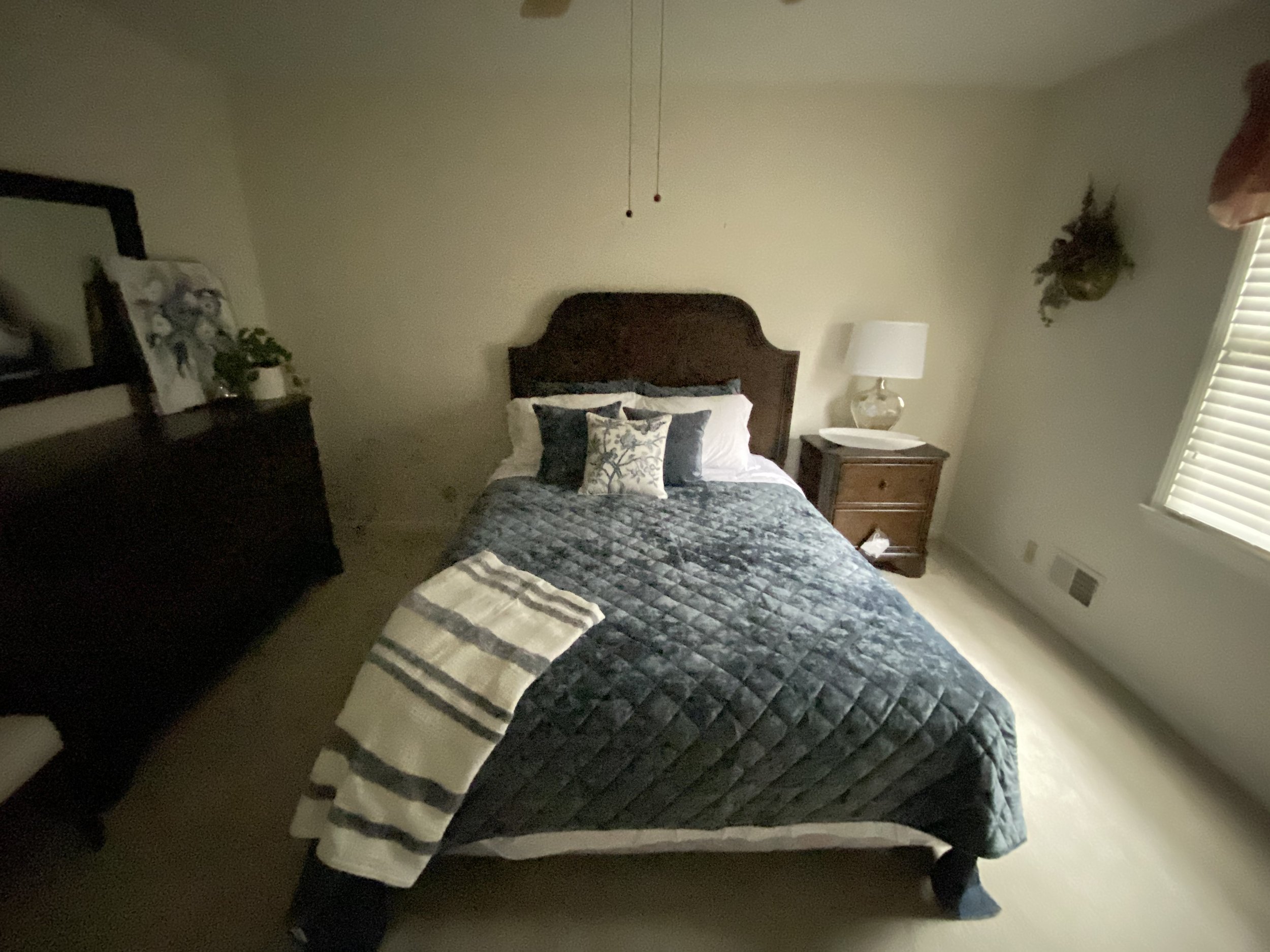
By filling in the center window and cutting out two new windows to flank the bed, not only could a larger bed be used, the room became flooded with natural light. A brick wallpaper, new nightstands, large area rug, updated ceiling fan, and new bedding finish off the space.

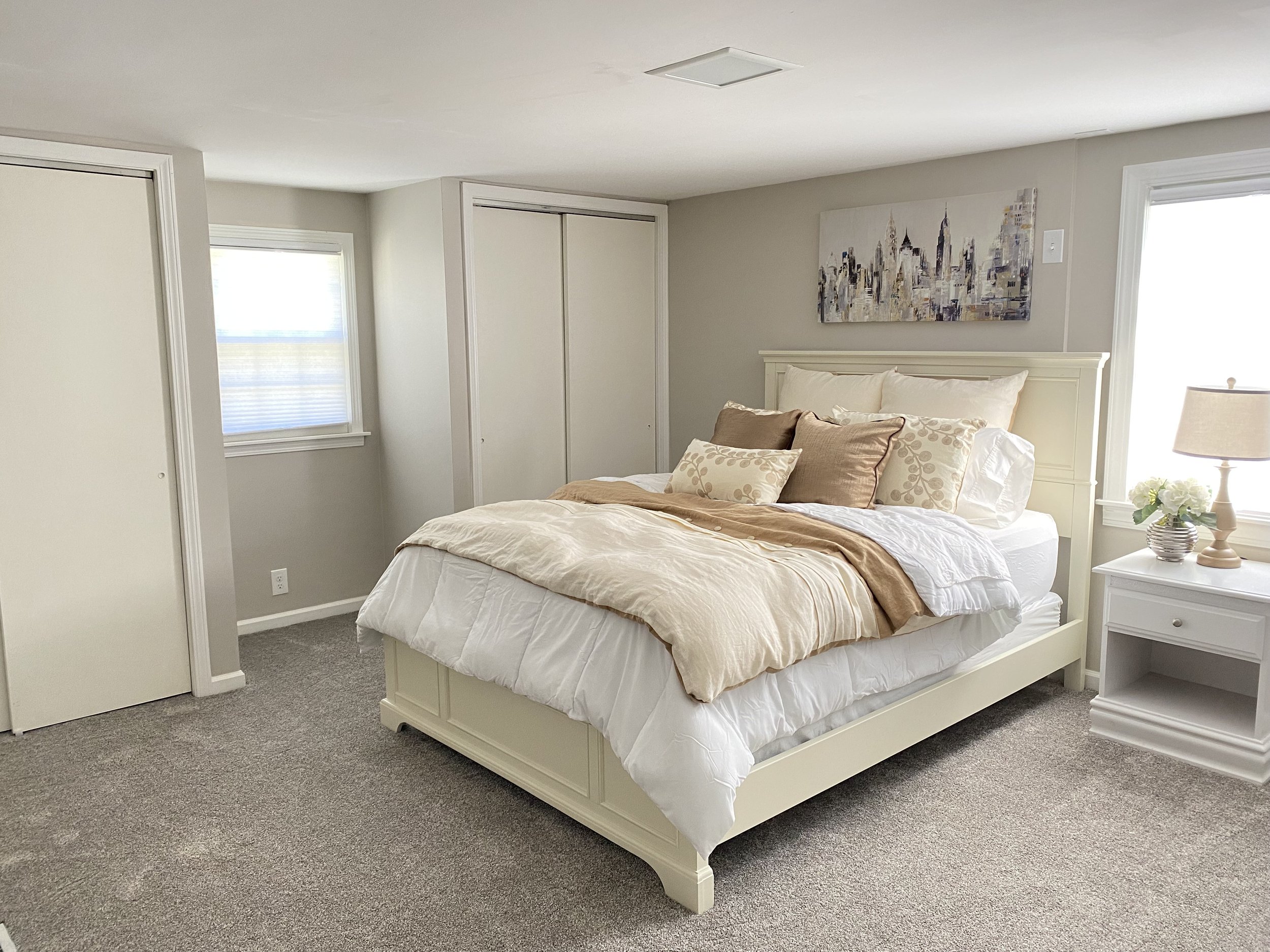
Another window was filled in, closets were set back 6 inches and reframed for large barn doors for easier access to clothing, a built-in storage cabinet between the closets uses every spare inch of leftover space for clothing and the homeowner’s books.
curb appeal & entryways


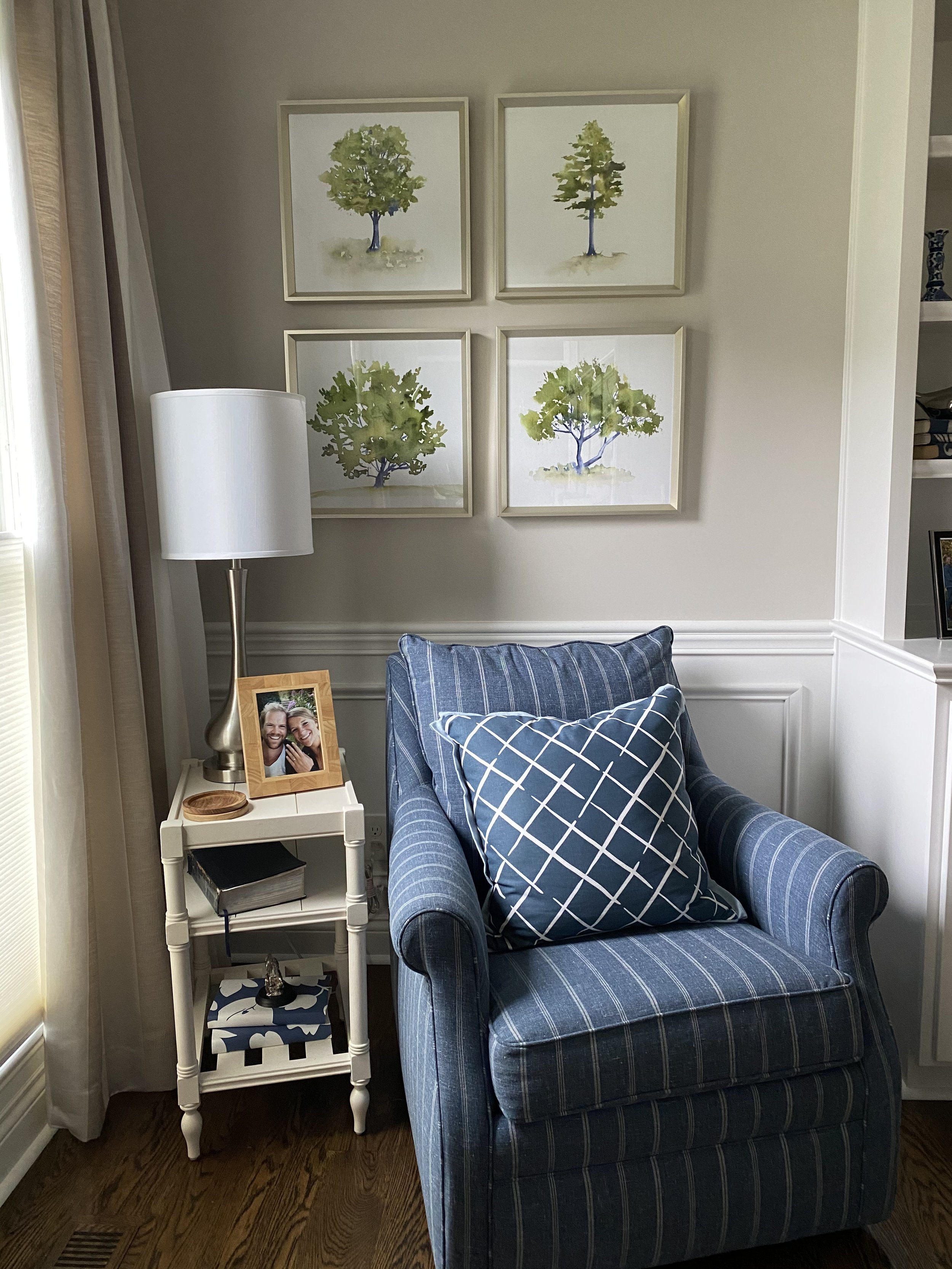
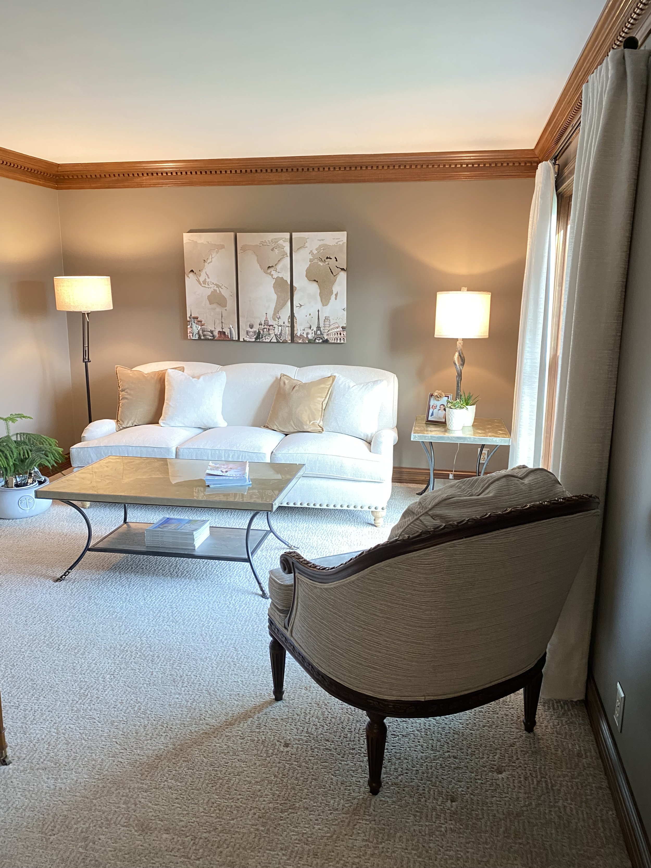
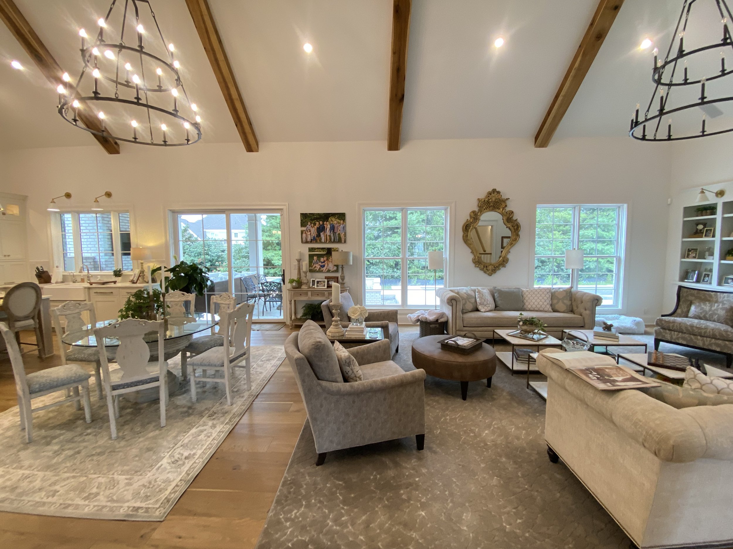
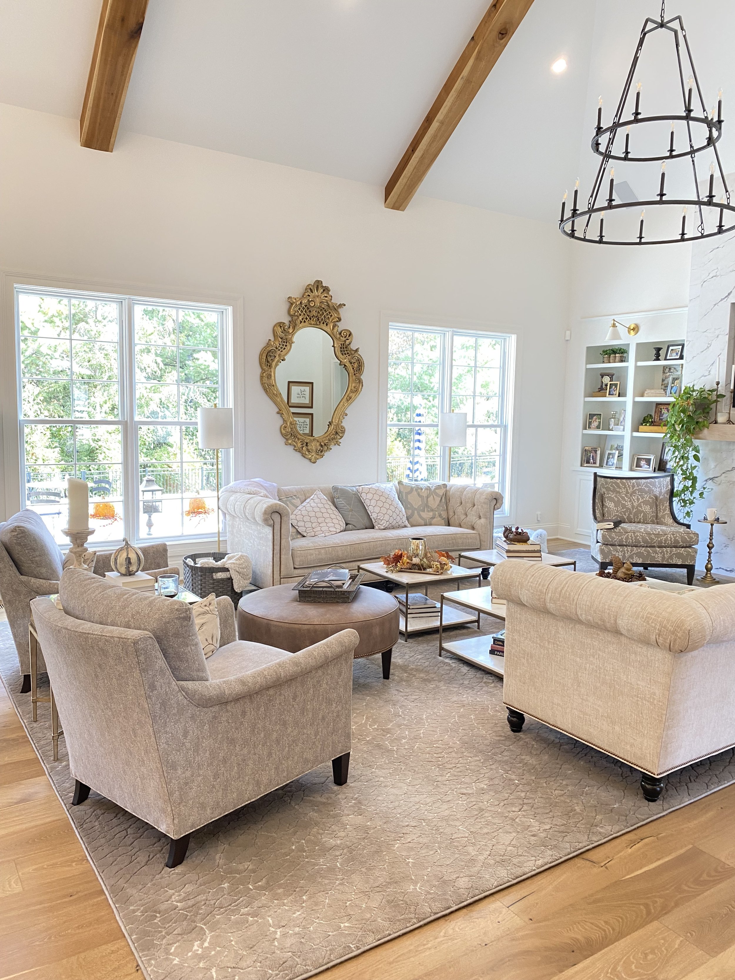
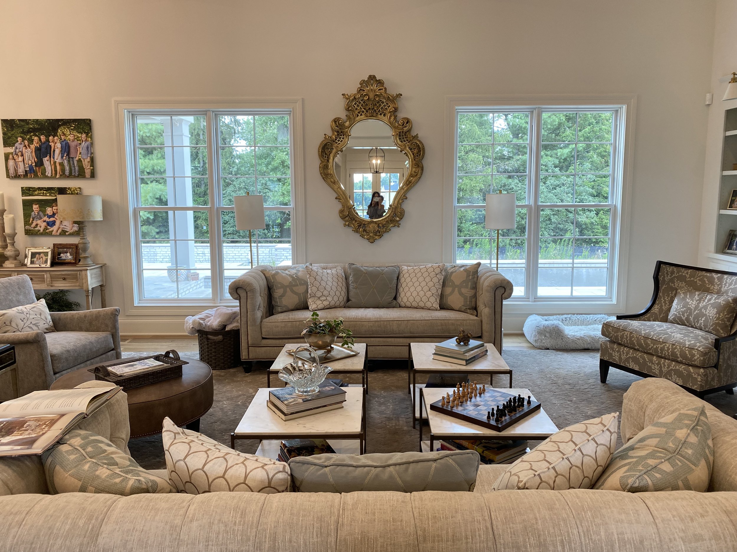
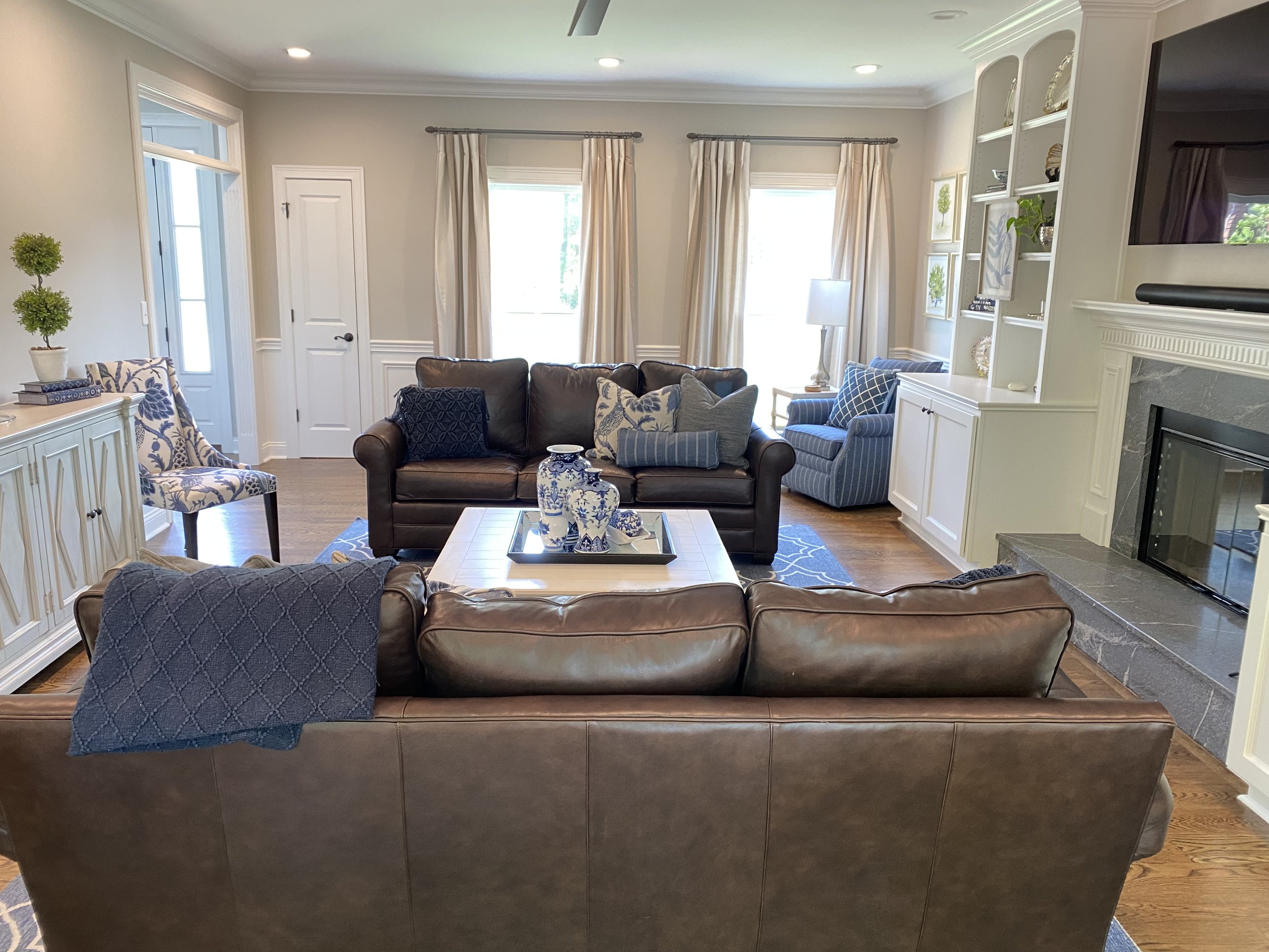
living rooms


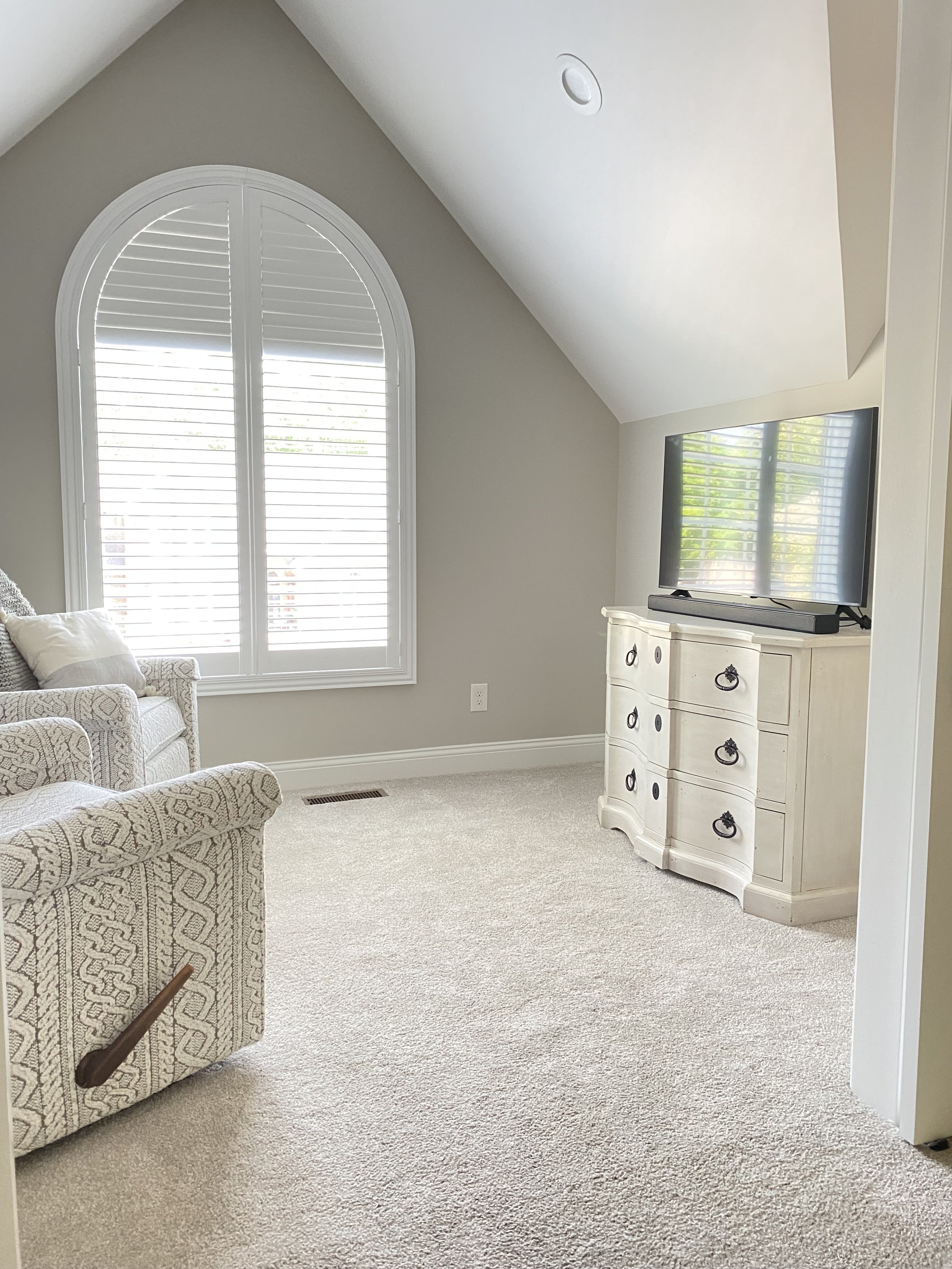
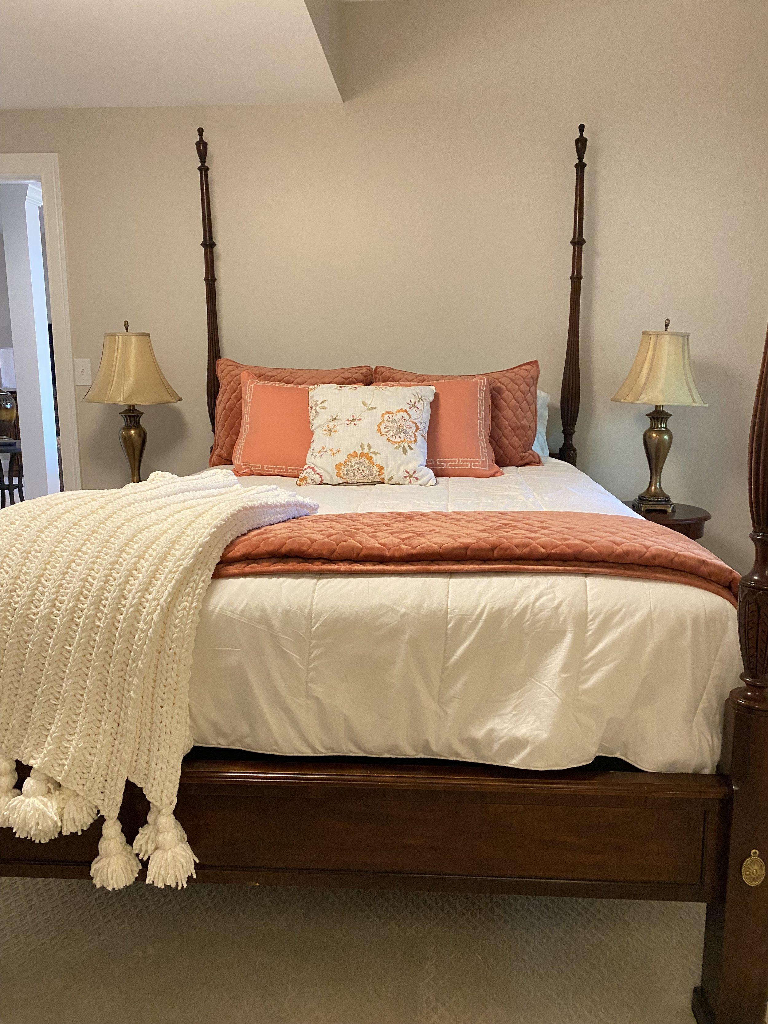
master bedrooms


guest bedrooms


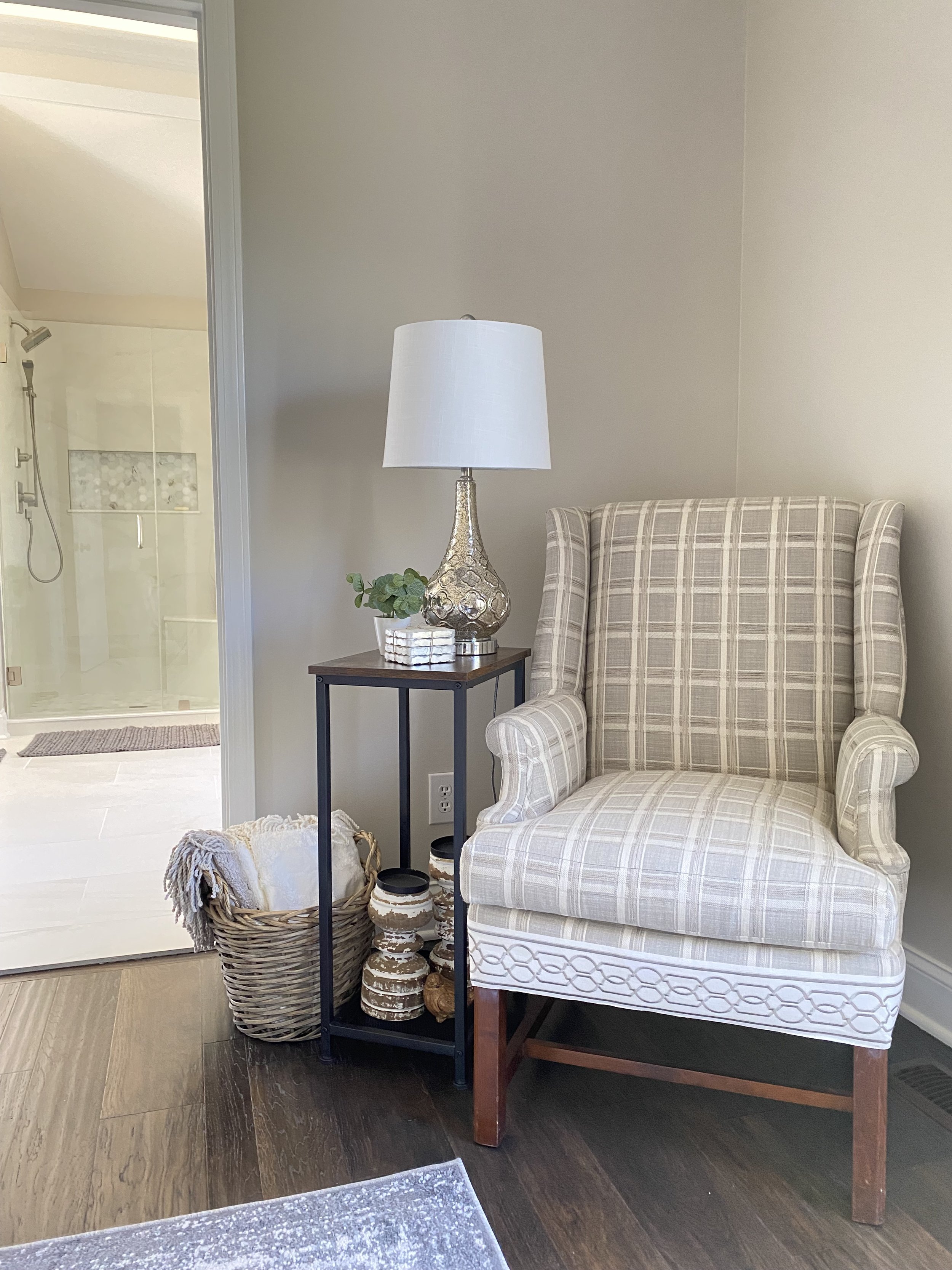
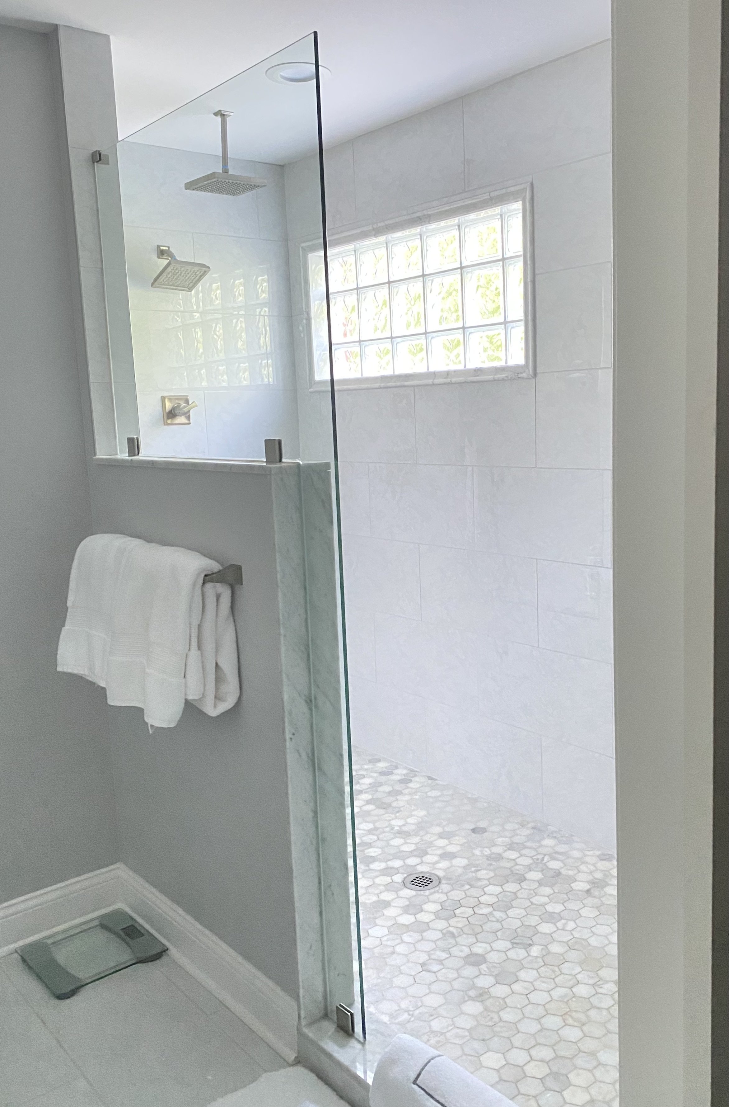
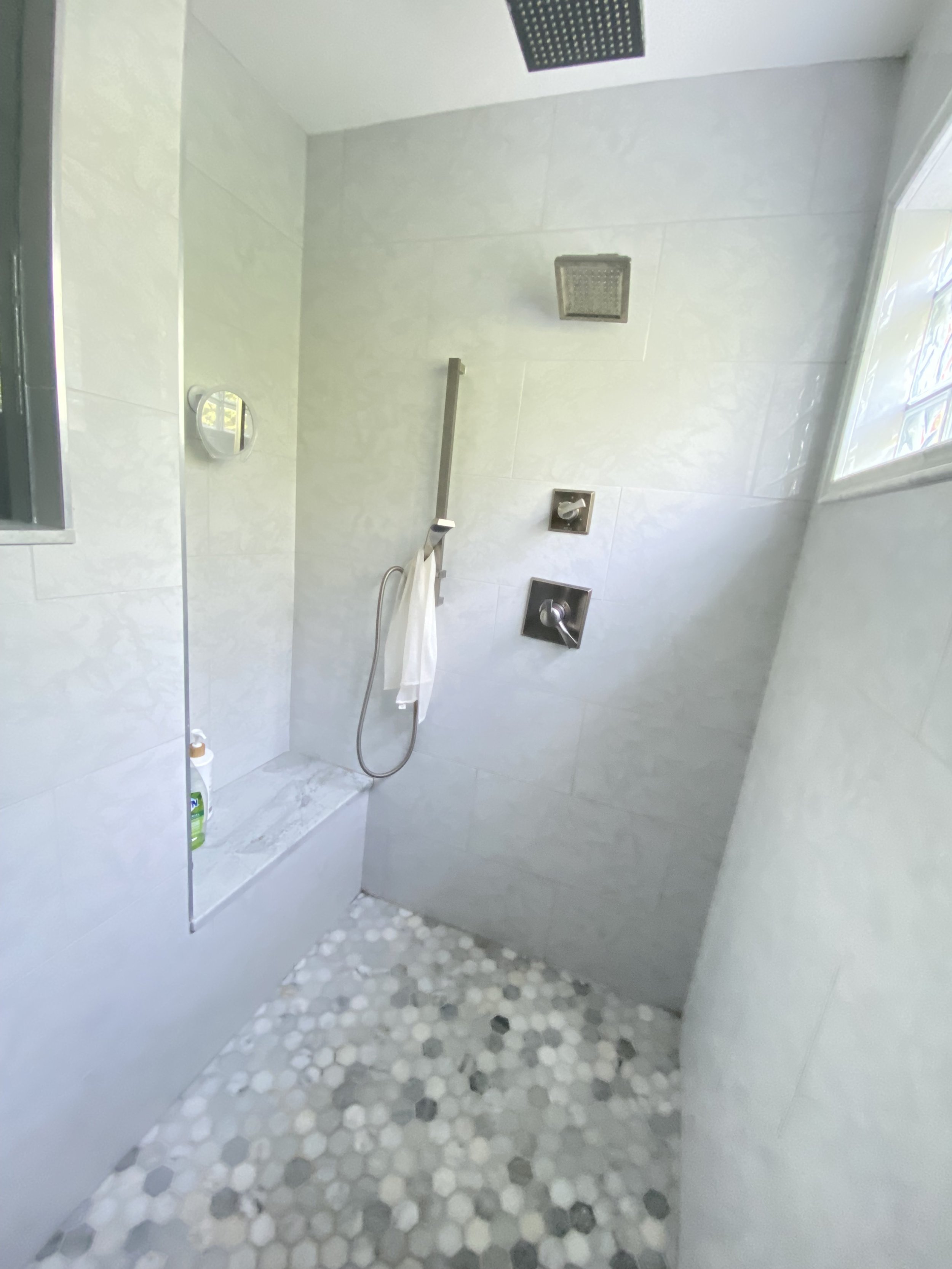
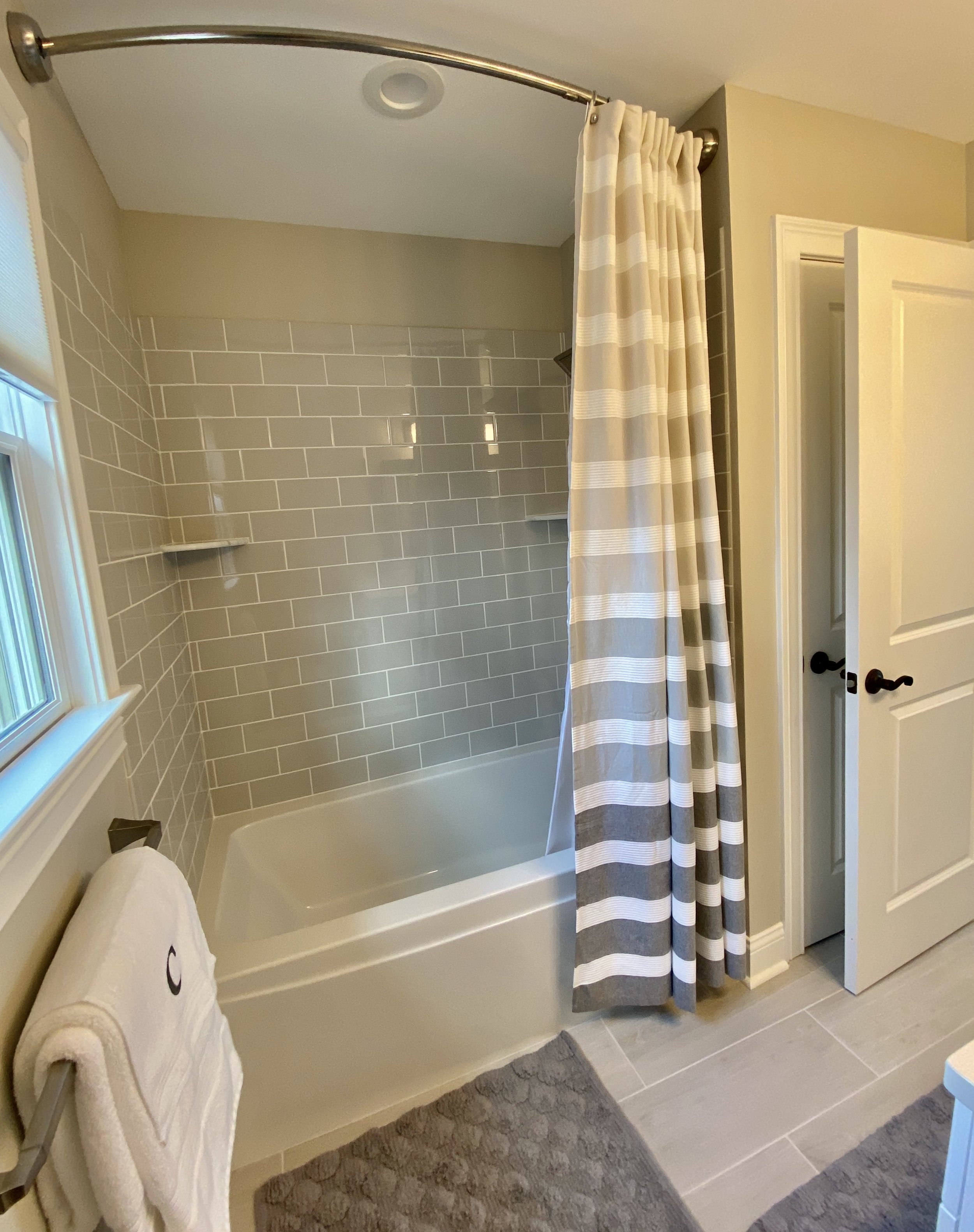
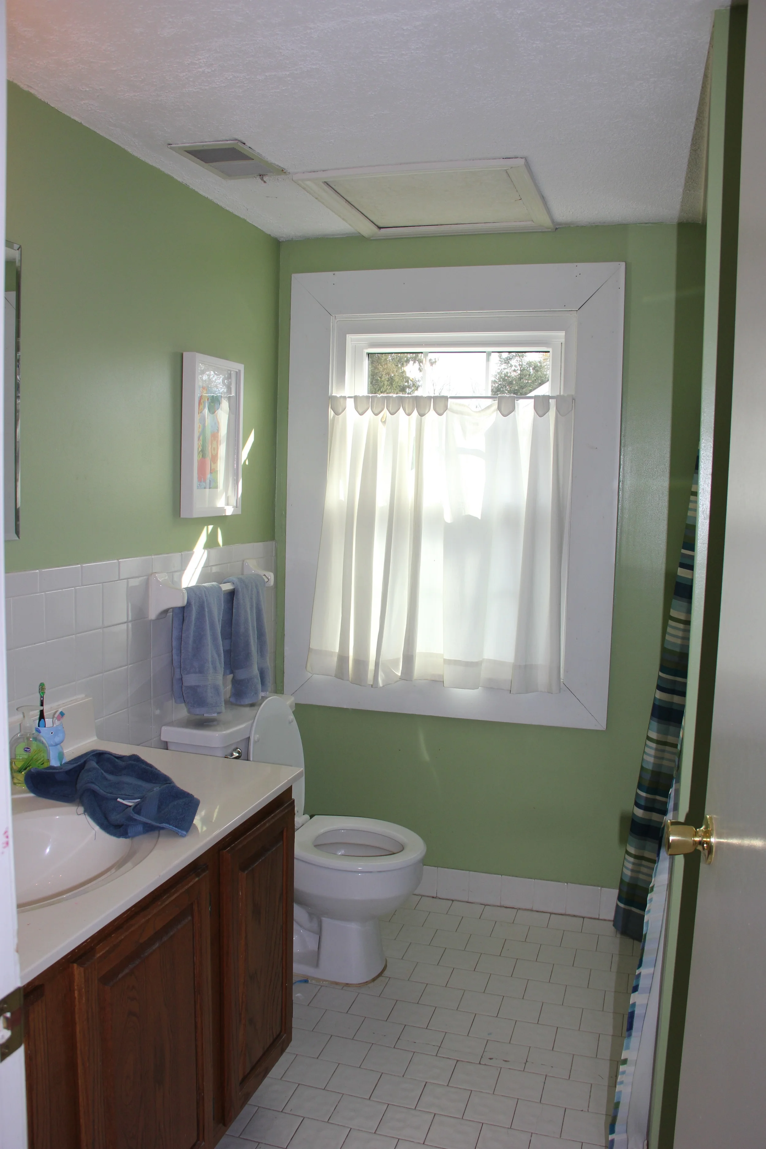
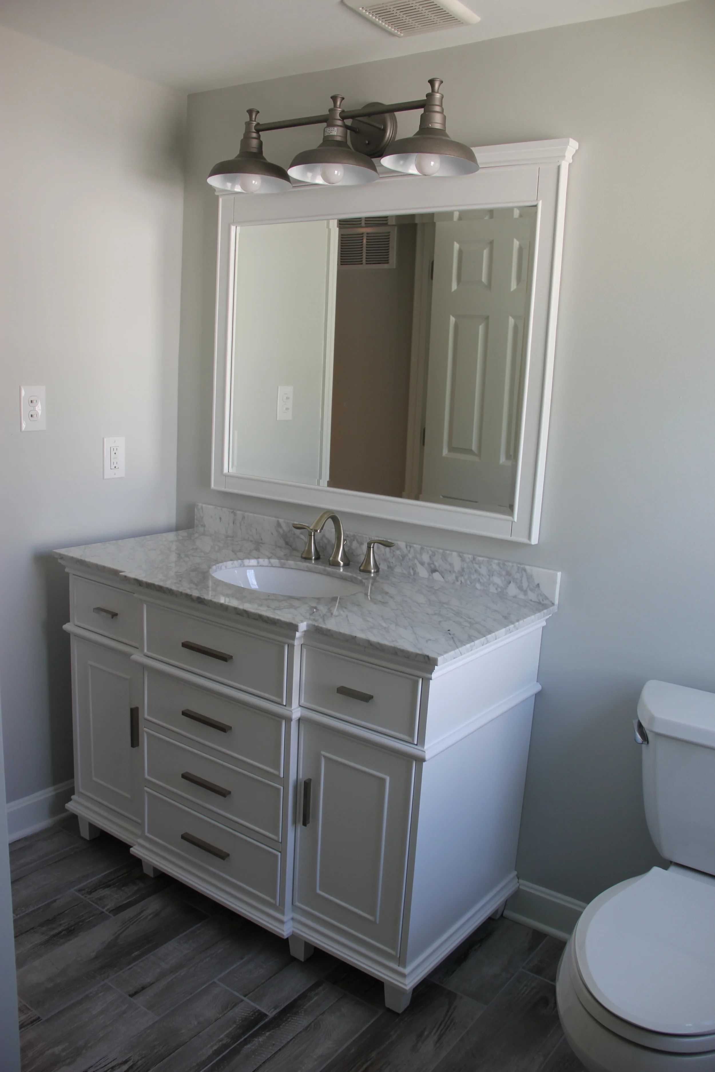
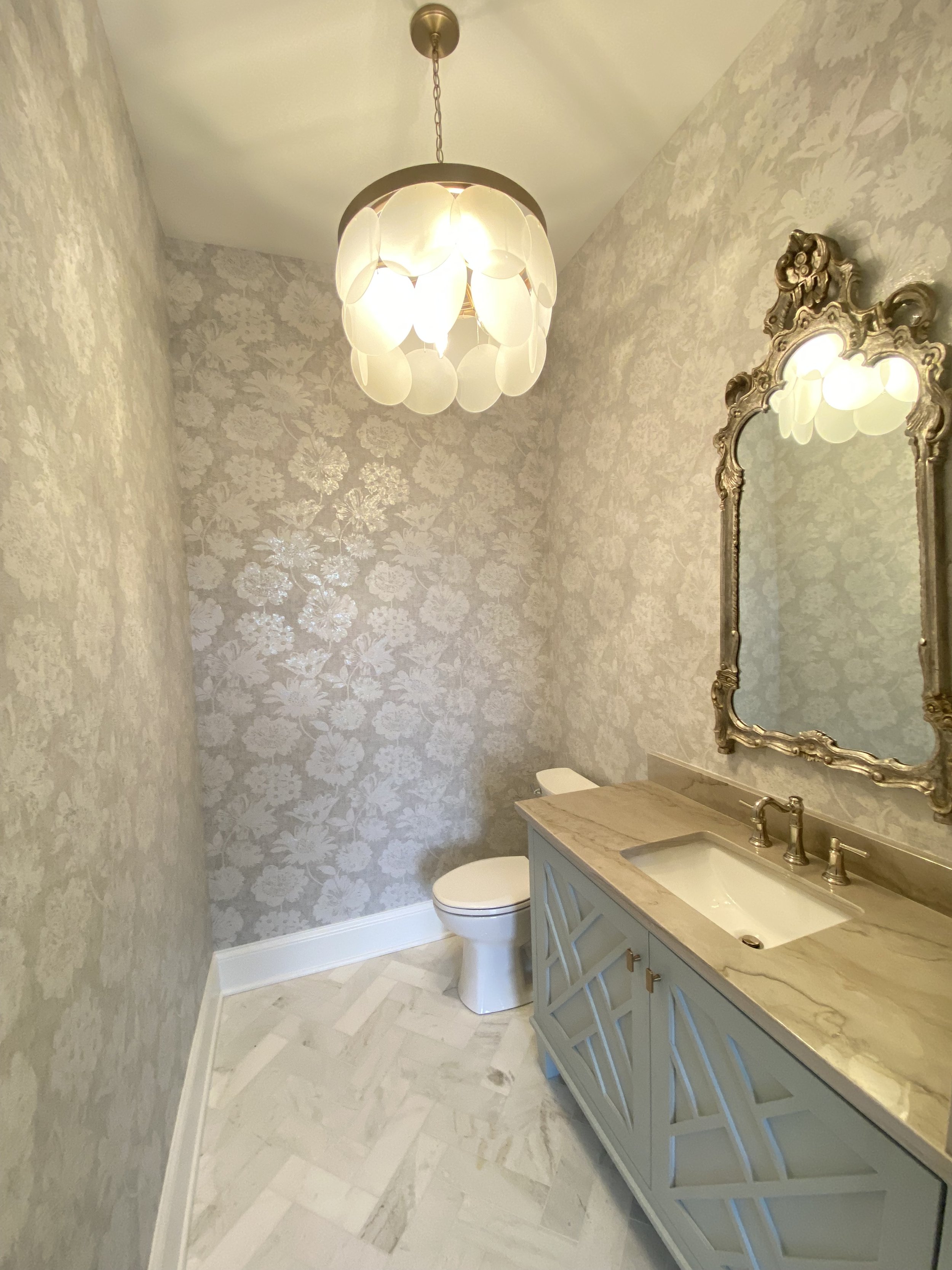
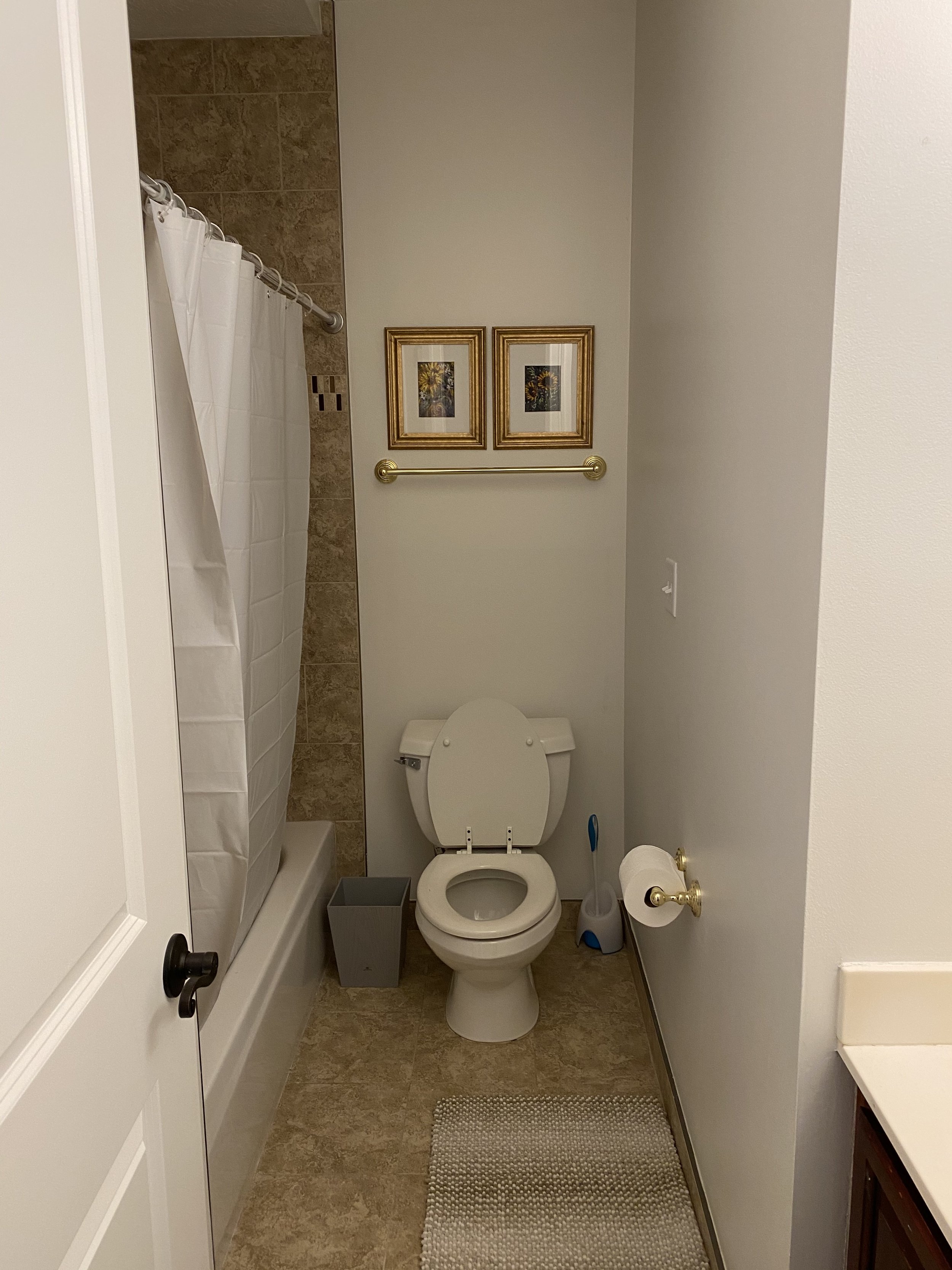
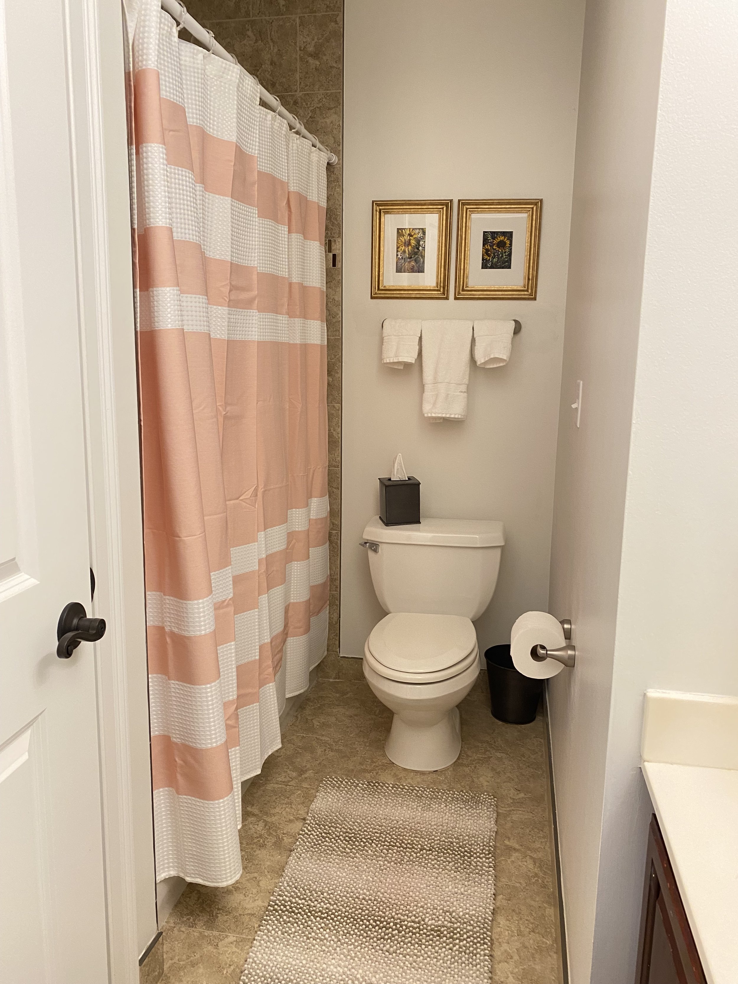
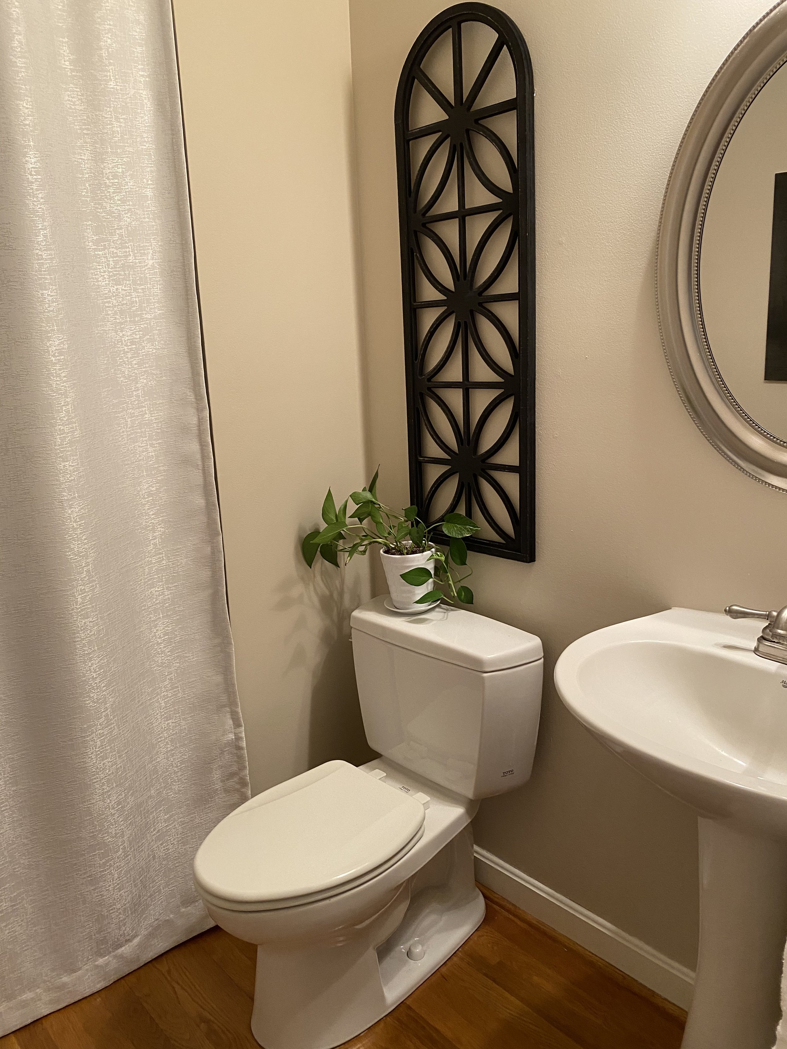
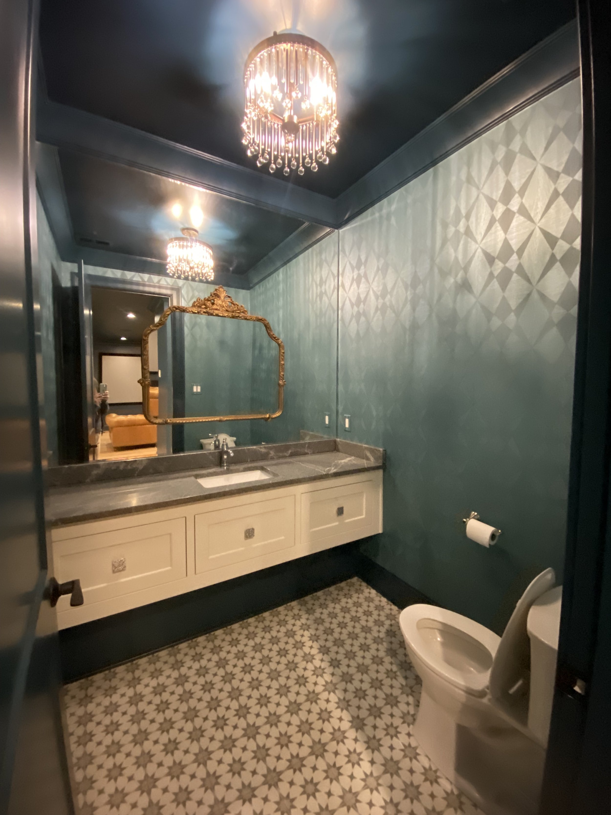
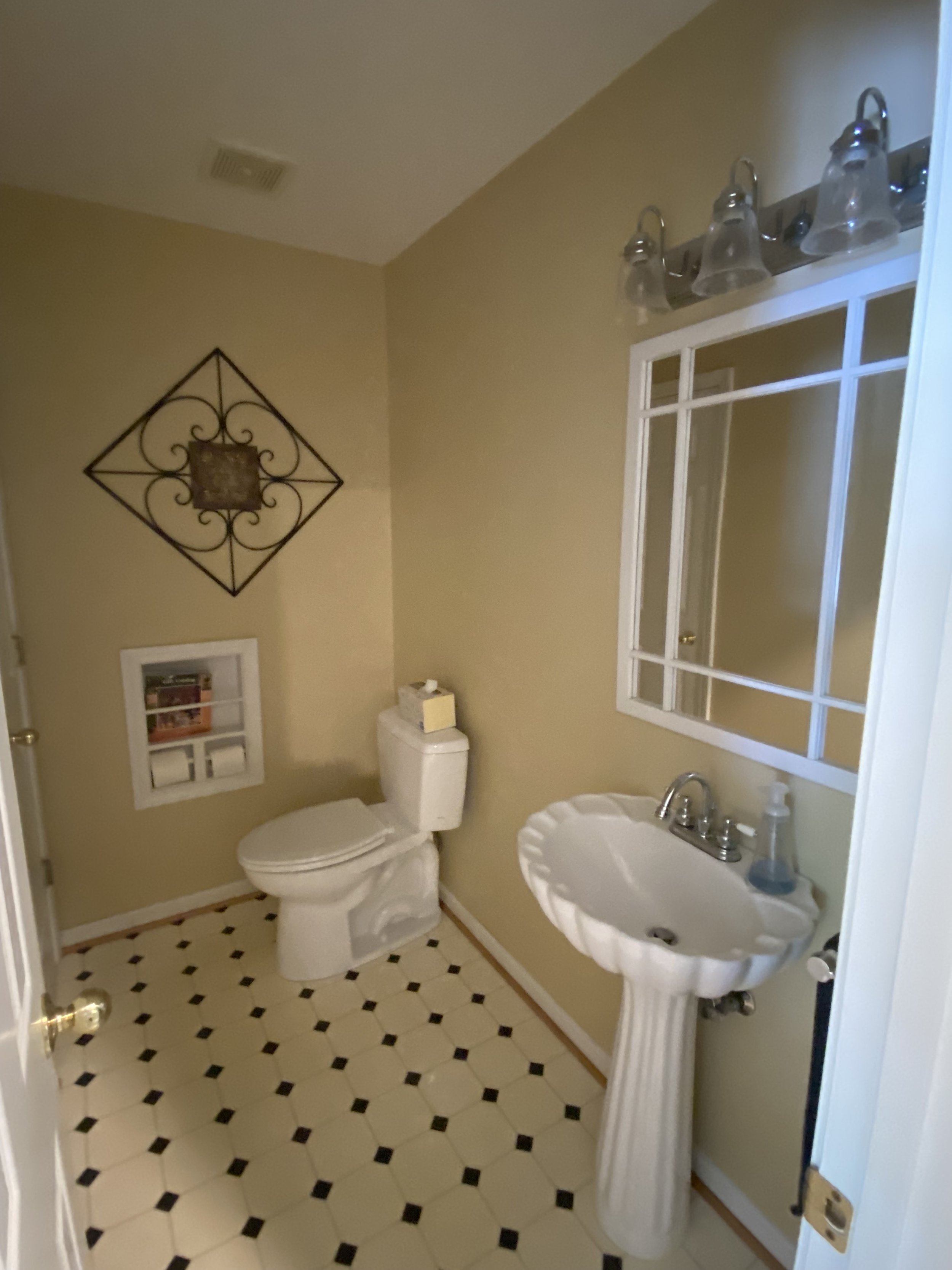
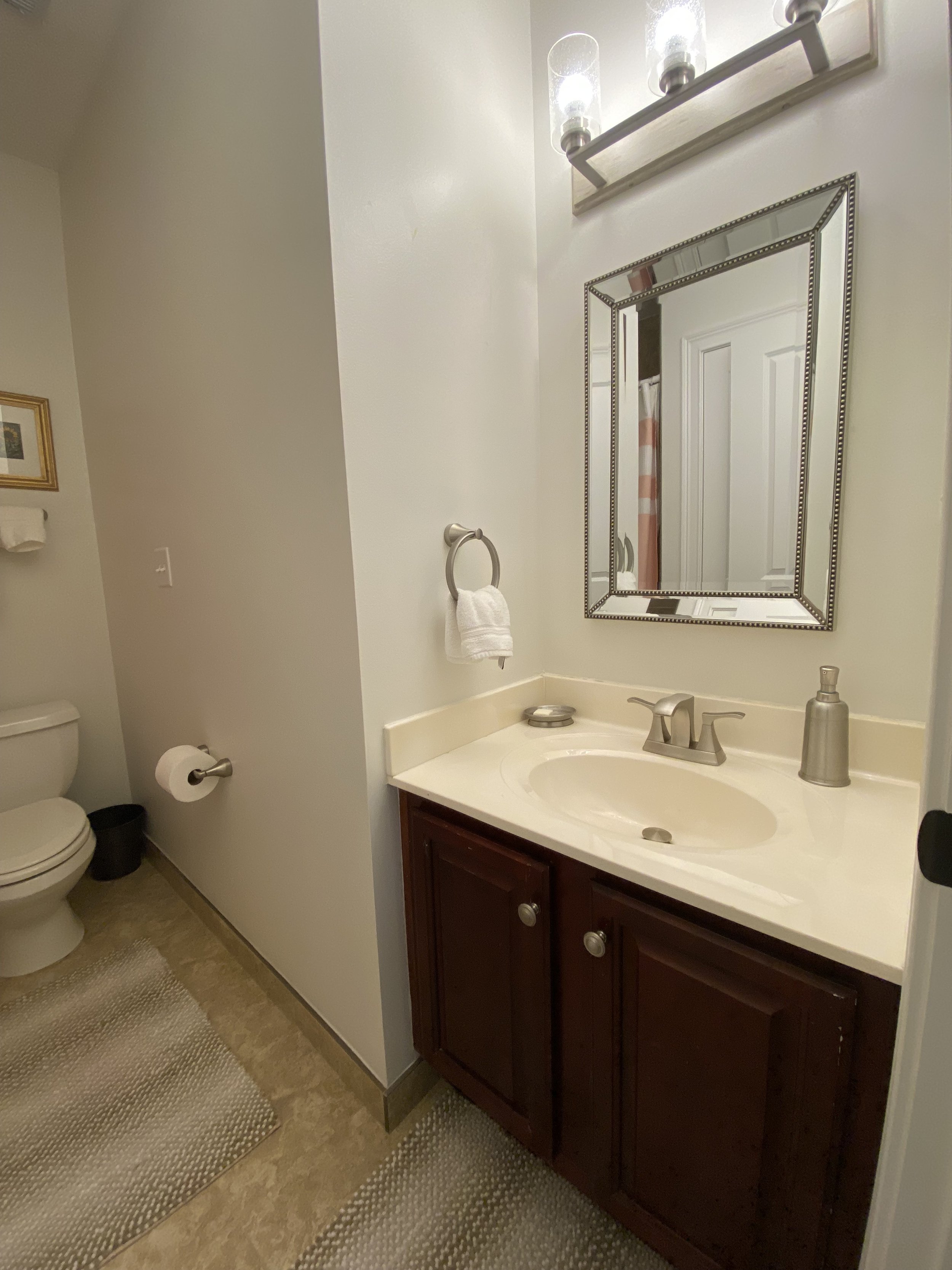
master baths


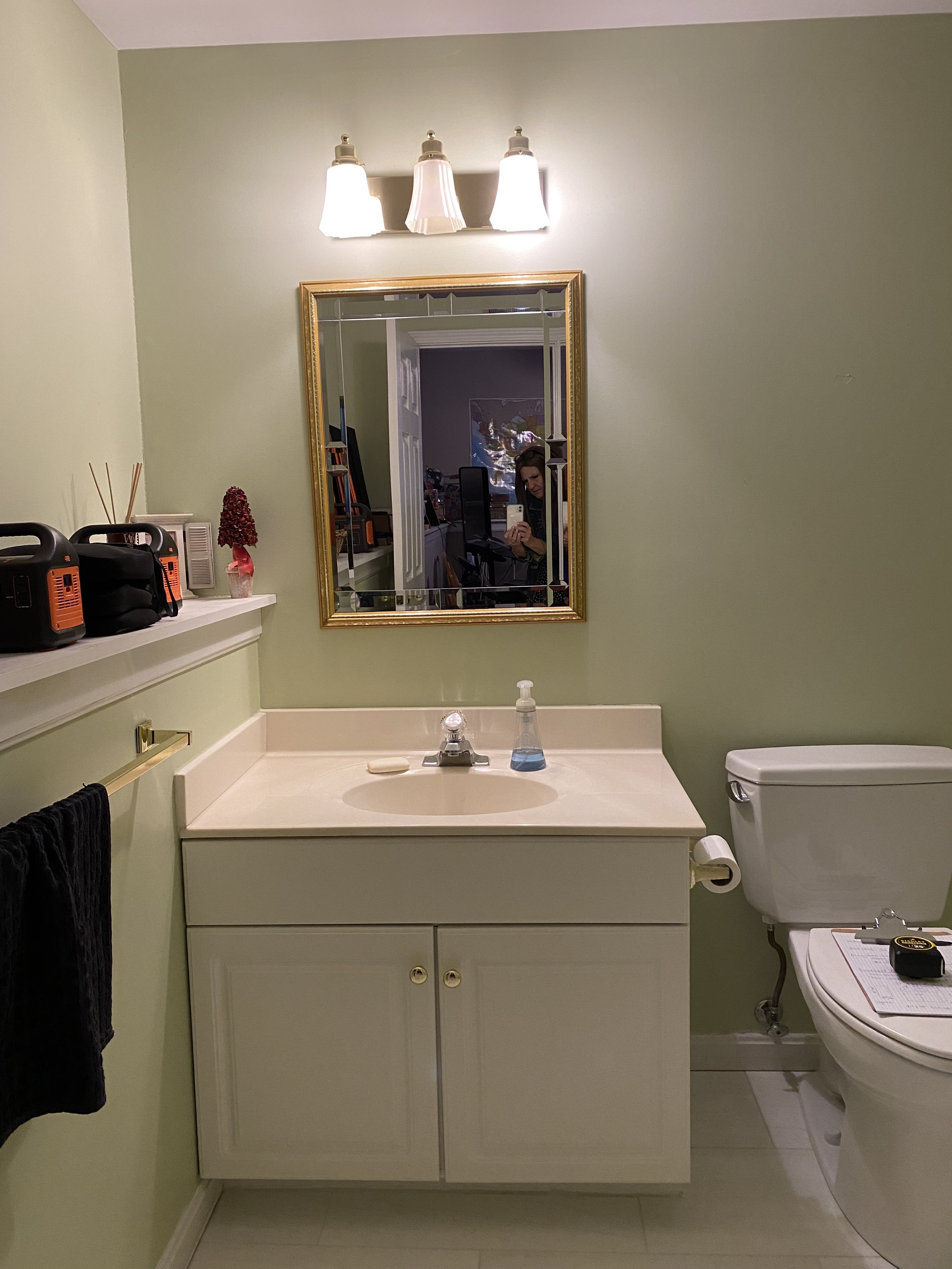
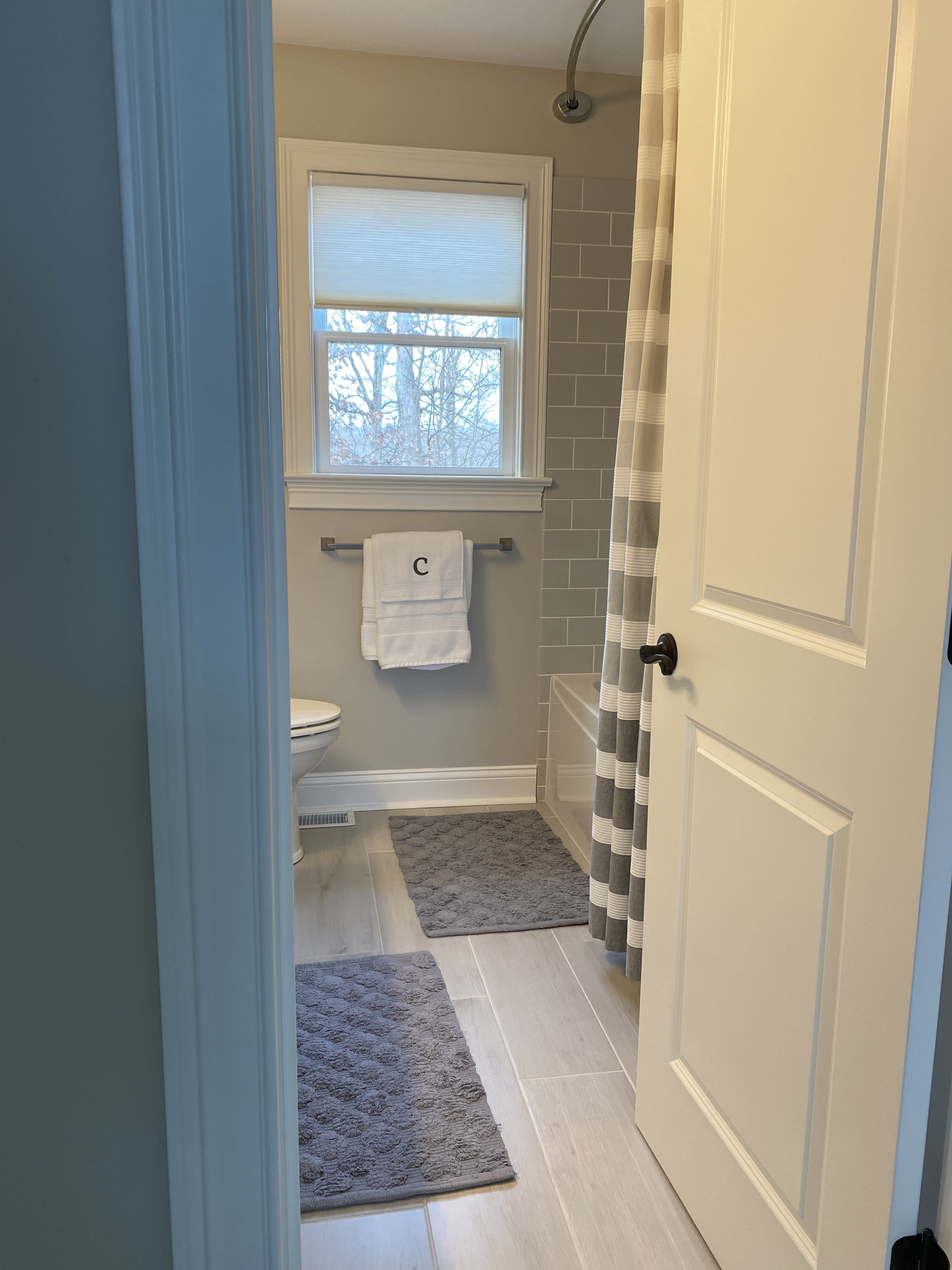
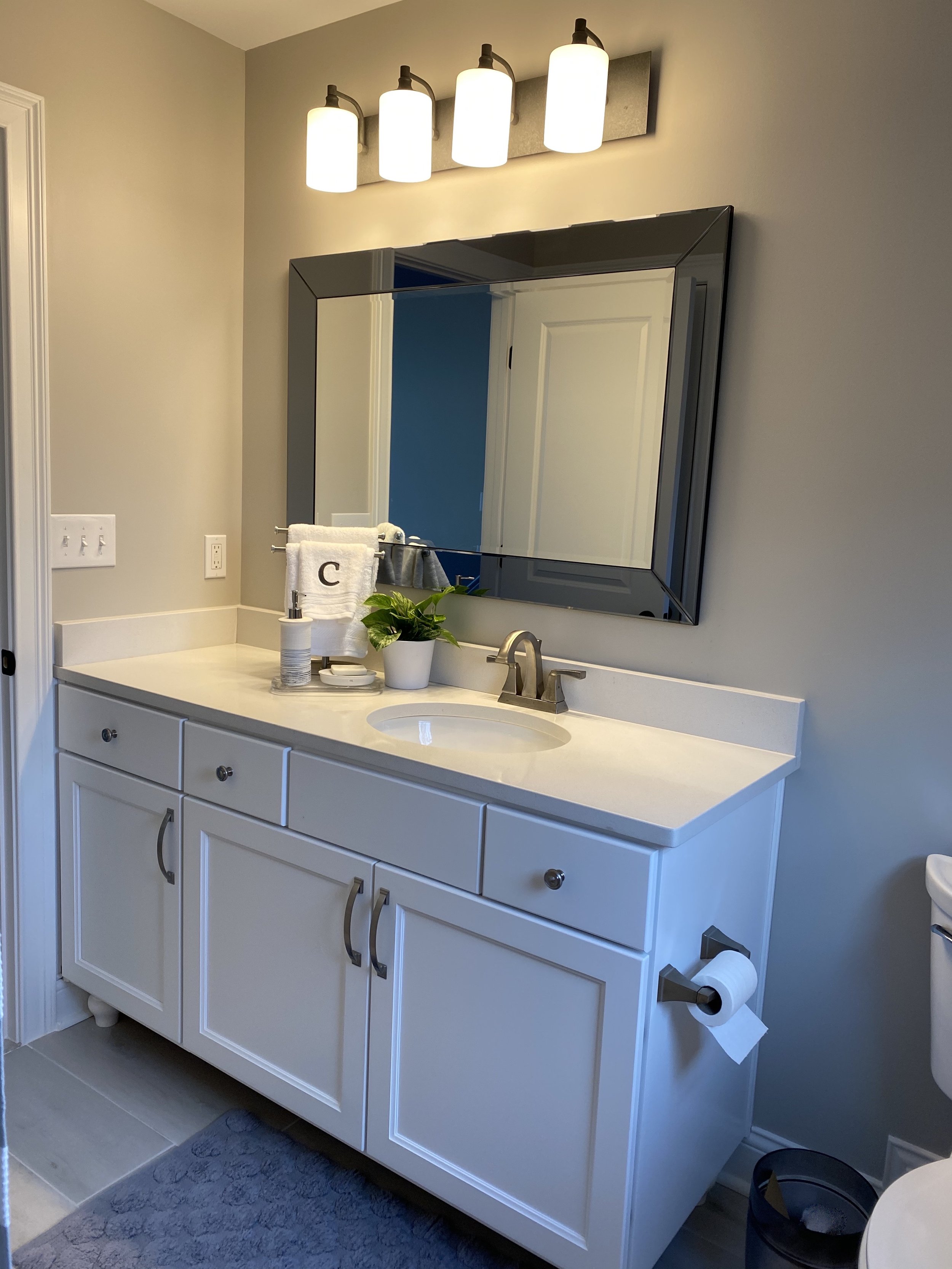
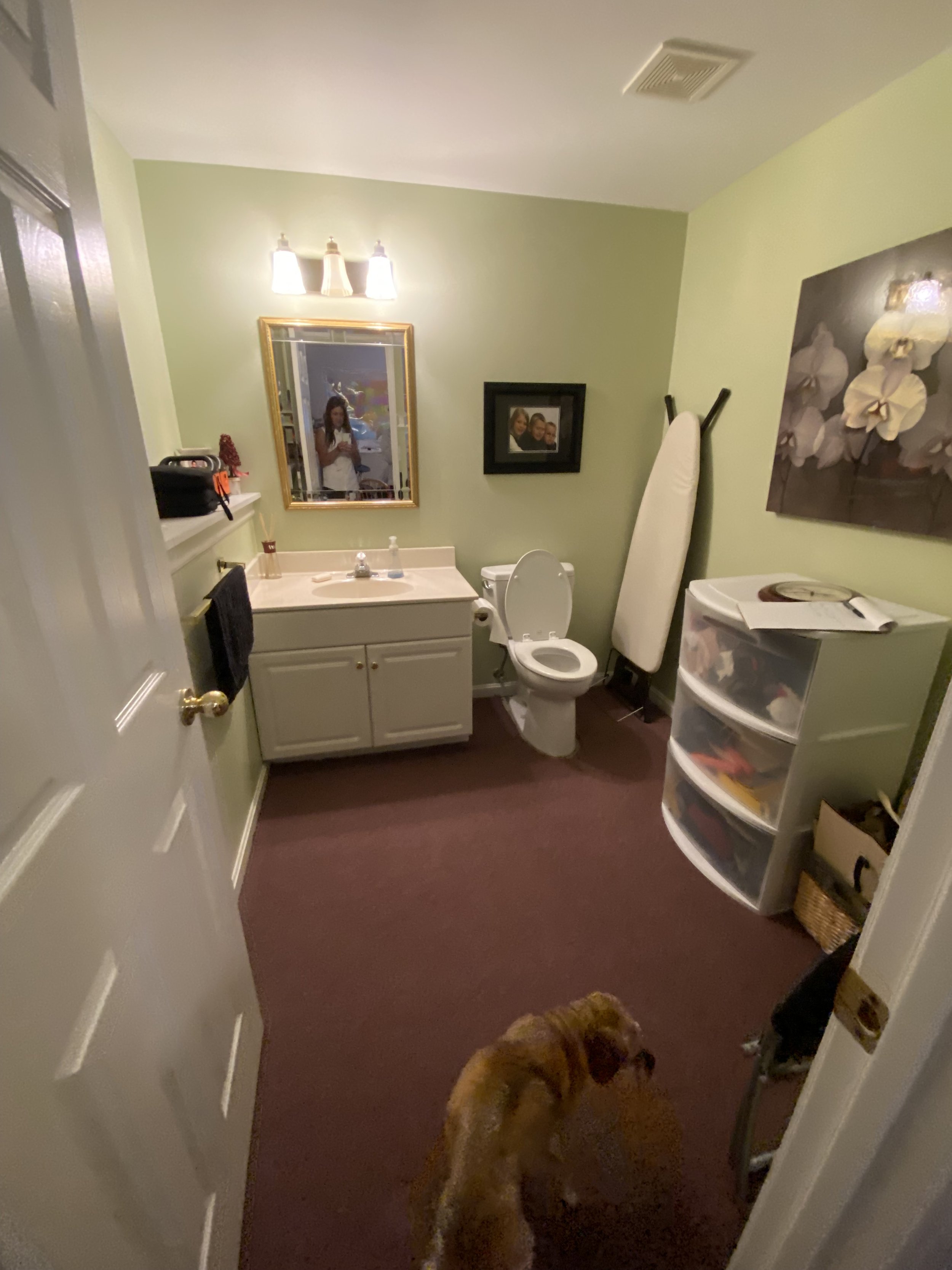
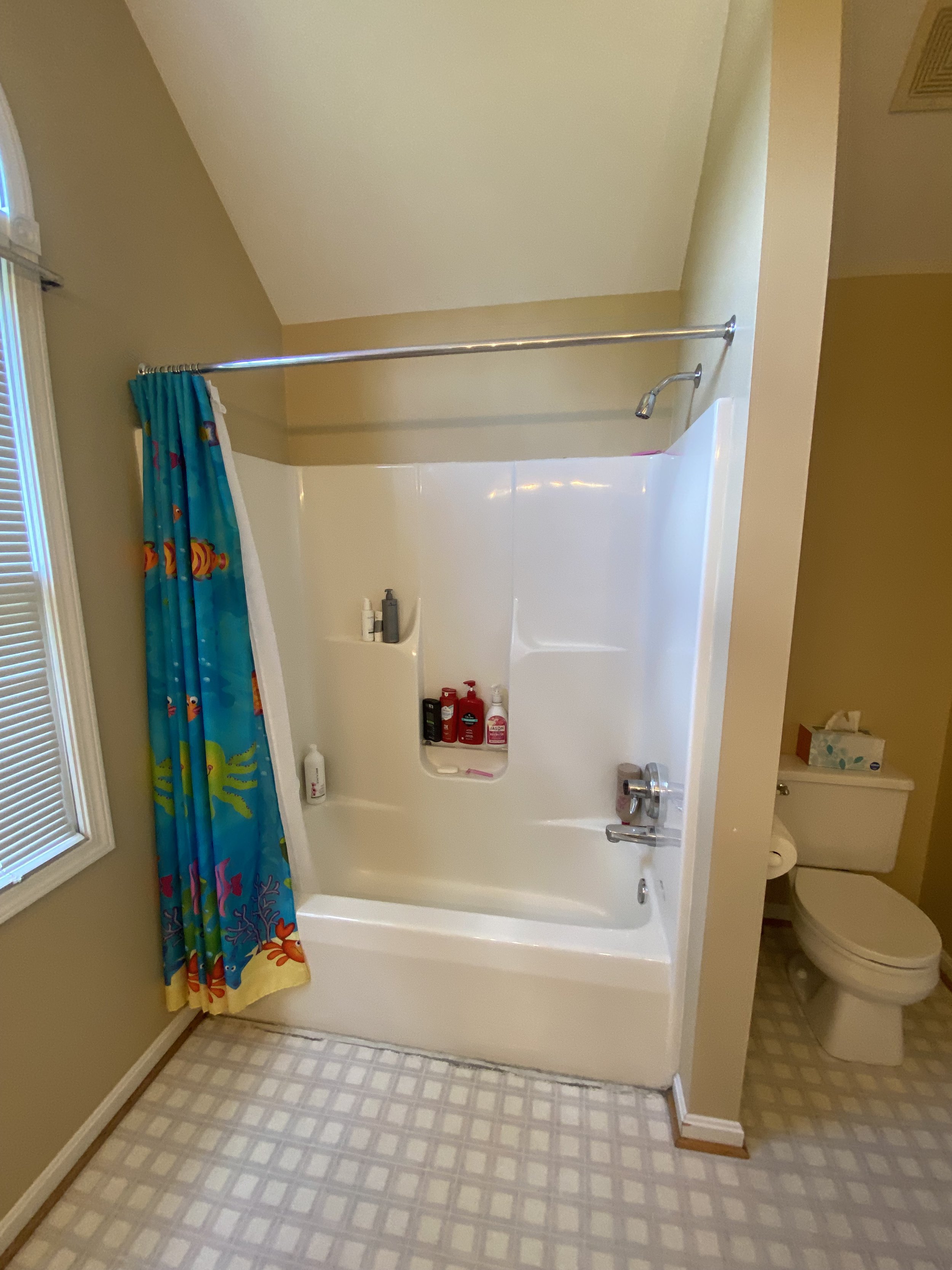
bathrooms


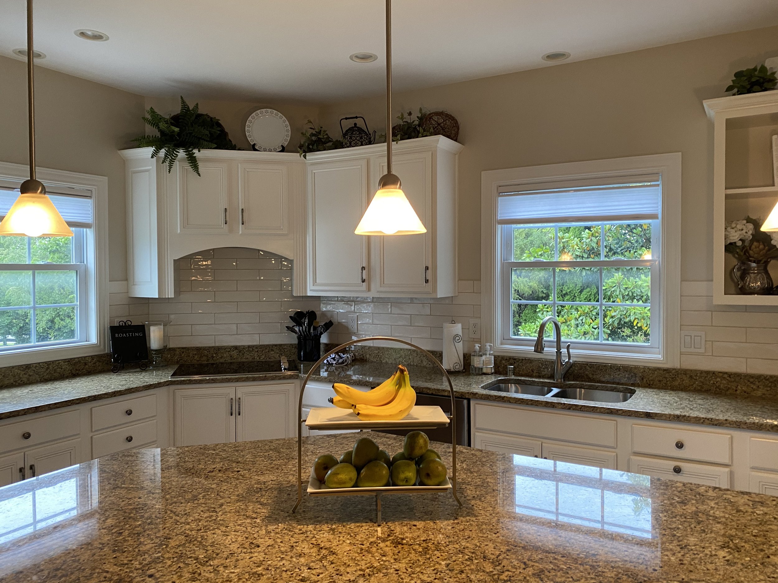
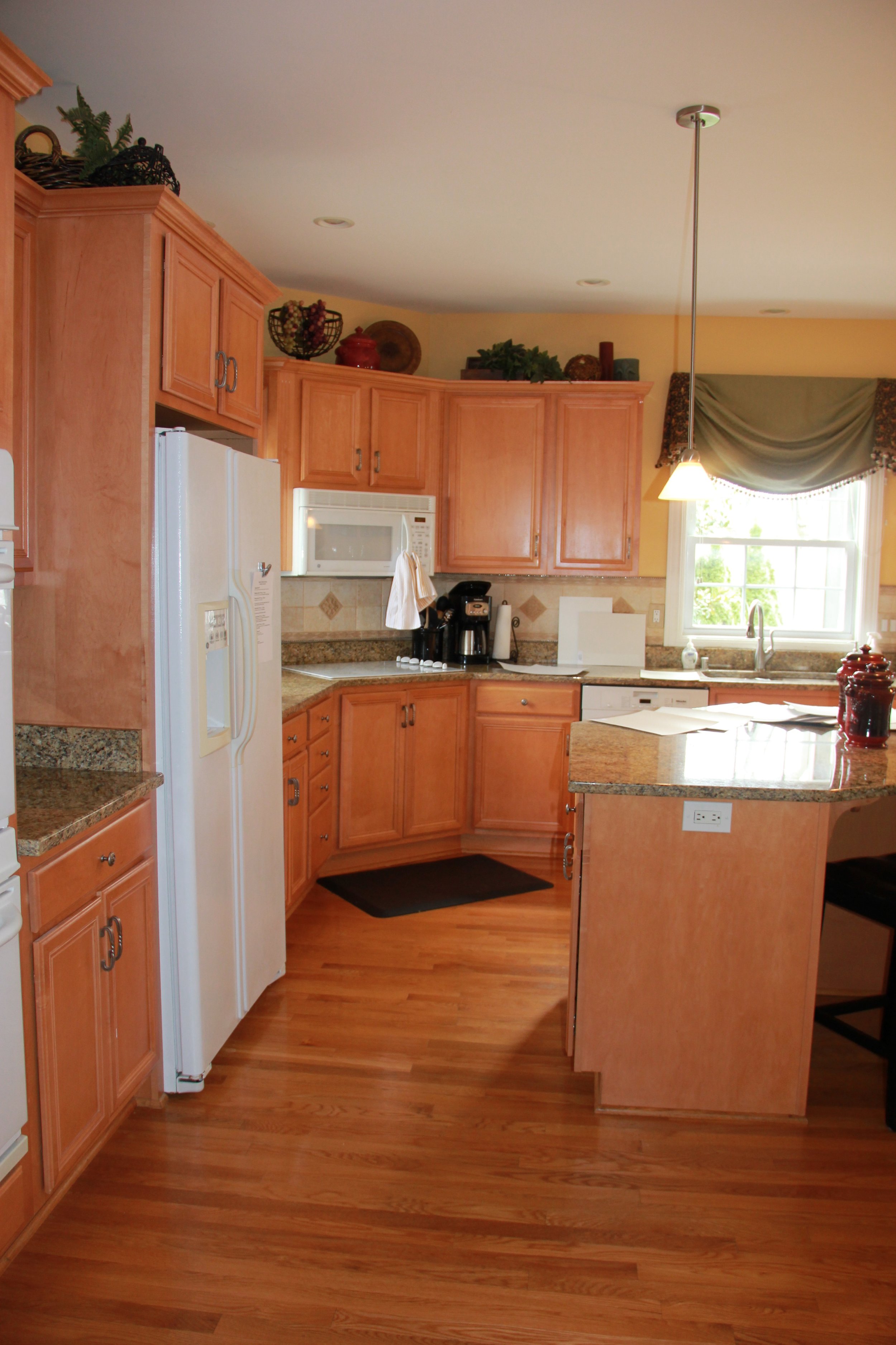
kitchens


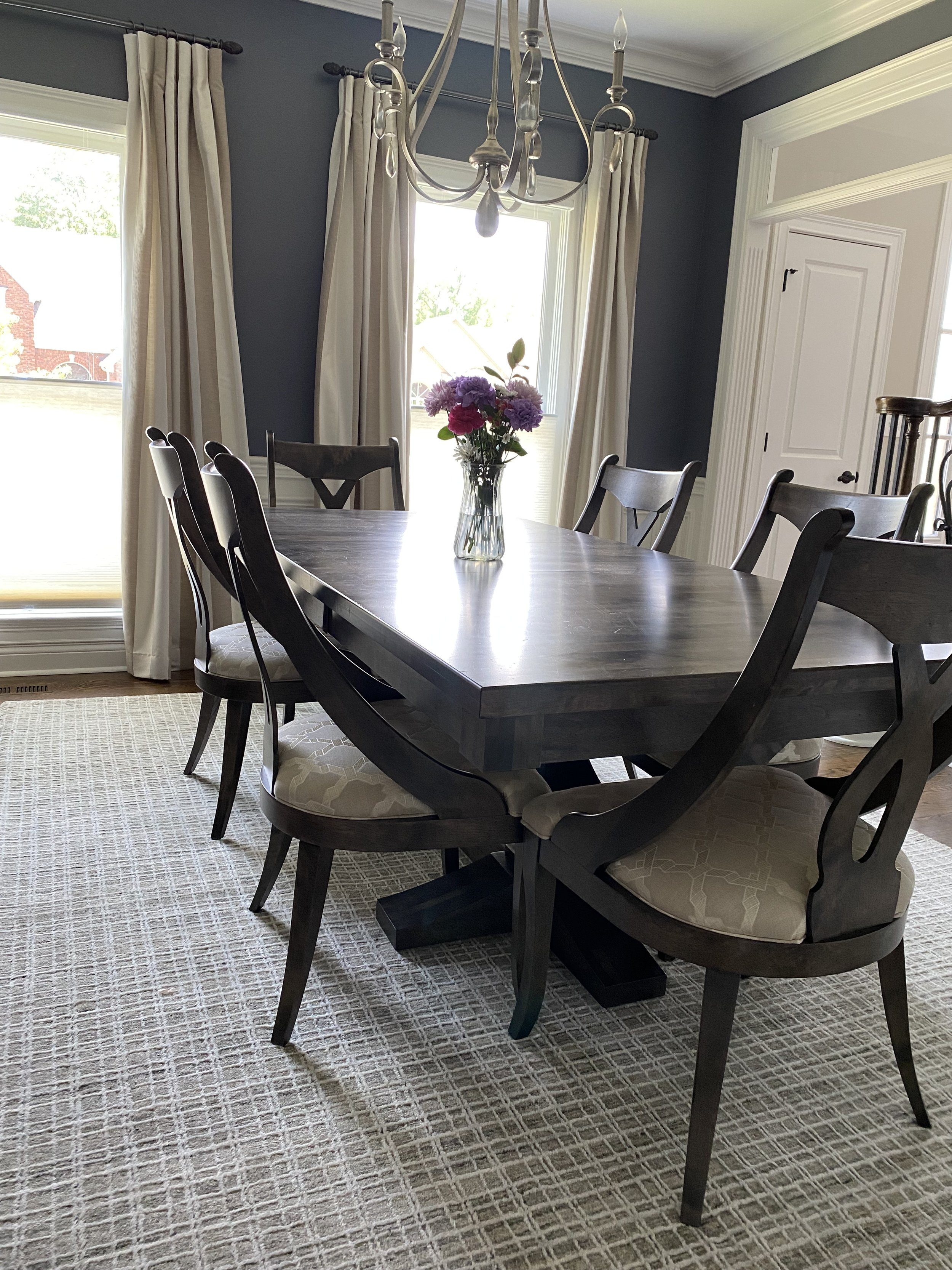
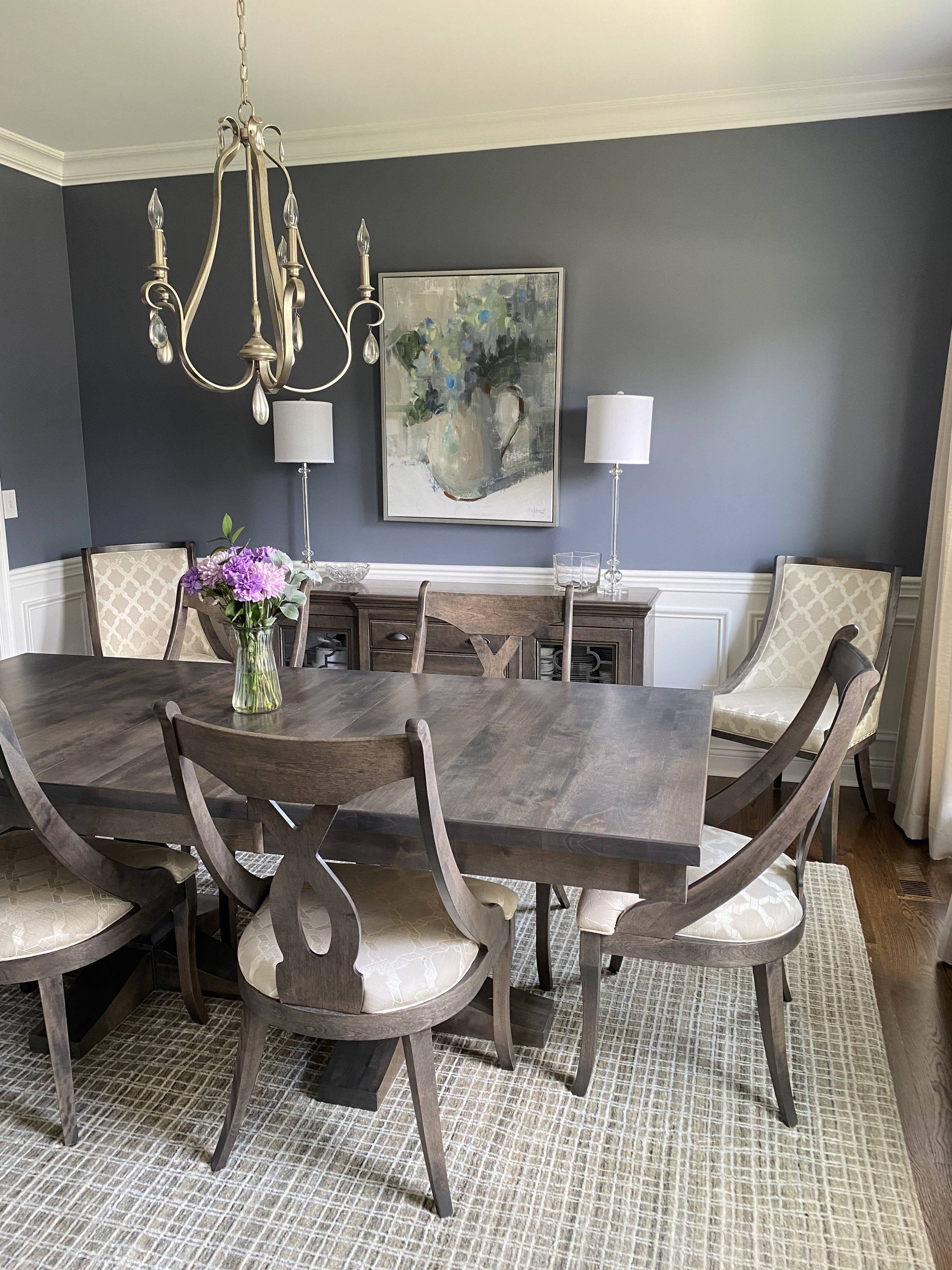
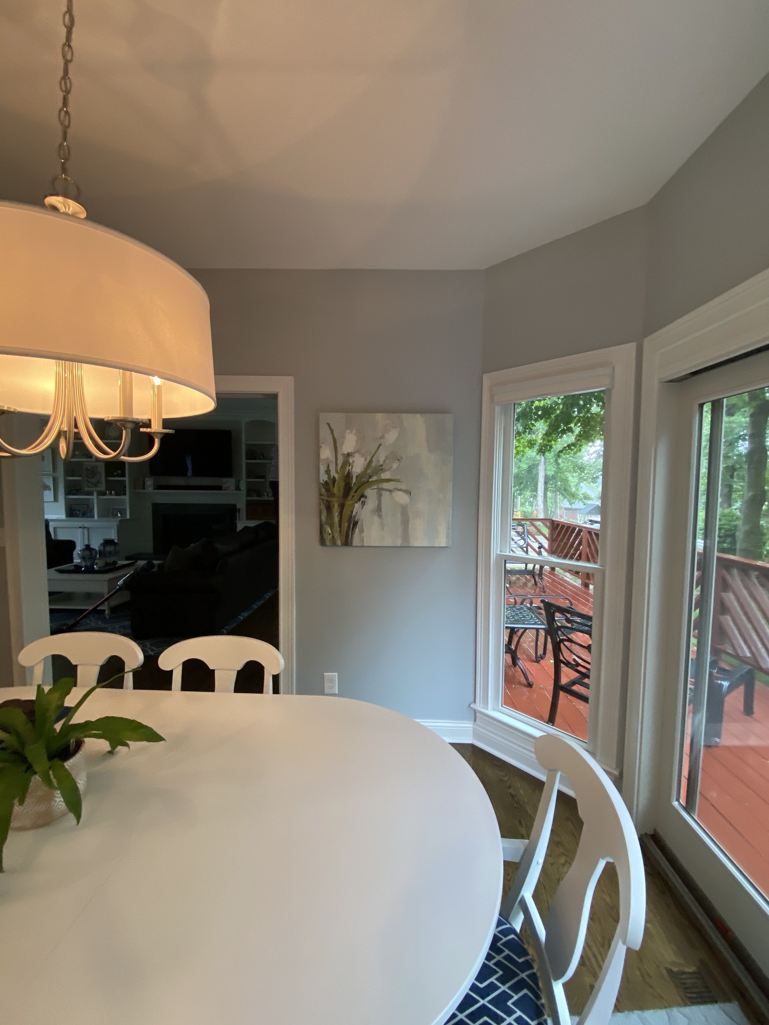
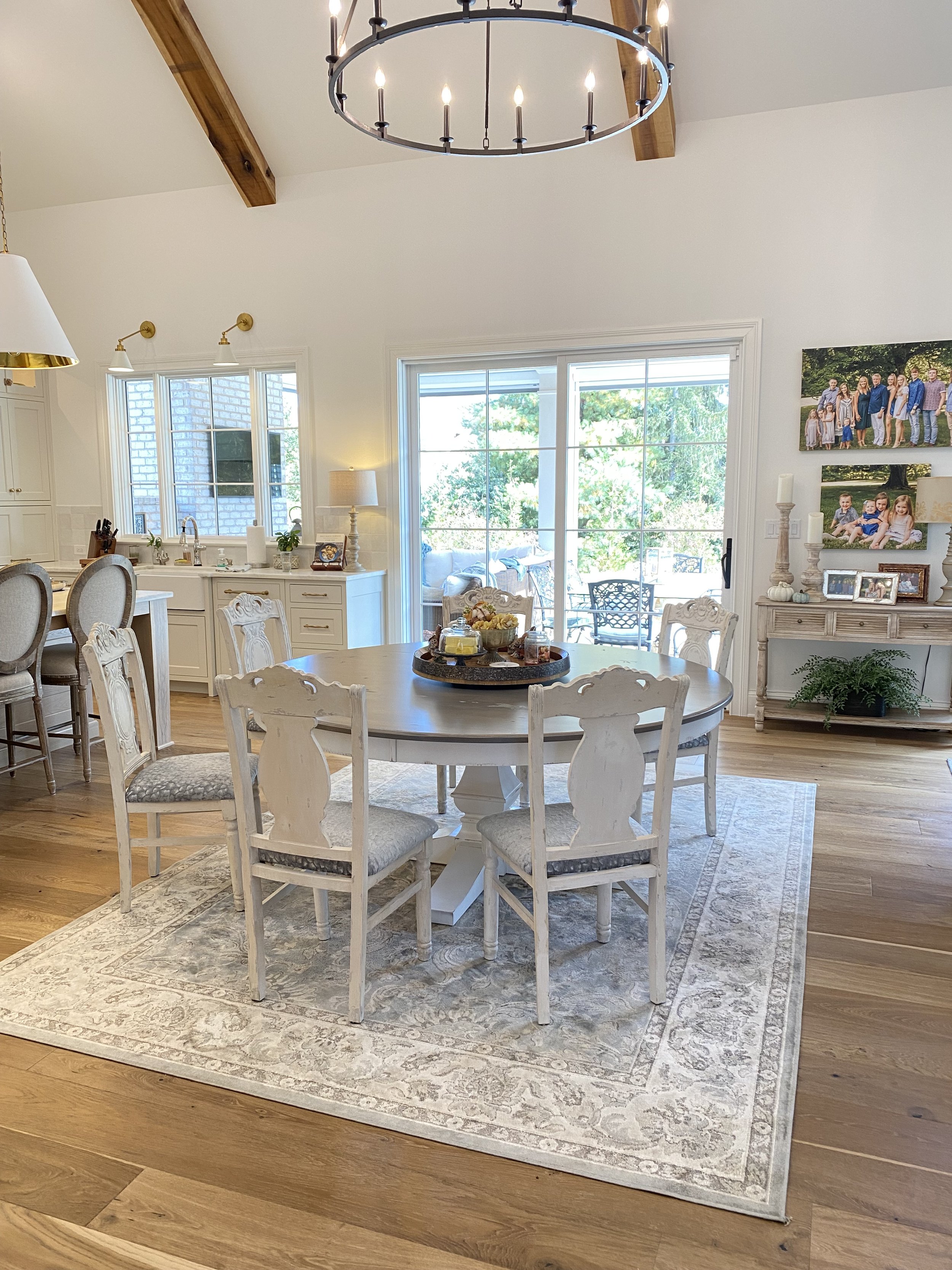
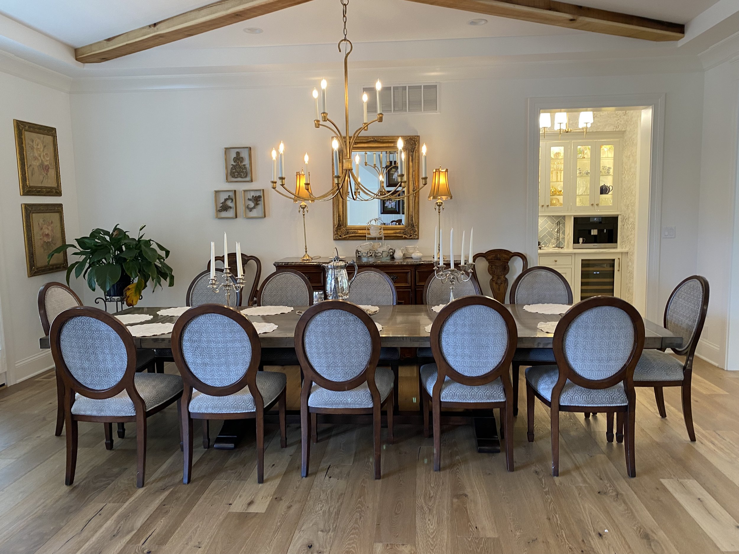
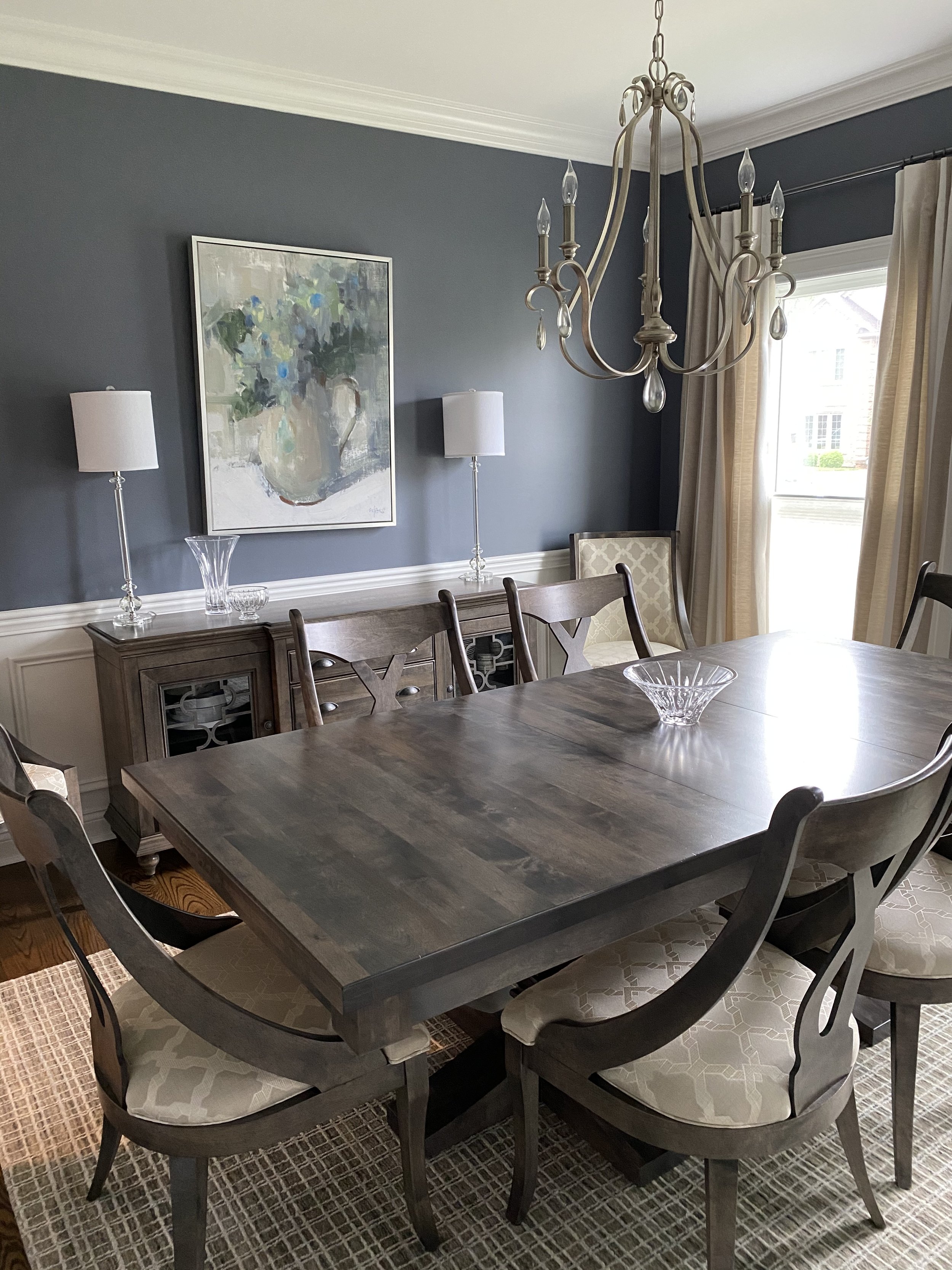
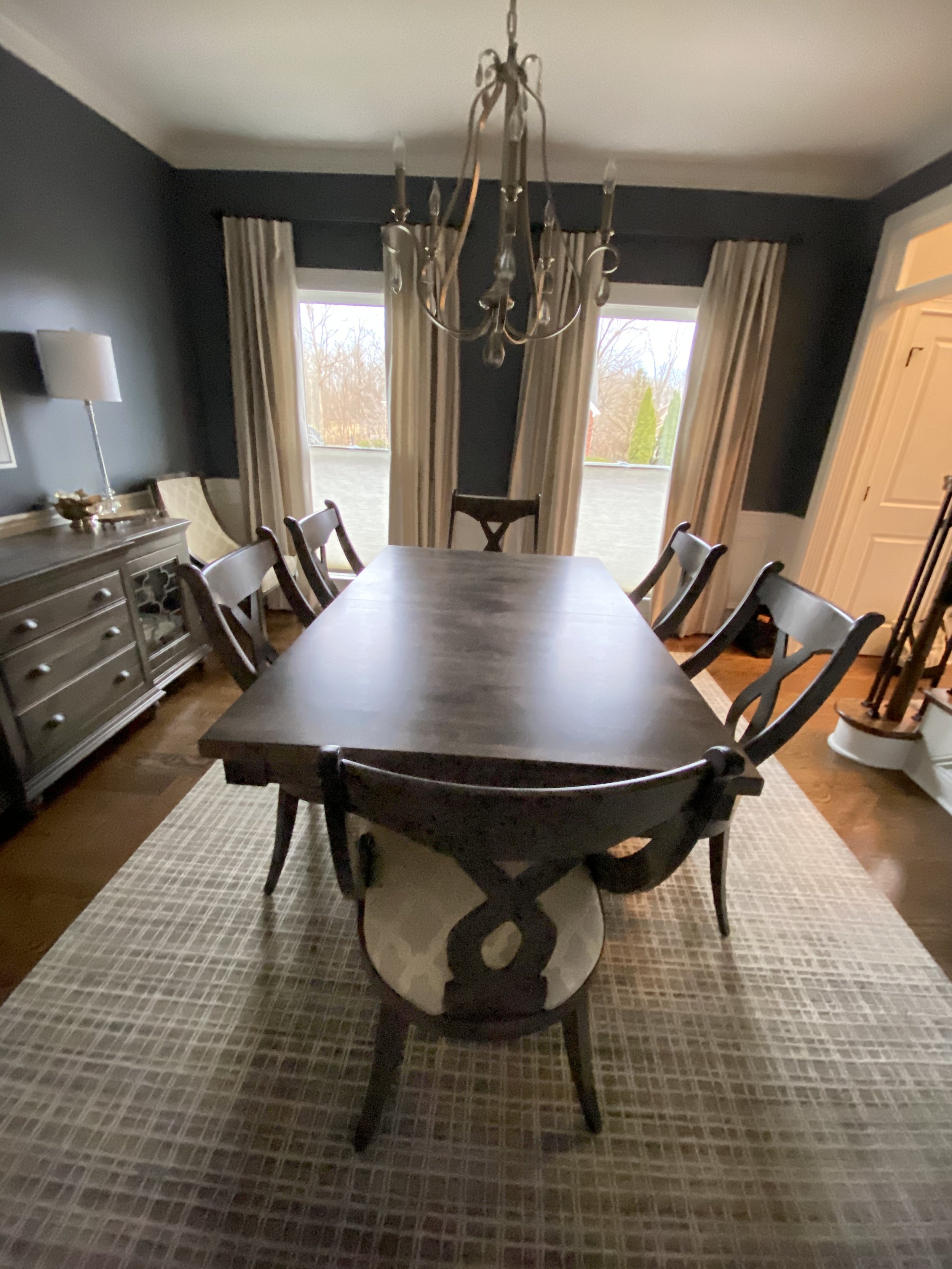
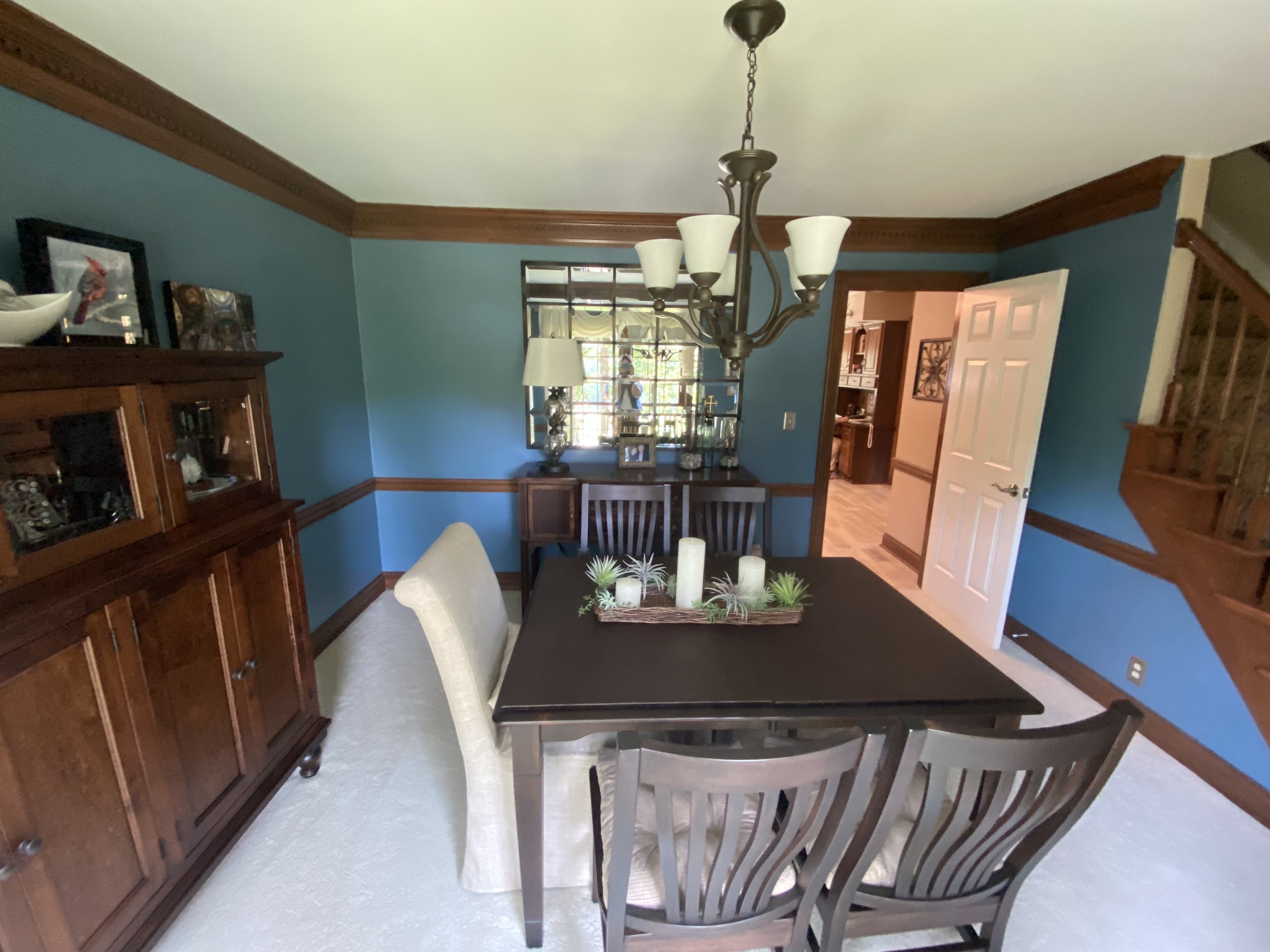
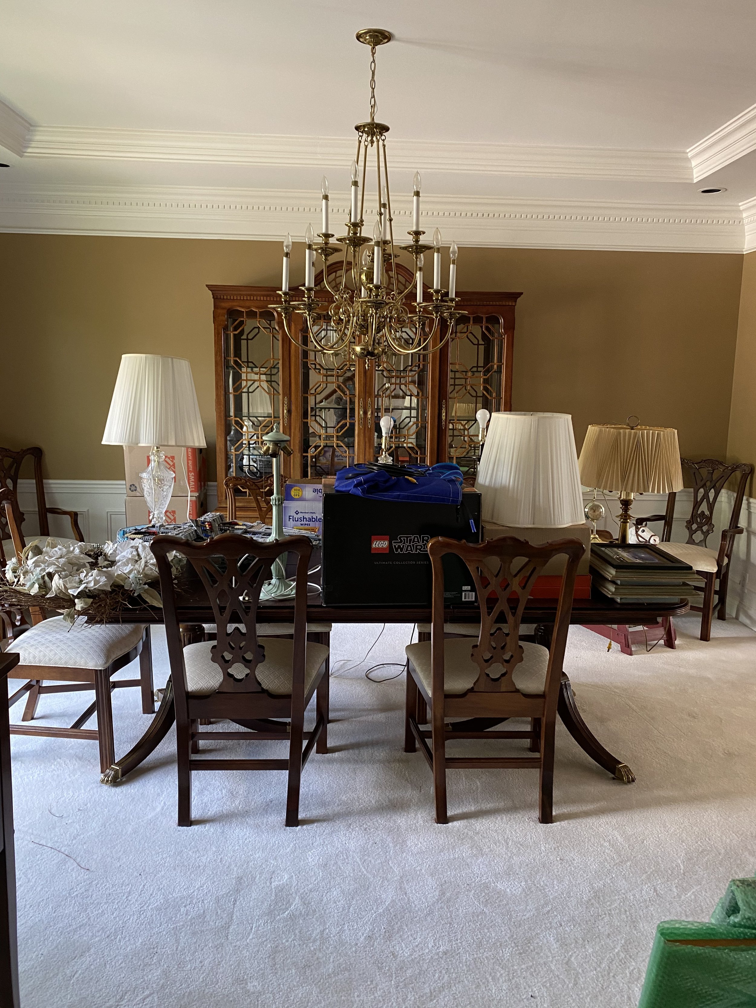
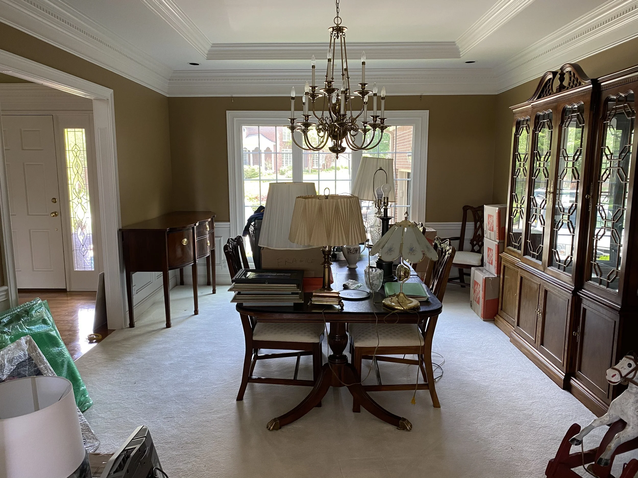
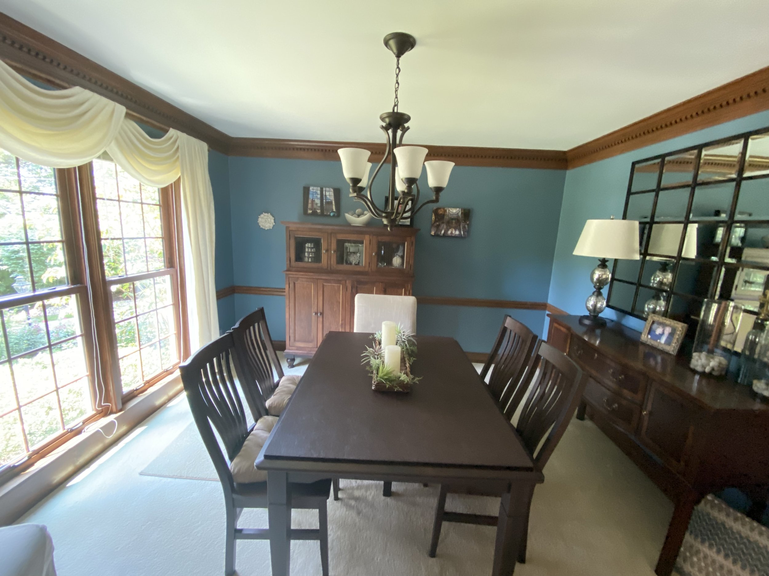
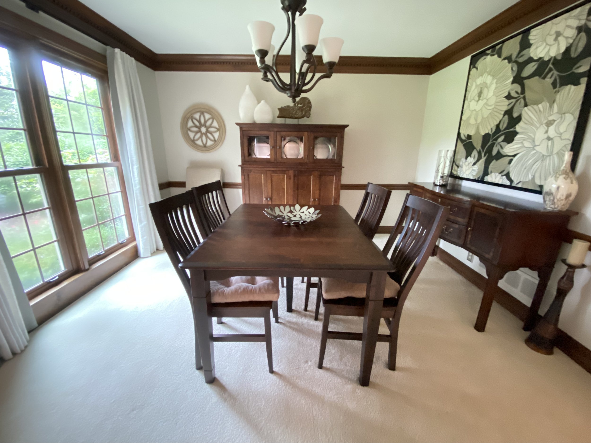
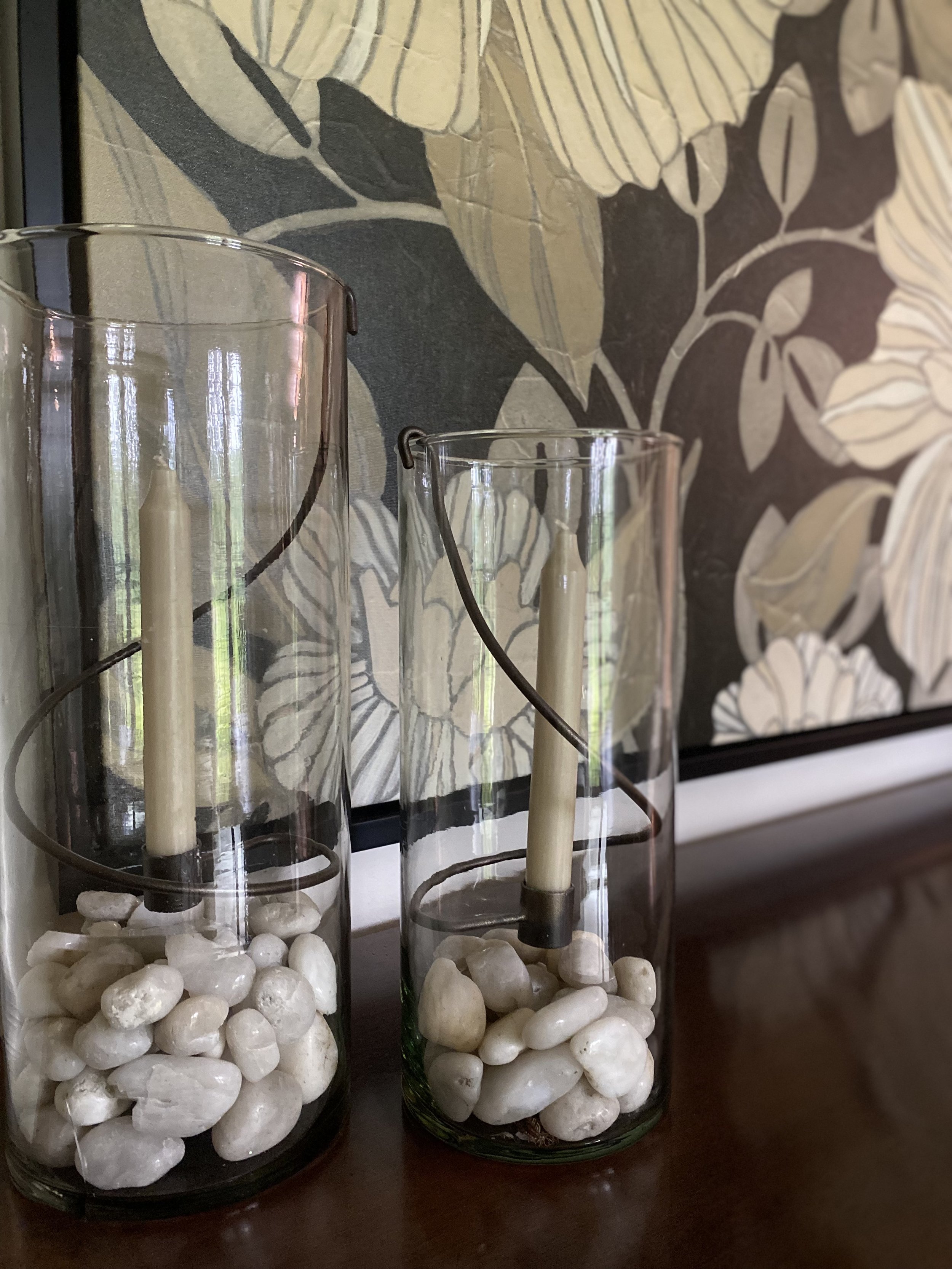
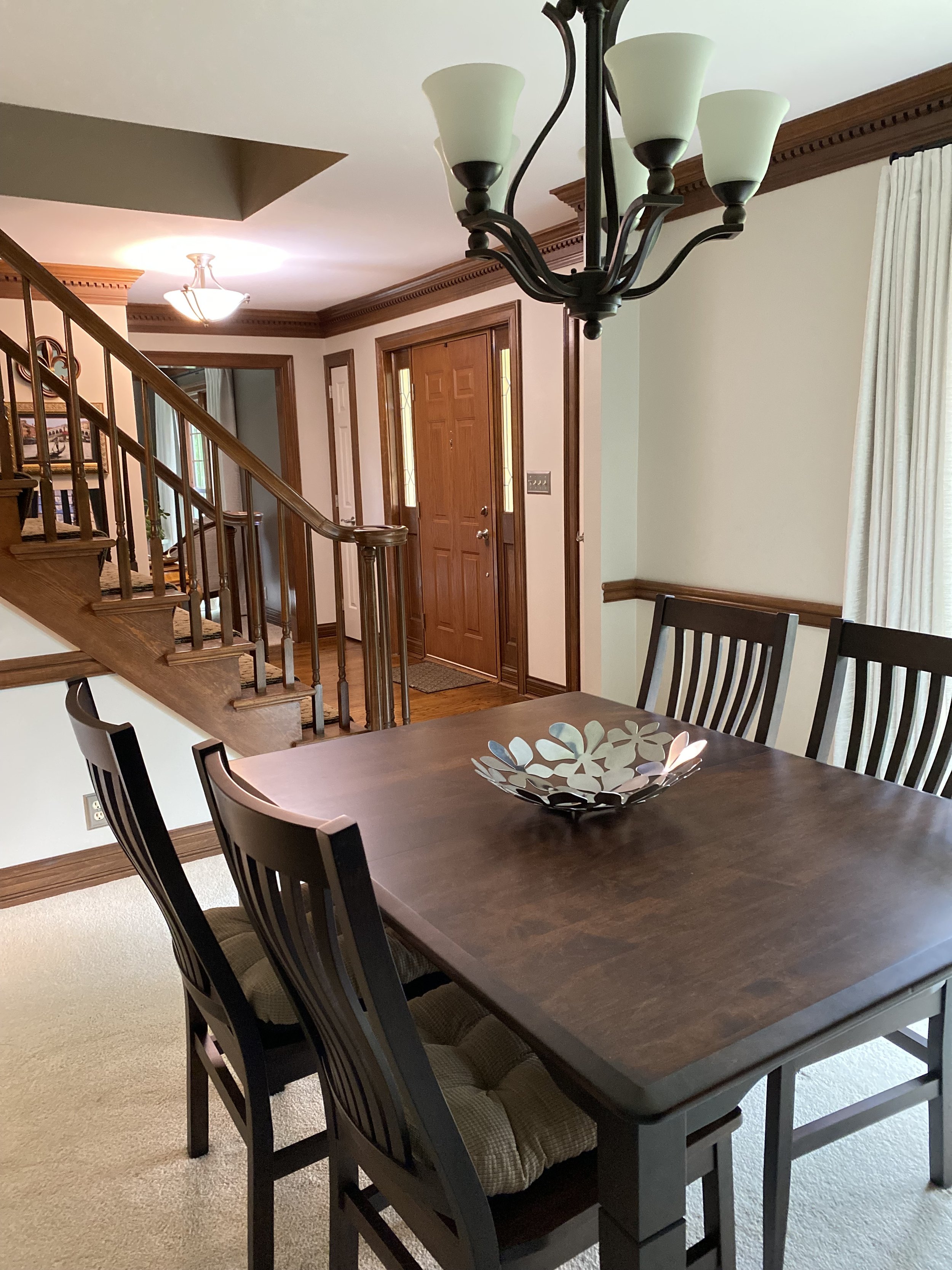
dining rooms


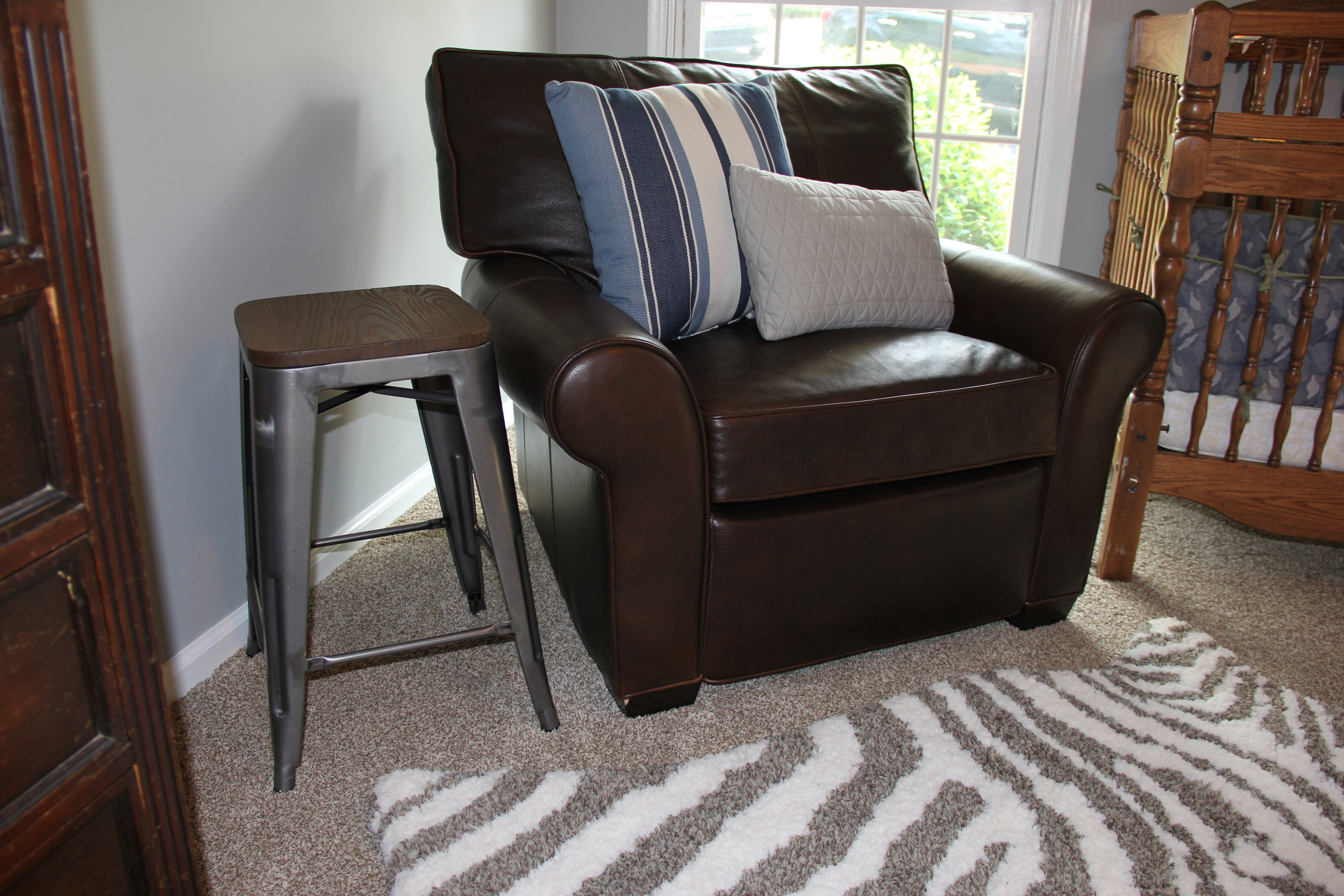
special places